compareのTwitterイラスト検索結果。 22,409 件中 183ページ目


It feels like someone hired a sweatshop of artists, threw an MTG deckbox and a Diablo III artbook at them and told them to use it as a base for new designs. Some designs are alright, but... compare the Pit Fiend from Heroes 5 to Pit Fiend from Heroes 6


Decided to draw me a John since I rarely draw Homestuck stuff, if ever.
I also wanted to compare with the one John I drew all the way back in mid 2016.
I sure have improved, right lads?
#Homestuck


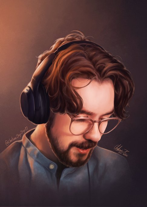
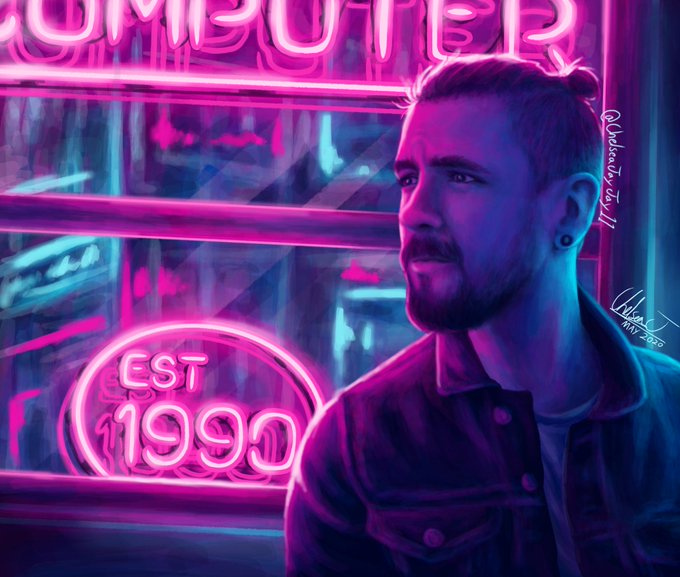
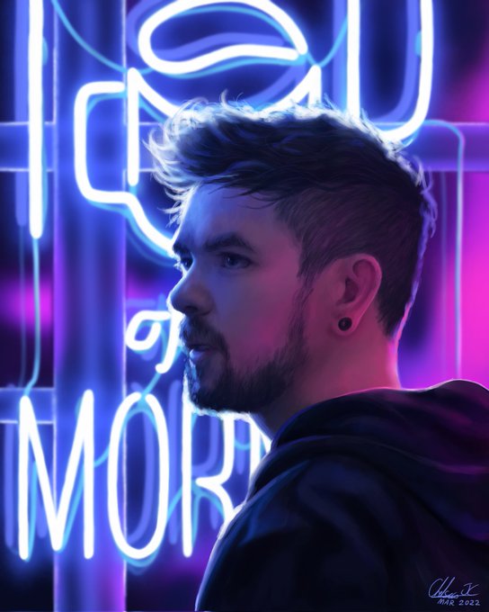
Found some similar ones to compare, my attention to detail got better I think https://t.co/cidGgkfNDZ

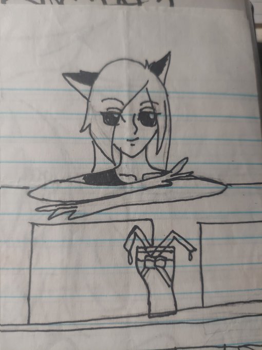


@Ciarra_13 Thanks for the thread!! I love seeing artist growth! Heres a piece from roughly 2009, then one from 2012 compared to my most recent piece done a few days ago. Ive gotten away from drawing people

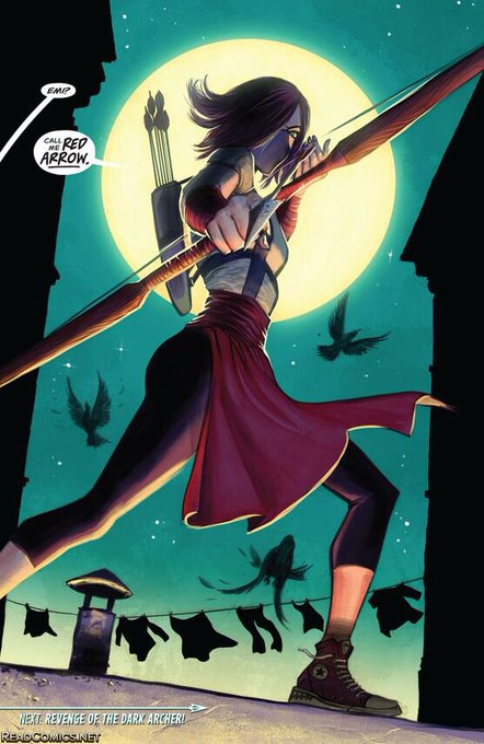
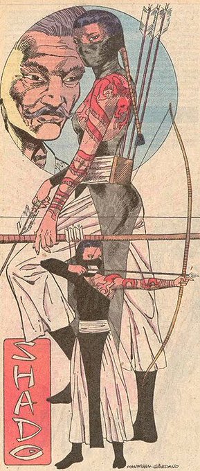

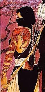
I mean yeah Shado isn’t a well known character but she does have consistent design elements compared to Shiva. The half mask, dragon tatoo and arrow are always going to be dead give aways https://t.co/Sc4eq9MAOE


13
Well, you know -for the sake of drama I guess LOL- people started to compare & take sides. That gives pressure too, cause suddenly the public makes it personal when there was actually no intention to compete. And I still feel that was unfair and toxic coming from many people.


Amaya’s weaoponry is minimal when compared to those of Imman’s Blade. For her selection, she carries a single kunai, of which she self provides maintenance. Amaya created her kunai and has since used it for her means of killig and fighting. ⬇️⬇️


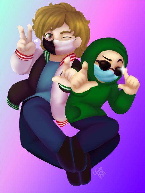

First vs latest drawing of Ranboo
(It's not anniversary art but I think it's still cool to see how far I've come as an artist)
I put the latest ive drawn of character ranboo too just to compare how much ive changed their design over time
(Even tho it's an au)
#ranboofanart https://t.co/lriXwSpprP


Patreon doodle of me in another one of my forms!
https://t.co/hsezmJFir2
As an absol I have a more sharply curved blade compared to most of them! Wee!


a bit of a shame i can't compare my albelumi art bc i start to ship them properly in early 2021 ;; https://t.co/EjudKR9As8


Wow- I have never compared them before. I suppose I got a Little better https://t.co/Vq4ytUeGg2


When I was searching for art from 2020 it was hard to find similar lightning drawimg as I use lately, to compare better. So here is my fox from ever first cover for Amazon book :D And Samus I did the last for now. https://t.co/Be0q0FQbyi


I wanted to share My OC here because I love Stella so much.
This is the 4th time I remade her but this time i given her a tail because I couldn't draw tails. Anyway I hope you like her this version compared to others.
#characterdesign #OC #originalcharacter

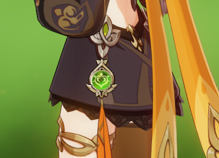


has anyone ever thought about the fact that visions seem to all be in different sizes?
Noelle's is HUGE compared to Lisa's and I wonder if the size of a vision is affected by the holders motivations maybe. Or I'm thinking too much about it and its random/hvy design choice


Could not find anything from 2020 to compare (mostly bc I switched PCs), but here is a little concept art comparison from 2021 vs 2022 :) it's not much, but I think I am more consistent with palettes and sticking to a theme! https://t.co/nXudI7Wwgj


They also teased Askin much more in the anime compared to the manga. In the manga you don't see his iconic hair and you barely recognize him.


2021 was a little better 😭 It was a renaissance compared to 2019 and 2020 ajfasdfas


@gentlepanpirate after looking through my layers i realise that the fault lies in my red tinted shadows layer, which has darkened stede’s skin significantly, where i intended him to be much paler compared to ed. ill be mindful of that in future and check before calling it complete!