contrastのTwitterイラスト検索結果。 11,163 件中 20ページ目


The pathos of Christ condemned stands in dramatic contrast with his image of a tyrant king leading by fear. Women running from Satyrs (1850), Ecce Homo (c1851), The King Continues to Reign with Order (1851) & Bathers (c1852)


Hope people know that Rouge wasn’t designed “sexy” for no reason.
Her design and mannerisms were supposed to contrast to Knuckles masculine, rougher nature. He’s also stated to be shy around women, which makes Rouge more of a tense challenge lol.


got carried away with testing colours on my sketch so here it is in grayscale lol. i gotta fix the colouring on the horns so that there’s more contrast


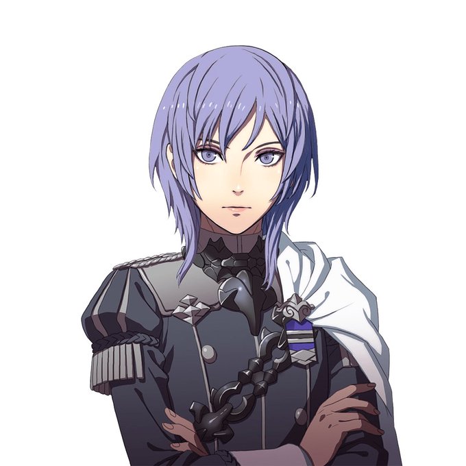
6. Fire Emblem: Three Houses - Ashe Ubert & Yuri Leclerc
I am THIS CLOSE to writing a compare/contrast essay on their backstories and personalities and philosophies. The sheer potential makes me insane.


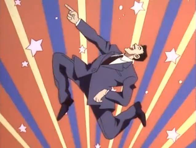
@MisterCrowbar @Tkacz_art I just love exploiting that contrast of warm and cold. I feel like it's a bit of a cheap trick but hey, it works... 😁


a surreal and dark mystical space exists in contrast within these bright sparkling temples.


Landscape Palette
bunch of greenish grays for all kinds of grass
bunch of grayish browns for all kinds of rocks and stones
bunch of sky colors
bunch of mist colors
a few high contrast star colors
a few popping "magic" colors as accents

UI Palette - Primarily used for icons
bunch of grays & browns to depict weapons, items, glass bottles, etc.
high contrast accent colors to give each icon it's own distinct, immediately readable flair
many shades of almost black for UI panels


warmup!! been enjoying some midcentury magazine artists who do cool high contrast stuff. gave it a whirl myself!


ชอบลุงโมริเพราะเมาแบบลุงบ่อย 😂 เอ้ย! 55555
นี่ชอบในความเล่น ๆ หัว ๆ ของลุง บางทีอาจดูไม่เอาไหน ทึ่ม ๆ แต่พอตีลูกจริงจังลุงก็โคตรจริงจังและก็ฉลาดด้วย เราอาจจะเห็นได้ในบางเคส อย่างเคสรวมรุ่นลุง เคสบนเรือที่เป็นเดอะมูฟวี่ ความ contrast นี้มันเลยทำให้เราชอบลุง https://t.co/4AKXPjQmKA


@Lademarmi This is Rei, he's got a dark purple aesthetic that contrasts so well with lighter colors, like this tannish/orange background and the hair pins (ps when hair is down I don't have to draw the other eye lol)


Moody, fantastical and oh so magical - the striking contrasts here are wonderfully imagined. "Sunseeker" by szart.creative Illustrator | Graphic Designer - inspired by superstarfighter #drawthisinyourstyle challenge.
#beautifulbizarre #digitalart


@TheMangoLabel @menjisworld Love the contrast on this piece fr!!🔥
Reminds me of this Menjified Quirkling @M33NJi blessed me with too! 😈😇


🟢This week's spotlight artist🟢
👀 @aidabbler 🔥
With his very unquues style of surrealism, each piece pulls you in with the lingering feeling of wanting to know more. A beautiful color contrast with a vast range of artistic expression, be sure to keep a close eye on him and… https://t.co/Q6GVenCtA4


I think the white back screen is also suitable for the light contrast. And this incubus drawing I made might look a little bad but the coloring is great 💜


tried doing a full body sprite edit,, need to fiddle w some colors for contrast and theres some jank (shoes my beloathed) but overall. not bad for a first attempt i think fdskhlsdf


Tryna add more variety in what I repost adjfjfjf
But uh yeah;
Inari, Alphonsus, Hoshi...
Inari and Hoshi because the contrasts in their styles and Alphonsus because -- gore 🥲 https://t.co/3Io7xnrYAS


@JaredSturman23 here's a striking, high contrast piece. i usually work with bnw so this was my "something different"


