CONTRASTのTwitterイラスト検索結果。 199ページ目

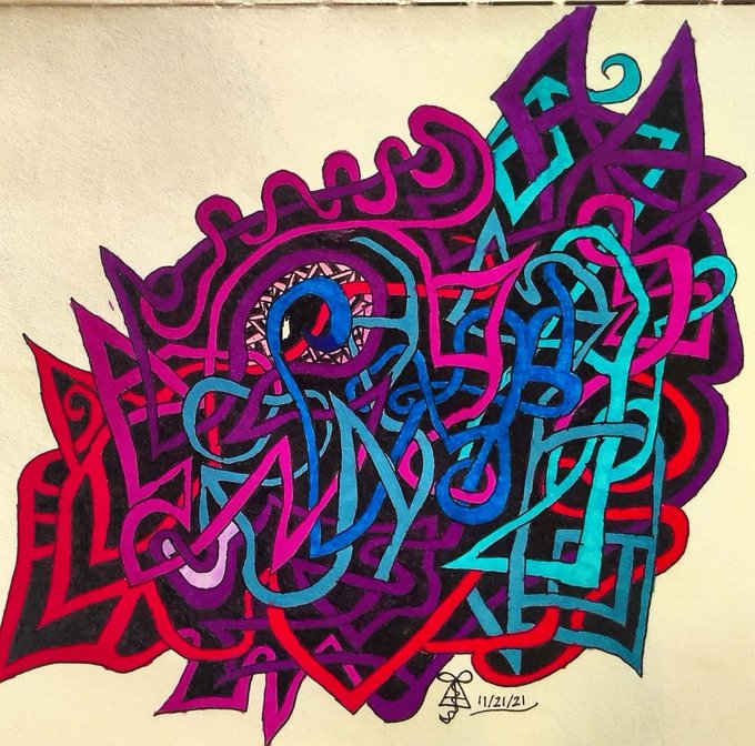
I really like how the contrast in this one came out. I either need to get new markers or transition to a drawing tablet to get more consistent coloring though.

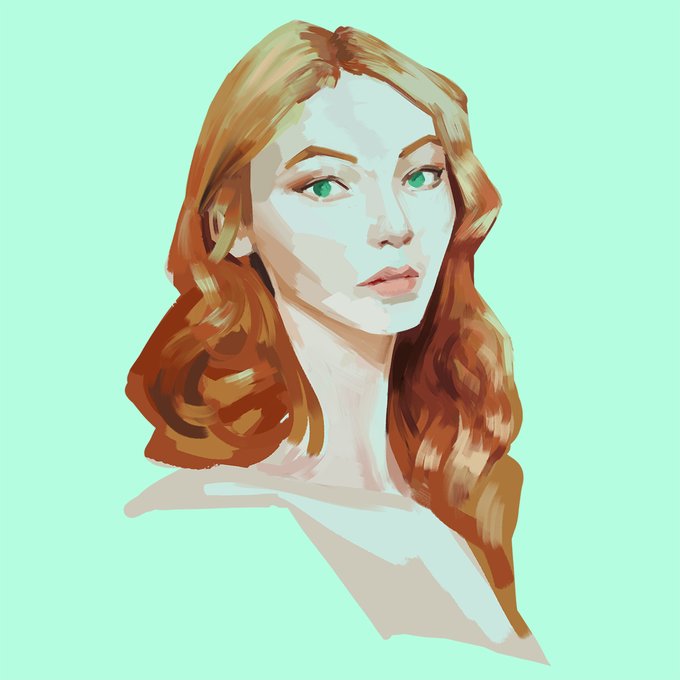
Another stylized portrait, liking the green and orange contrast in this one.
#art #portraitart #stylizedart


@SpeedArts64 u might want more contrast in the background btw along with making the signature look more visible
Just somethin to think about so the character can really pop
Also u can add an outline to the character too if u want like I do so so character has contrast with the background

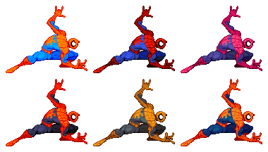
like I know some people want things more real but Spider-man I prefer to exaggerate and go crazy with to not only contrast the avengers but help him stick out, if he isn't doing crazy flippy shit what is the point.


@_Dominik_Mayer_ Love the shape language and contrast on your painting. Here is an orange colored piece with fire theme.


CHARACTERS PRESENTATION: FYBER
Fyber, the Haku's second son. In contrast to his brother Fury, he is an arrogant and scrappy guy. He is often in conflict with Flare. He is a good fighter too, as his brother, because he was directly trained by the Fire Master!
#manga #flaremanga


In contrast, #antibiotics became easy to synthesise at a huge scale, they were the same each time, were broad spectrum, and worked reliably. Why bother with #phage? #AntimicrobialResistance


My stock art packs are 25% off. To promote them I've been picking some of my favorites and making them into ads. Recently I've been tweaking many of them to improve contrast, etc. Check them out. Each has over 100 images for just $4.50. #ttrpg


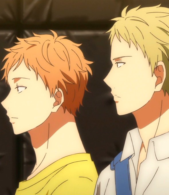


It’s true that Hiroki’s hair looks spiky in his 17(pic2&3).
To the contrast, in his flashback scenes of his childhood, his hair looks soft, so I guess his hair is soft naturally but now he’s putting wax🧐
…but maybe every children has soft hair 😅 so…I couldn’t say the fact😂


The Sun Summoner - portrait of Alina Starkov to contrast/match the one of the Darkling I did a few weeks ago! #ShadowandBone


"Liam y Clara caminan a lo largo de la orilla. Semejan personajes que un pintor romántico pusiese ahí con el único propósito de servir de contraste al magnífico y magnético dramatismo de la naturaleza"
Nueva carta: Cuentos de otoño (I)
https://t.co/JLk49dfnyX


Mareeta doodle. I want to highlight the contrast between her clothes and her jewelry based on that one old portrait of hers
#FireEmblem #FEH #Thracia776


2014, agenda de première
J'aime toujours beaucoup cette illu, je la trouve douce, les filles sont plutôt heureuses. Gros contraste avec l'état dans lequel j'étais à l'époque x)

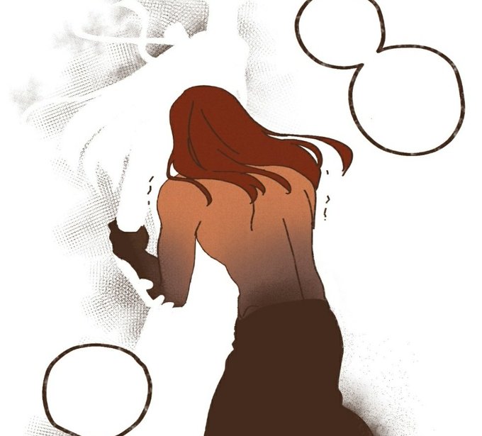


Seth is shown to be such a touchy person in the past, and was always physically affectionate Nephthys whenever they were together. But yesterday he was holding onto her out of desperation and being utterly terrified rather than love, and the contrast HURTS.


~{ROL ABIERTO}~
Puede ser escrito o dibujo
Te encontraste con un chico de primero bastantes llamativo , te animarías a hablar y pasar bien esa noche de fiesta ?
Rolaunquenoterminesufichqporquesi
#RoyaltiesInstitute


once again I'm being predictable, talking about female mentorship, Kylo and Rey as contrasts and parallels again, yelling about finnrey, and doing my damndest to love Rey and Poe in this movie