compareのTwitterイラスト検索結果。 22,409 件中 200ページ目


Merged Zamasu will be the next art so this’ll be my first time drawing him in a while
Corrupt this time tho 🗿 here’s the art from Summer 2020 that I’ll eventually compare it to lol https://t.co/jIHYQ1ezCs


I imagined it might help and artists workflow a bit! Just getting shapes and such down since it still can't rly compare to a true art piece (last pic I drew by hand)


@oceannid Even though this drawing is in his style it doesn't feel much like his other works??? (Idk if that makes sense) compared to even a doodle of his


Crazy how every time a new strong character comes up or an existing character gets a new form they are always compared to one of these 2 😂


Top 20 Best Serif Fonts to Download.
Top 20 Best Serif Fonts to Download
This roundup of serif fonts features a selection of best-selling typefaces in the industry.
What makes a serif font different from a sans-serif? If you were to compare the t https://t.co/SFUttHpHwY


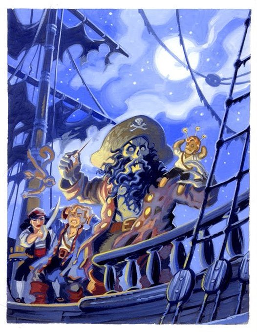
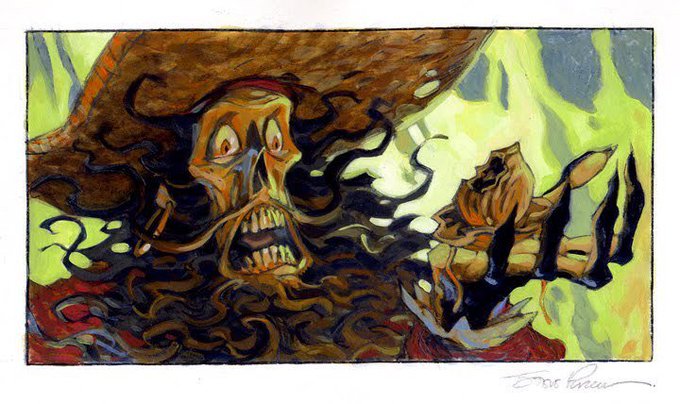

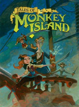
@EpicFunnyName I don't know much about Monkey Island, but I do know that Steve Purcell had a lot of say in terms of visuals & his stuff compared to the quirky modern look is like night & day.


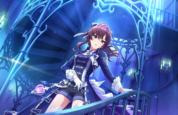
+ 2. the difference that Nagi had ranking 1st compared to Yui and Kaede says a lot.. She's a strong contender..
If I honestly had to choose I'd say either Kanade or Shiki, they both have grown SO MUCH over the years and deserve it so incredibly much + they've both been so close!


CHOBAM Armor for the Alex
Figured that it would be highly unrealistic to obtain this armor and it also lacks offensive options compared to the Full Armor set


This is not a real character design for Hilda season 3, it’s just a height comparison to the dark lord.
This is the dark lord’s height compared to Hilda and Johanna. But he can change his form in anyway he wants.
#Hilda #hildaoc #hildatheseries #hildafanart #hildanetflix

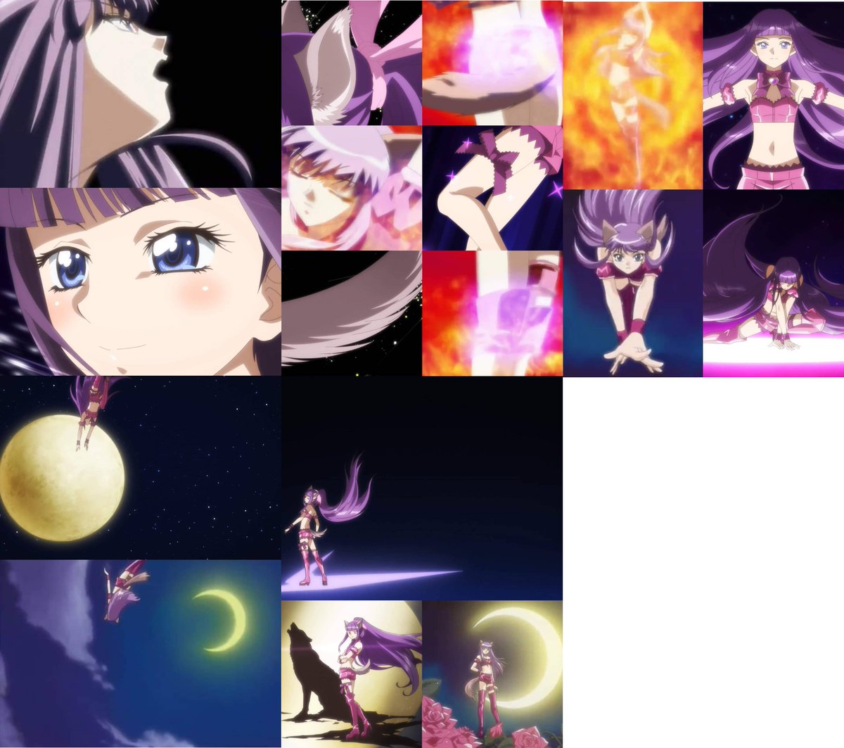
I'm sorry, i find new zakuro transformation to be much better for reasons I've already explained.
Another example with too little things to compare with. The fire effect really hides much of her figure.
#tokyomewmew #memewpower #tokyomewmewnew #mewmew_new #東京ミュウミュウ


An art from a decade ago compared to the most recent one I did, I guess I made some visible progress?


But nothing compares to Titanfall 2's mastiff. The way it just belts its chonky projectiles from the front of its barrels is glorious. It is easily the best shotgun I have ever had the privilege of using in a game in my eye's.


You could buy every sappy seal in the collection but they’ll never compare to mine


November 2021 Roxy Migurdia
I think I will make another fanart of her sometime to compare how far my art skills have improve from then.

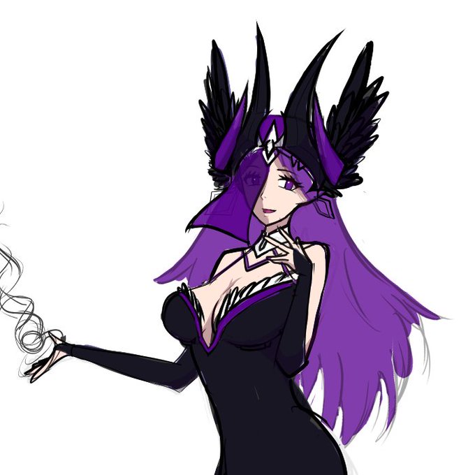
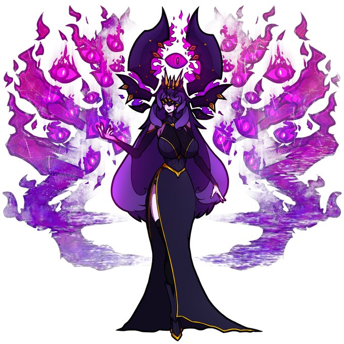
@mr_plagu3 2021 vs 2022. Not the biggest improvement compared to some of the other insanely good artists here, but I'm getting there.


@RetroDubsVA I've always feared that people would compare Raishu to RetroSpecter back when I was giving the alchemist color. So much so that I actually scrapped a few patterns and fur colors to try and avoid it


Style mimicry part 8 (final part), a rectangle-eyed Noelle. Focussed a little more on the color rather than the line art this time because that’s what stood out the most in the original drawings. Compared to that last one I think this turned out just fine.