TypefaceのTwitterイラスト検索結果。 605 件中 21ページ目


@ChappellTracker Top stories from 2019 🏆 What’s the difference between a font and a typeface? Take our new + improved ultimate typography quiz > https://t.co/zUnW0TGiD7


As seen in The Archive Occasional, @typethoughts’s interpretation of David Klein’s lettering is now on @futurefonts as a beta typeface. You can support its development by buying this early version. https://t.co/7Zcw4BvRVt


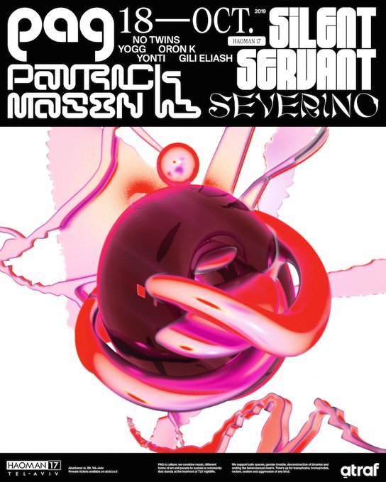
Challenging the viewer’s eye 👁 @lieliel’s designs for a Tel Aviv queer rave include abstract 3D motion design + a retro but futuristic typeface #DesignDiary > https://t.co/e6m1jGluLE


Today we are happy to launch a great new typeface in our shop: Vallejo Serif by Felipe Calderón! Test it right away https://t.co/Gi00RN1lF4


We have a new typeface available in our shop. Botanist by Jason Carne. Test it out right away: https://t.co/1Hw1ycmrJu


To letter Liebestrasse I wanted a typeface that felt European and matched @timfishworks lineart work. With @greglockard 's blessing I chose one of my faves: Fonteys Caps, made by @FandoFonts based in Eisner nominated @AlbertMonteys' calligraphy.
https://t.co/xia9QW0pIt


Roger Excoffon, Choc typeface specimen, Fonderie Olive, 1955. See the entire specimen on the Online Archive. Join for beta access: https://t.co/a126kCJcU2


Halloween Typeface 🎃🎃🎃
Feedback, RTs and likes are very appreciated.
Behance: https://t.co/SQax35u4Em
If you are look in for some graphics, contact me in Dm.

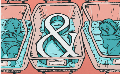
Sometimes the best typefaces come out of never-realized brand identities #TypeTuesday 😍 https://t.co/oEvRRwQNWS


Not for the squeamish: leech-inspired typeface by Christine Fischer. The prompt for this design was "emotion", and Christine chose "disgust" — more of Christine's work > https://t.co/Xcz3gAn78v


https://t.co/3MWIPmISam — Canopée is a great #typeface. Good rhythm and harmony. I like type foundries ignoring the sans obsession. As for the rest of the typefaces... not so good but still interesting.


🥁New Release: Flecha
👉 https://t.co/sZGQ5hqGuP
#typefacedesign #typedesign #editorialtypeface #editorialdesign #highcontrast #typeface #fonts #oldstyle


Agyei Archer presents his research on “The Afáka” which initially started as an extension to a Latin typeface, but is now focused on documenting and archiving the script and its design features. Don’t miss his talk at #TypeCon2019 on Saturday, Aug 31st. @agyeidesign


Found a couple of really wild typefaces recently, this Buddy Rich one is especially nutso. And the Gimme Shelter one I know I've seen somewhere before but can't place it.

Load up your typefaces + line up your tabs to take our new and improved ultimate typography quiz 📝 https://t.co/zUnW0TGiD7

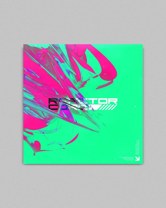
reactor core
ft. an incredible typeface by @adrianwrobel_ named "kontakt(one)"