typeface.のTwitterイラスト検索結果。 24 件


A golden-shaped figure stand in the middle of Christmas décor, showcasing a giant red banner with solid white typeface.
#winter #winterday #winterdays #winterseason #winter2023 #art #artist #artwork #digital #digitalart #digitalartwork #illustration #illustrator #photoshop

A young girl clutching a hat packed with yellow leaves while wearing an orange blindfold; and a brownish-yellow typeface.
#fall #fallday #falldays #fallseason #fall2023 #art #artist #artwork #digital #digitalart #digitalartwork #illustration #illustrator #photoshop


Victory Leozack was characterized in the BotCon 2009 comic as a stereotypical anime character; with Rik Alvarez even wanting him to speak entirely in Japanese.
Though this was nixed, the basic idea survived in the form of his dialogue being rendered in an Asiatic typeface.

While the Didot style does not vary in the history of Spanish typography, Retiro tries to imagine this kind of typeface. Retiro is available 5 optical sizes. More than 1100 glyphs for the Pro version.
➽ https://t.co/e5oNI2L7er


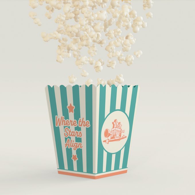


2-3 day creative brief exercise for a drive-in theater. Modern retro-style logomark/branding and custom y2k typeface. Lowkey went crazy. Check out the rest 👇
https://t.co/sbWeu9IMTM


OC fact of the Day; Muramaku is the only character in cast that speaks in a unique typeface. This is to emphasize his uh... "unique" voice, which is loud, raspy and deep
Everyone else uses Wild Words or SS Boba Date. Mura (or someone imitating him, like Nate) uses Mouthbreather

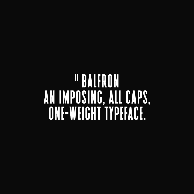

Balfron
Inspired by Ernö Goldfinger's east London tower block of the same name, II Balfron is an imposing, all caps, one-weight typeface.
https://t.co/PZgbtLq0ec


HD lockscreen
Light and dark, with and without typeface.
https://t.co/MyXknqcGNV


@Glass__Moon Right?? I've got even more! Even the logo is very clearly the Sailor Moon typeface.

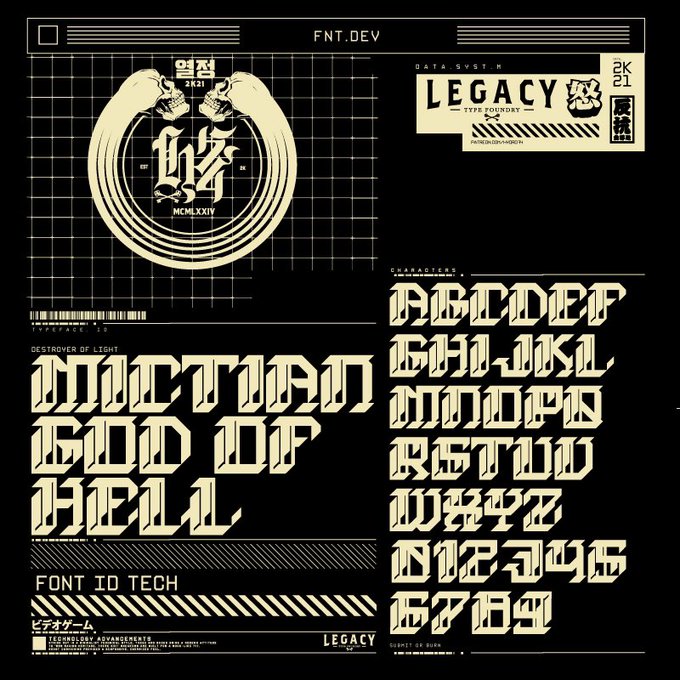


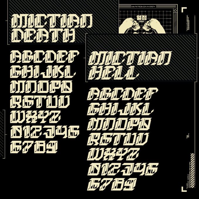
MICTIAN / GOD OF HELL
New black letter / cyberpunk typeface. Up on https://t.co/CfUmCq5IHO (typefaces) & Patreon.


We worked on a great update of our Kobe Typeface.
https://t.co/OTLQDwCgGa
In this new 1.1 version, the regular version has just undergone a subtle makeover and now exists in 6 different styles
https://t.co/4GNN0buTcW


@one_to_read @PaulWat5 @toddstanton1 @FlyingEyeBooks @smithsmm @f33lthesun @KarlDuke8 @StephenConnor7 @sam_creighton @teacher_mr_r @WatsEd @jonnybid @Mat_at_Brookes @MrBReading @Misterbodd @primaryteachew @karen_wallee @eenalol @MissSDoherty @MissNCleveland @Remy_Lai *Really* looking forward to all of these graphic novels too (but they are not for primary school readers). The first book is What the font?! A Manga Guide to Western Typeface.


my 2nd day posting this ✌😁... using my #baybayin typeface. this will be my showcase of this anyway. hope you guy like it 😄...
#BuwanNgWika #CLIPSTUDIOPAINT #AnimeArt #digitalart #illustration #artph


As seen in The Archive Occasional, @typethoughts’s interpretation of David Klein’s lettering is now on @futurefonts as a beta typeface. You can support its development by buying this early version. https://t.co/7Zcw4BvRVt


https://t.co/3MWIPmISam — Canopée is a great #typeface. Good rhythm and harmony. I like type foundries ignoring the sans obsession. As for the rest of the typefaces... not so good but still interesting.


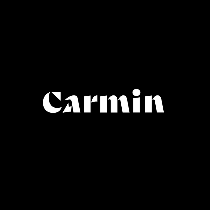


✒️NEW RELEASE 🖋️Carmin by @Theo_Type is a mix of historical and contemporary shapes. It revisits 5th-century Uncial letterforms, puts them into a time machine, and spits them out as a modern, sans serif, stencil typeface. Get it for $20 https://t.co/0jTg40sETs


GeneTypo 03 - Cavity Typeface. Generative Design & Typography. #generative #typography #proce55ing #creativecoding https://t.co/uAGMVjgGh1

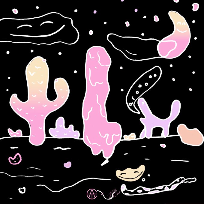
🌵 @LauraHelenWinn illustrated her 1st initial for ATC Artist Series II. Here's her letter #L in our Nasty typeface.

🌴 @JulianoPezcado illustrated this "#" using our ATC Duel typeface. More fonts on https://t.co/JFzxX18FCQ! #Fonts