opacityのTwitterイラスト検索結果。 1,338 件中 21ページ目


@mysteryseong Don't know if this would help u, and I'm no expert, but usually I color pick the skin and slightly change the hue to a warmer tone, then choose a very saturated color from it, apply in a multiply layer and adjust the opacity. Is simple, but works!


5. Shadow
Ini penting banget di aku, biar warnanya kelihatan lebih rapi. Opacity nya turunin jadi 75% atau sesuai selera kalian.

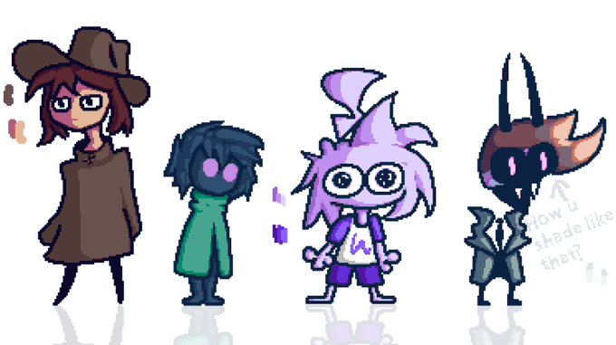
Some cool mutuals
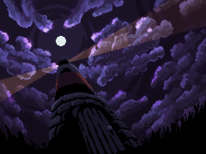
hanging out in the 10% opacity floor void
#pixelart


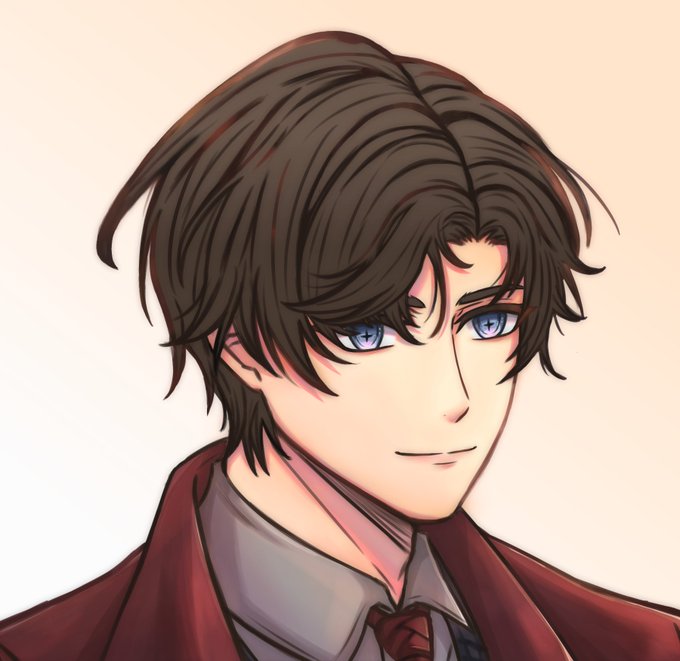
@akechipilled69 ah thank you! and this is how it looked like before i added the additional layers and adjusted the colors a bit :) i also use multiply on low opacity for easy shadows on the hair and clothes, aside from that this is what my colors look like normally


normal setting 100% opacity ---> color burn %30 opacity ---> no gradient map
LIKE WHERE DID IT GO maybe im just dumb


@EokiiM @CriticalRole All of it is drawn with a 57 opacity brush, i colored whole areas without lifting the pen.


@EokiiM @CriticalRole I actually color picked but i use a way where i do the whole drawing on like 50 opacity. And if u technically look at old official art of scanlan,not the show,hes lighter. Ive been drawing him since before the design came out im pretty sure.(First 3 my fanart,last by kit buss)


Realized the background was a bit too much after I posted the tweet so here’s a lower opacity version :3


Old. I sure took my sweet time getting comfortable with high opacity brushes 😅

Trying to do studies w/ just a hard round brush w/ no size or opacity pressure and no colorpicking is definitely going to be an interesting challenge.


@SuperFormIchi I exported a frame of the shot in Premiere as a png. and then moved over to Photoshop. There I figured out where I want the art to go, lowered the opacity of it, and very carefully started erasing where it overlapped with the text. The white background is transparent in Premiere.


if you don't feel like shading each individual layer, you can shade with a brown or violet over all layers. I usually set it to multiply and lessen the opacity. this is also the part where I will manually use a pen or airbrush to draw in the sections


Damn, it's amazing how fast simple things can go, hah
Took a minute to figure out what I wanted for background. Ended up going with like 4 different color gradients at 50% opacity.
All left is shade, text and mess. But might be next week, we'll see!


10. Buat Add layer di atas screen dengan opacity 52 % dan buat secondary lighting, aku pakai flat brush untuk lighting tajam
1. Base color, add new layer opacity 50 % an. Apply gradient biar gak flat banget colorny dan merge. Abaikan colored lineart di rambut, aku males itemin lagi 😅