portionのTwitterイラスト検索結果。 14,639 件中 21ページ目
>be vegan
>be an alcoholic
>decide to eat nothing but fast food for a whole month
>deliberately order the largest portions possible every time
>never exercise
>still an alcoholic during all of this
>"LOOKIT WHAT THE FAST FOOD DID TO ME" https://t.co/ArAtcmNuBR
Quick sketch of the besties ft. Awful cosmo proportions
@PkmnBrainrot How do we feel about the redesign? I honestly like both just the same but i definitely fixed some proportions and design errors in the new version :)
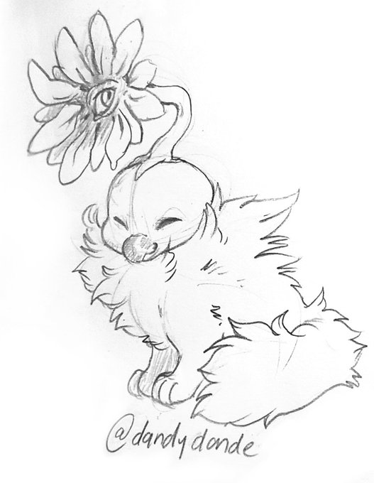
My oc Doolybird hasn't changed substantially but definitely a lot proportionally! His head is more round and body has gotten fluffier and more cat-like with a longer tail.
2006 -> 2008 -> 2022 https://t.co/vswFHAsCmq
Are you waiting for cutie #NFT portion of the day? ☺️
✨@doodlezkingdom
✨@GotTheJammies
✨@DinoStrikeNFT
✨@Dimitramilan_
#NFTcommunity #nftart #nftartist #NFTcollections #nftcollector #NFTs
@callipeste_ Your model work looks so lovely~ 💕
This is my model; The Chinese New Year is more accurate to normal size proportion. The chibi is her regular clothes :3
model update what do you guys think about my new proportions🤪🥰 i had to make my head bigger because i had to show how intelligent i am
Ibis Paint is where the biggest portion of my work has been done https://t.co/WVl5ZfYrgS
And then you look at her from Other M cutscenes and it looks like they cartoonishly squished her shoulders in to make her boobs and hips pop out. She looks proportionally much shorter too.
And then in Ultimate they had the audacity to put her in friggin heels! 🙈🙈🙈
I've created a silly oc Spizard species by @spaz_tik i made em a grassland n hope I did the proportions right on the front limbs 🦟
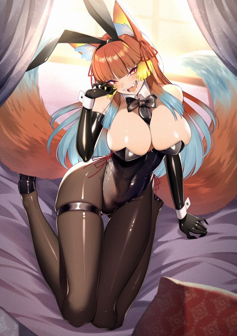
A wonderful art piece of Rei in a bunnygirl outfit by the talented @cluseller!
The colors, her proportions, and ooh, BOY, the fangs!
Thank you very much for your hard work!
Reposting because I think these drawings show better how I've progressed with my art style
I'm happy bc I feel now I've defined my style, proportions, and the way I highlight and shadow
a case of over-rendering
here's two side by side quick drawings I worked on where in I end up losing all the personality I wanted on the left for more correct-looking proportions on the right. figuring out how i *want* to render is something im still trying to work on haha


