APPEALのTwitterイラスト検索結果。 205ページ目

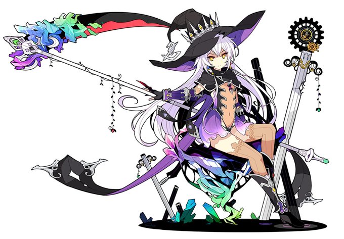


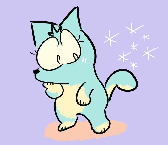


slowly flatting this, languishing over how bad the food looks but will be going back over them to make them less..... spread out and unappealing


Not a fact by any means, but I feel like Flora was whitewashed to appeal to Winx’s Russian audience, because the show has and will always be extremely popular there, and she now shares more visual similarities with them. Just an observation.

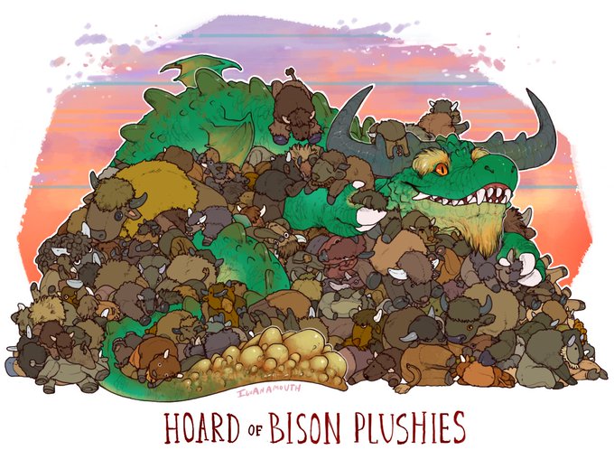
@Corvuscorax81 For most of us... that's why I took this one as key visual instead of e.g. the "Hoard of Bison Plushies"... even though I personally find the latter quite appealing as well :-)


💎//So after some feedback and seeing how the poll was going, I took it down. @Lacie_Sylv edited the first option to be less colorful, so now we have a more appealing pair of choices! Let's see how the votes go between (1)breastplate and (2)catsuit!~


I've never played a Xenoblade game but I'm really enjoying Pyra and Mythra in Smash, especially the latter. I think her 'censored' design is an improvement over the original as it gives the outfit a sleeker look with better colour contrast. Quite appealing to draw.


@Twarda8 is both incredible artist & independent game developer. Her expressive style has universal appeal. It's something that will definitively inspire and introduce many new people to field of palaeontology. ALSO CHECK HER GAME OUT.

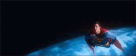
The original Superman is still wholesome as fuck and I love it, though. It's funny, Superman's appeal is so simple that people can't grasp it, making it "complex". We're all so jaded that we can't appreciate someone being fucking nice. We're like "yeah, so?"


Regional Swirlix and Slurpuff for the #Mazah region.
Wanted to come up with a “Salsa Pokémon” and these sweet Pokémon becoming spicy seemed all to appealing.
#Fakemon @Subjectively_5


She’s trying out Jo’on’s clothing... she still can’t find the appeal of why Jo’on wears it...


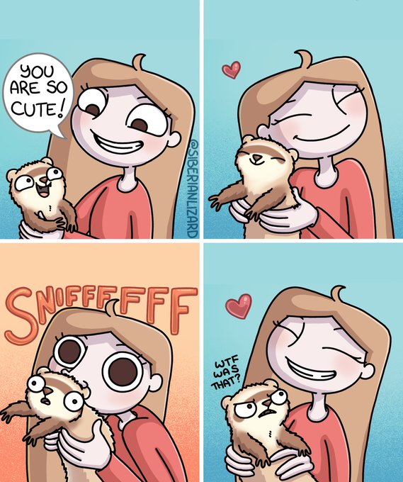
Just one good sniff is all I ask... 👃 #ferrets
Redraw of an old comic of mine from 2019 (seems like ages away now). While my style has come a long way, some things haven’t changed too much! I definitely think that ferrets have a more appealing and distinct designs now.


[ CW // Explicit Gore ]
Once again Invincible redefines itself as the goriest superhero comic book on the shelf. While not its sole appeal, it's hard to argue that it isn't shocking every time, which really is a testament to Ottley and the colorists.


Still baffled that FORTNITE of all things continues to serve consistent W’s with their Marvel content & aesthetically appealing character designs. 👀👌


GIVE ADVICE ON MY AVATAR SO I KNOW WHATS APPEALING AND WHATS NOT


Today's pick: Arent de Gelder: Bathsheba makes an appeal to David https://t.co/GOYjBv4OW5

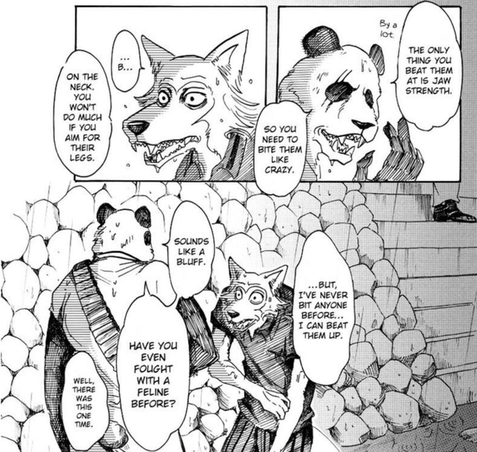
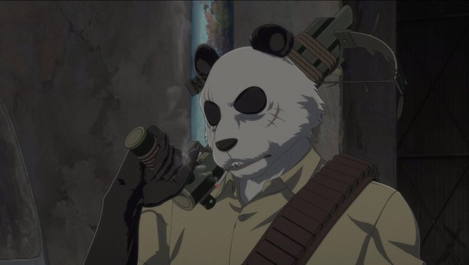


@Luck_Voltiaxx @BackSpokey I like the manga but not the art (it's not bad at all, but not appealing to me, the character body proportion are weird). Beastars art is awful, but the story amazing, and the anime extraordinary