ComparisonのTwitterイラスト検索結果。 22,246 件中 207ページ目


In comparison to Olivia's old design, I went for a more simpler look for her.


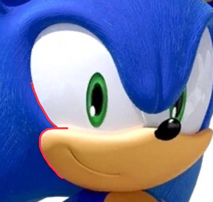

@MarcusLarry627 Possibly the worst things about the model to me is how the eyes are formed in tandem with the muzzle, how subtle his back quills seem in comparison to the quills on his head, how inexpressive the model is and as a personal notpick, how flat and non-puffed out his chest is


[2019 vs 2022] And here's the comparison of the two!


Here's a comparison between her old design and the newer design.

@notallwitches oohh actually i was wondering why no one on the feedback thread mentioned how low contrast the values of he rocks looked in comparison to PP, I guess they where using base taliyah as a base for clarity maybe


the hair is an obvious comparison but besides that idk??? https://t.co/KKjyvxzGFl


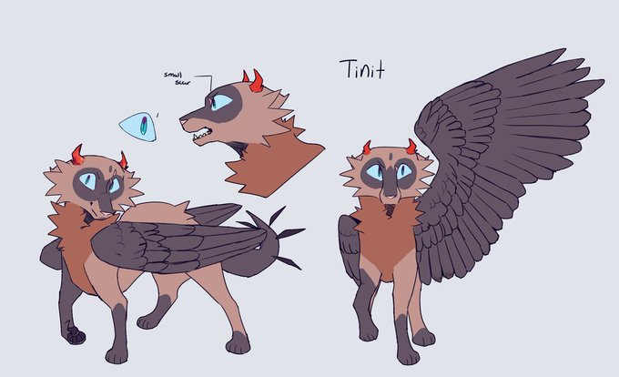
Did something I've been wanting to do for a while, finally polished up Tinit's design
(Also a 1 year old ref sheet for comparison)


I decided to sketch this design of sonic from sonic adventure I hope you enjoy this picture and the comparison #sonic #SonicTheHedeghog #sonicfanart #sonicart #fanart #Sonicadventure


CRAP.
Duncan Fegredo with Stewart and Gary Gianni with Stewart.
#Hellboy #Comparison #HellboyComparisons


Blast from the past, how my art used to look way back when. I might need to do an actual comparison post and redraw something from way way back.


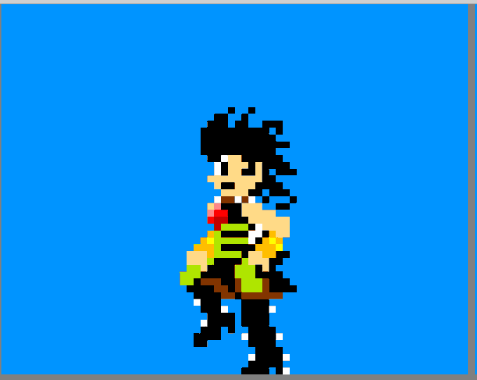


I am also making some sprites more anatomy accurate and adding "motion" to some sprites so it would look more lively. Here's comparison images. the "before" and "after". #pixelart #update #indiegame #indiegameart #indiegamedev #WIP #remake #Phoenix_Saviors


Here’s the original shot that I used for the redraw along side a completed ultra instinct variant for comparison.


@translationmon Putting the shitty DMO model was a douche move tho. but Im fine with both tbh. here is some art comparison


New MyRoid family height comparison chart 📏
① Japanese game account.
② ③ Overseas / World game account.
#moecanch


Aah I managed to find two from the first day I made him!! :D (Most are lost but I was happy to find some!)
So I'll put two recents as well for comparison!
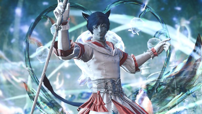
(He's not even canonically a WHM but that's the most recent shot so jhfvgdg) https://t.co/Z9xhIA6GTT


I never had a different title planned for Draconis Wicked, but here's the original logo (plus the current logo for comparison.) The old one's more colorful, but kind of tacky. I was so close to going with my first pass. Yikes. https://t.co/w5ssRhTNY3


@RhysBDavies Lol, I love the RWS as much as the next guy, but the classic series of the TVS is just *chef's kiss*. But, for the sake of proper comparison, here is the Caboose Brake Van Hybrid next to some RWS vans of similar height.


I know the other characters don’t change too much BUT I thought that since Winnie’s been around the turtles for 2 years, she would adopt a new style bc she’s an honorary turtle ✋
Comparison btw she’s no longer baby she wants to be a hero