ContrasのTwitterイラスト検索結果。 10,815 件中 208ページ目

asdfghjkl the coNTRAST BETWEEN MY REALISM AND MY NORMAL STYLE- i-
w o W


a full version of odette and odile redesigns. i liked the idea of odile having a similar look to odette but more upscale. she's a special girl who deserves nice things, she proclaims to her father! contrasting odette's "peasant dress" (i was going for a chemise de la reina)

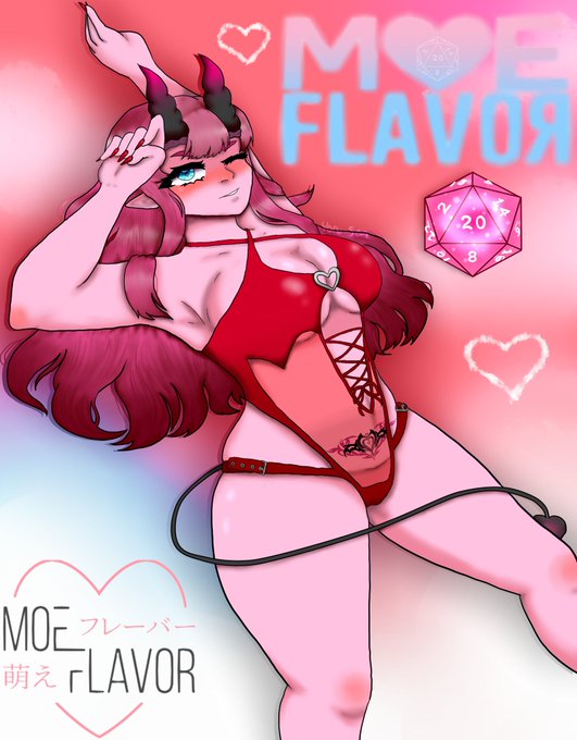
@The0neulost Out of my personal works these are my top choices! I like both contrasting color palettes and complimentary but these are my favorites based on colors alone ♡


OC first design vs now!
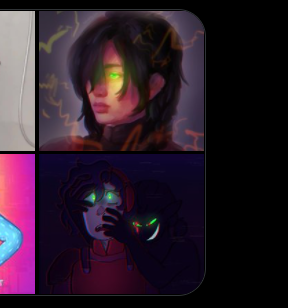
there were a few I could've chosen for this but I think ryder has a pretty good contrast between designs LOL
He's my old fursona and my namesake :3c https://t.co/qT8Am5OQXn


Design for KS project of https://t.co/vjQk7TfsR8 I did some edit to have a stronger boost of color and contrast


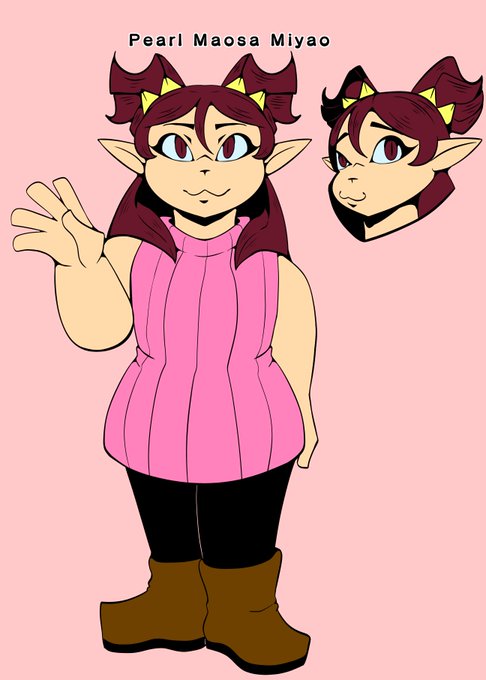
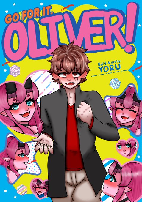
Early Design➡️Current Design
To me, her old design almost makes her seem like she'd be more restrained and proper. I'm glad I didn't go through with it. She also contrasts more with Misty in her current design


A C Q U I S I T I O N
@doodles #4213 by @byburnttoast
The contrast, use of line and color, plus the love it puts out into the world.... I had to have it. #NFT #nftcollectors


Those two were fun but this is the study I liked working with the most: it was nice to be able to adjust lines and create contrasts with the "white ink" in the final pass! Next time, I'd want to make more liberal use of black in the core shadows (hair, dark fabric etc) [3/3]


im so angry that these two have to be probably my favorite contrasting designs and they arent even standalone characters grrrr


Maybe looks a bit more natural with less contrast for eyes and lips


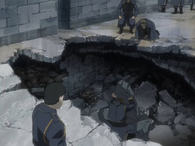


Kenji Yasuda was absolutely in his bag storyboarding this episode, lots of cool framing and layouts
The drab bluish-grays and constant rain in sharp contrast to #14's bright blue skies is also a nice directorial choice to bring out a more solemn mood


@DowerChus @ZazCross Voy a decir que si porque me olvide xD, creo que fue para hacer contraste con su apariencia o algo comico pero me olvide ya


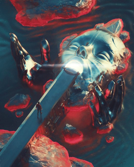
@SurrealReality6 Really neat and contrasty 3D artwork. Love it 🤍
https://t.co/HnR3XRcCag
https://t.co/DWs43n5w8f


Linda O'Neill creates inspirational paintings that invite joyful contemplation. She brings a powerful and expressive range of contrasting colors, forms and depth to her works of art. This dynamic work of art titled "Foundation". https://t.co/CLSt7oeo6I

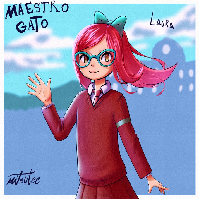
illustration of laura from cat teacher (maestro gato).
I actually like the design and the contrast in her colors, and.. well that´s it, i´d like to do a more dinamic pose but it was an old sketch.
#maestrogato #catteacher #fanart #maestrogatofanart @paulinaapc_art


Not sure whether the contrast between Runo Stromkirk's two #MTGVOW arts is meant to tell us "this is your brain on Lovecraft" or "blood vials are the greatest glow-up". Imagine them in the sequence you prefer 😉


God i miss GOOD ANIMATION! GOOD ART! Lets contrast.. On the left we have Steven Universe by CARTOON NETWORK. on the Right we have Stefon Galaxy... WHAT THE FUCK happened to artists in animation??!?!


In stark contrast to the Mawkin tribe, the Thoha was a tribe of Chozo that had significant prowess in their scientific capabilities. The Thoha would create the Metroids on SR388 after colonising the planet. The Thoha would later be completely eradicated by the Mawkin, bar one.