opacityのTwitterイラスト検索結果。 1,333 件中 22ページ目


Slow and steady (but also fuck blending out this ass crack and I dont want to fight opacity urgh)


Practicing how I paint. It started off quick and fun but as I work on it longer, I get lazy with going back and forth with the opacity setting @-@
Note to self: Set 2 different brushes for a better workflow and leave a base color swatch on the side ;-;

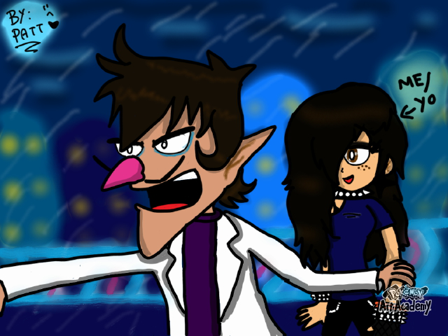
Jan 26, 2015. By: BowsyKoopa
[45 Yeahs!] [0 replies] (EU)
https://t.co/NSzDNHss35
" Waluigi and Me in my City,the KoopaCity(of mk7) ^ω^"


When in doubt. Low-Opacity Scribbles make great veins. 🤣
Probably gonna be the last update on this piece for today.
#Destiny2Art #Destiny2 #art #WIP

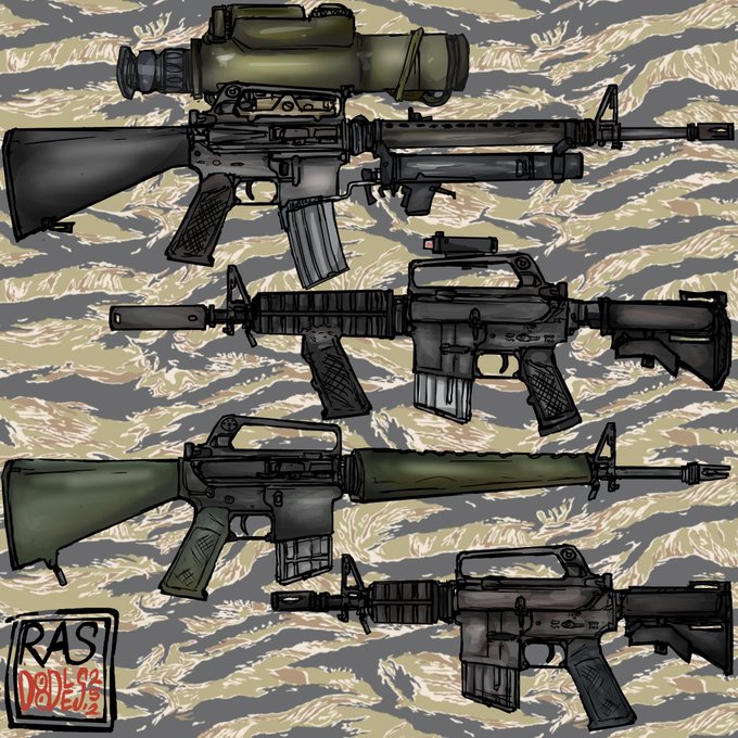
finally get to color the retro ARs from the showcase post, now added Colt 601 and CAR-15 N-23 shorty..
plus I'm late to the new year tiger trend so here's a low opacity tigerstripe on the background


@aztex_01 kinda looks like mine if opacity by pressure existed for me😂🤣


Here's a visualization of the masks in VTubeStudio
(it feels clearer with opacity a bit on)

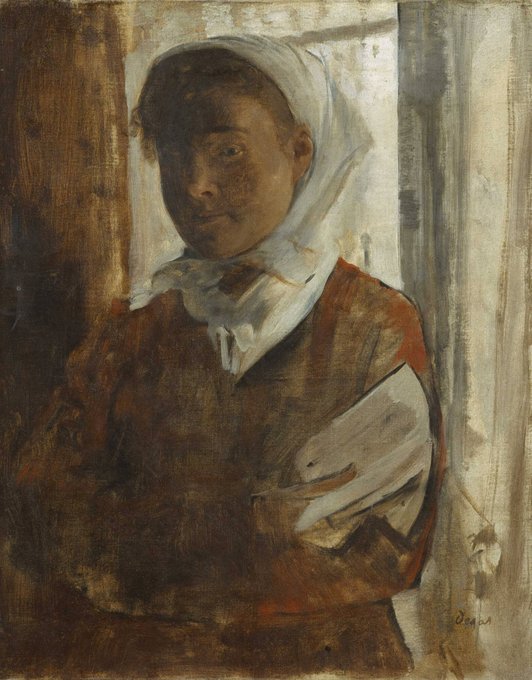
'A Peasant Woman'~ Hilaire-Germain-Edgar Degas, (1871)
A Peasant Woman is part of small series of works where he tackles the problems of painting white material against light with its opposing qualities of transparency and opacity.


@tyton12 On clip studio, I paint the jacket in grays and the I made a “Correction Layer” —> “Gradient Map” selected an holographic gradient and then repeated that step again but this time lowering the opacity at 33%


@InkfishDraws I saw someone do some funky colouring for bh’s soda girl so i taught myself how to do it and made this 1st try, it isnt the same technique but its basically just highlights and the opacity tool


Adding this process video because I was actually pretty surprised at this illustration. Even though all the leaf brushes I used were 100 opacity. So in order to make them kind of blend together I used a soft brush to wash a color over them. But it ended up being kinda cool.


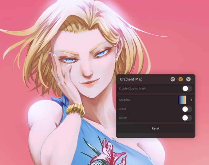


As for what gradient you use for the gradient map, that’s up to whatever you think fits best
the map here is set to 50% opacity and Color, which is kind of my default settings for it


This kid of soft colors and crisp lines art style is incredibly convenient for game design. It's readable and It's very easy to adjust how much visual focus something should crave by simply tweaking the frequency and opacity of lines.


@PopettArt Thank you so much!! I tend to work with alot of colour in my stuff so I guess it's just learned, main advice for colour is gradients and layer effects, this way you can tone down the opacity of individual colours and brights if it's too cluttered, other than that, no idea!


@TexanSoda I could honestly learn from YOOU!
Whatever "follow the shape of the form means". I'm not even sure how we do it sometimes. I'm sure glad yoou can "protect alpha/opacity "! Now we can shade in pure ugly black and then change it later.
I'll consider a Drawing II class sometime.


A quick test. Just the hard round on everything including the lines. There's no pressure sensitivity but I did allow myself to adjust opacity. I think it can be done! Once freelance work slows down I definitely want to try an entire illustration this way.


@TexanSoda I have a separate Multiply layer with a brush that is supposed to look like organized fur tufts. I use a very saturated blue and change the opacity to what seems right in the moment. i don't use blending but that might change as I use Clip Studio more than Sai


@GamesLiek Depending on what you’re going for, you can cell shade (hard lines) or you can build up tones and blend them out for seamlessness. When it comes to colour for shading, don’t use black, use a greyish purple and reduce opacity so the shade underneath shows through, or use mltply


