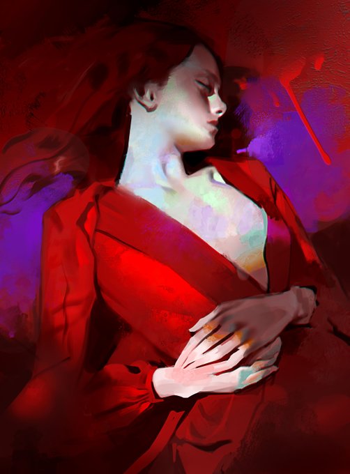
CONTRASTのTwitterイラスト検索結果。 218ページ目


Paul Cézanne studied the works of earlier artists and admired Jean-Baptiste-Simeon Chardin, whose still lifes feature an air of informality, as if he were working in his kitchen rather than his studio. By contrast, Cézanne’s settings are more ambiguous, space flexing and tipping.


@MissaMissaria @zappBEASTxx Idk, loud colors don’t bother me too much. Vivid animals exist irl.
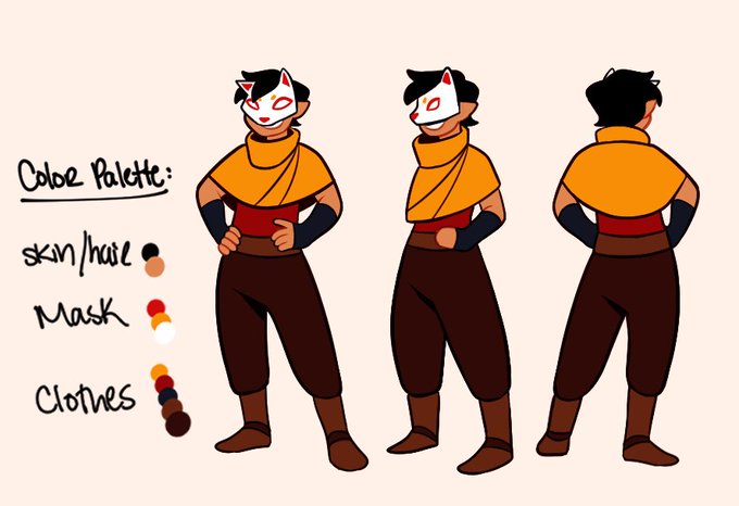
If a characters colors contrast the settings a lot. I draw attention to it. That’s why the bounce lighting on Snags here is blue. It makes the character stick out and draws attention to them


time to repost my venom draws from 2018 >:) contrast corrected bc my old monitor was shit. my venom was more comic series based


✨WIP✨
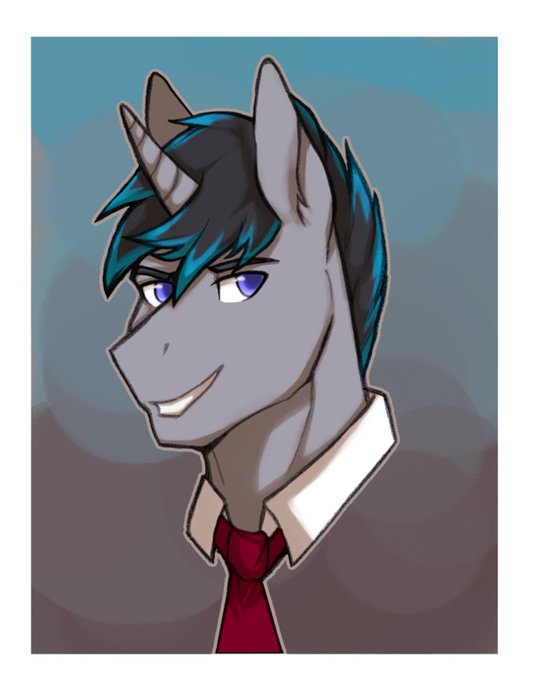
🤔 I think I will make a bit more orange/yellow the background, this would add more contrast in the colors between the Bk and the character.
#Hearthston #UnitedinStormwind
#Warcraft #Fanart #commissionsopen #TCG #TTRPG #worldofwarcraft #ArtistOnTwitter


Take your players on a journey through a city of contrast, one side elite ruling class the other sprawling slums, in its center is a grand plaza of statues. This was a big map to make.
#dnd #dnd5e #dungeonsanddragons #rpg #ttrpg #roll20 #pathfinderrpg #darksouls #gothic #maps


Dappled Coast
by Erin Hanson, 2021
11 x 14 in
The view from the tip of Monterey's peninsula is best experienced at sunset. The rich turquoise and violet shadows contrast with the warm hues of the setting sun.
View Online: https://t.co/Fuz2izxjU9
#art #ErinHanson


Wille but he is like 22 and wears all blue cause I wanted this to contrast the previous drawing with Simon xp
#YoungRoyals


@SaurinaCarme @montotomsol Excelente elección de obra con limones, en fuerte contraste con el rosa, gran sabor fauvista.
Comparto tu gusto por #Matisse, y añado a esta obra de su primera etapa en este día del limón.


Compare and contrast concept art to in-game graphics


One of the ideas of Le Monde Courrier is to play up the surprise effect with certain serifs in order to improve letter recognition, such as C and G. Nothing very scientific, just visual! Rounded low contrast fonts are pleasant to read on screen. https://t.co/qbaHESHjsZ



quietly obsessed by this Chris Bachalo panel - the contrast between the handdrawn flowers in the foreground and the photograph of roses in the frame in the background. magnificent


@kairolion I know it's kinda plain but I just LOVE red roses. The simplicity, the gorgeous, alluring color, contrasts so well with the green stem, I just really like it 💙 I'd say it kinda compliments my boy Jack? funny enough I've not gotten a rose in a pic with him hah


11) love the blue and red contrast honestly if u took out the mouse this would be higher


I’m just a fan of the contrast of Amethyst holding her tiny tiny babies in her big hands, ok? it’s cute

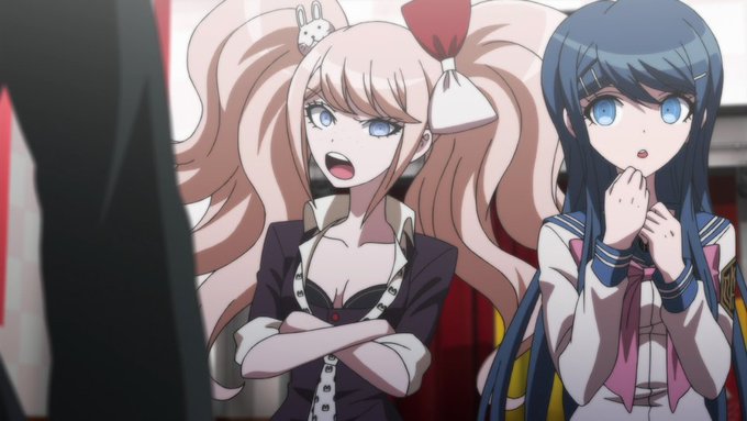

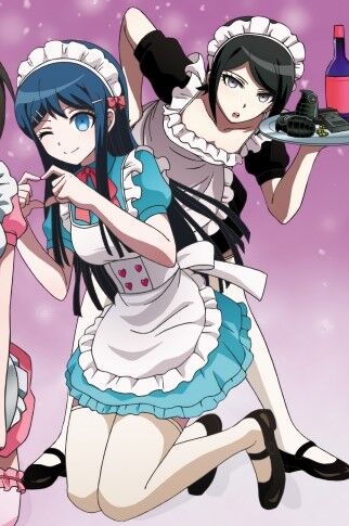

Tonight's color-contrast pairing is Mukuro/Sayaka (IkuZono) from Danganronpa! 🖤/💙
In TDP, Sayaka and Mukuro talk over tea. Mukuro asks if she had fallen for her (which she neither confirms nor denies). Sayaka then compliments Mukuro's slim figure and nice legs.

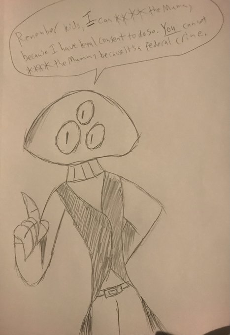
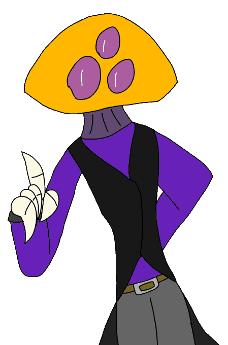
Had to wait 24 hours for for the glue I was using to fix one of my computer chair's legs cured
And during that wait I decided to do some traditional drawings of characters that were digital only, like Phoon, and then digitally trace the pencil drawing for a compare and contrast