GradientsのTwitterイラスト検索結果。 23ページ目

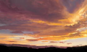
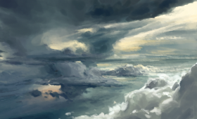
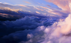
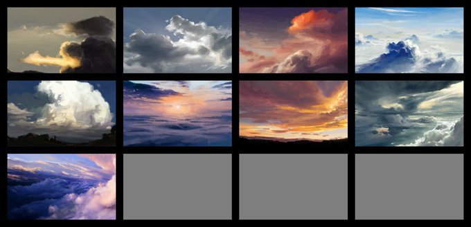
clouds are a painful exercise in form and subtle shifts in gradients
but also when i was driving today i looked up at the clouds and my head was already figuring out how to render them so i guess it's working 🌪️😩👍


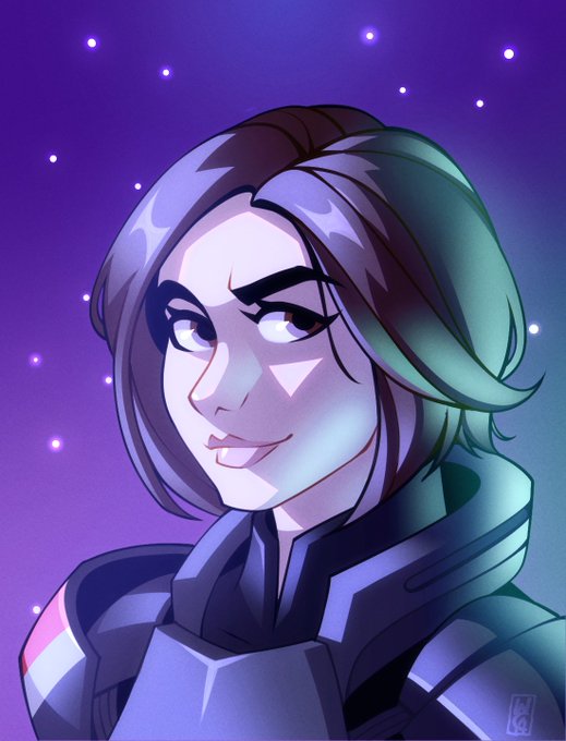
@sassi0406 Just over a years worth of difference! I've embraced gradients (after all this time) so the older entries into this roster will see some changes when we reach the end!


#MayTheFourthBeWithYou ✨As always, I need to have my #StarWars #MerMay mashup so here’s a Padme mermaid! I’ve always been in awe of this dress and thought the gradients would be perfect for a mermaid. 🧜🏻♀️ #PadmeAmidala #NataliePortman #Procreate

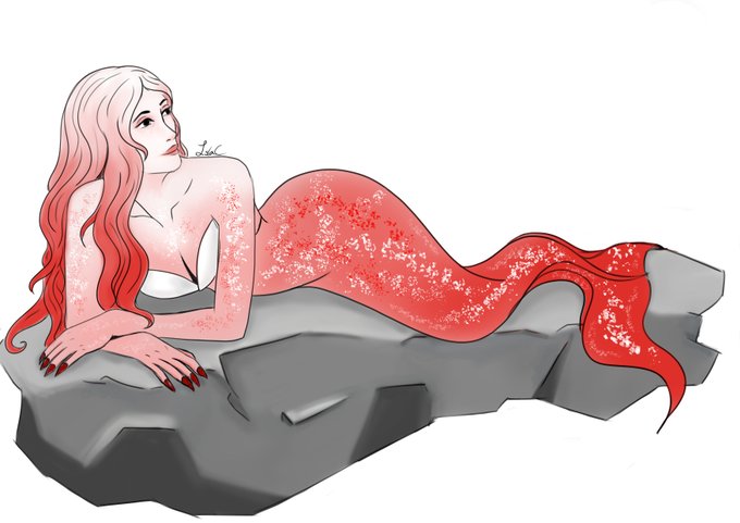
day 3 - I am learning I really like gradients for some reason #mermay #mermay2022


GM!
Today I try something new: learn to combine gradients and textures.
Have a nice day , fam!💖
#WIP #NFTCommunity #NFTfamily #FrogFam #PepeFam #NFTartist


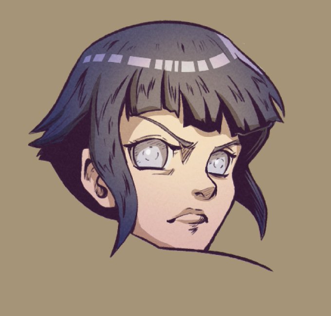
Improving with this new process/ style. Getting to where I’m happy with just lineart and flats. I want to have shading, lighting, gradients etc, be like a nice extra, but i dont want that to be what my art leans on. where i feel like i have to do it, for a piece to look finished.


The hair modeling and painting took an extra week. I was also beta testing @jfranmatheu UV paint tools in combination with UV Squares. I'm editing a quick video about it.
Why UV squares for the hair? - Gradients and procedural texturing are easier.


Compare these panels. Gradients and uninspired colors just blanding everything up.


Star Trek The Motion Picture poster logo. I reworked the rainbows as vector gradients.


I LEAVE FOR 10 DAYS AND RODNEY FUCKIGN UPLOADED????? anyways gay ppl (yes this in fuckign scratch bc gradients are silly)

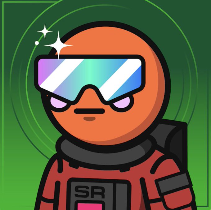


Maybe a second sneak peak? I was experimenting with different brushes for the skin colouring for this, kinda like it but I know it’ll ruin me (ah well 🤣)
SN: I loved how the gradients worked with this panel 🥹


~dtiys~
My entry for @/lemonbunee dtiys!! ( #lemonbunee )
The design is super adorable, and Congratulations on 700 (now 900) !!
I love the gradients in the hair and clothes. It makes the character look so interesting and fun! I loved drawing the big bows and frills. #dtiys #art


@AZSportsHistory @Suns This version is meant to be a less bold that the Barkley-era @Suns version but I think somewhere in between might look sharp. Over time, the gradients have been removed from the logo... a bit underwhelming but reflective of the less work the better @NBACreative mantra.


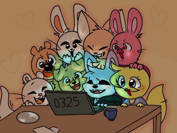
@ortamaw how dare this thread call me out with the solid colors and gradients /lh


Icon YCH Commissions
Only $5 Each! Or two for $9
There’s a number of different species so feel free to ask! (Also different options like hair, horns, tongues etc!)
Background can be changed to any colours/gradients you’d like!
(base by Weinerdogworks)
RTs appreciated 💖


@xeno_toast I do very minimal shading overall (mostly just what's required to make the art look less.. flimsy ig?)
But I like to use "blocky gradients" where I layer a lot of segments of cell shading to get a slight blending effect! It's most visible in the eyes I think


@xeno_toast Cel shading is something I enjoy, but I like using airbrush for little details and gradients.

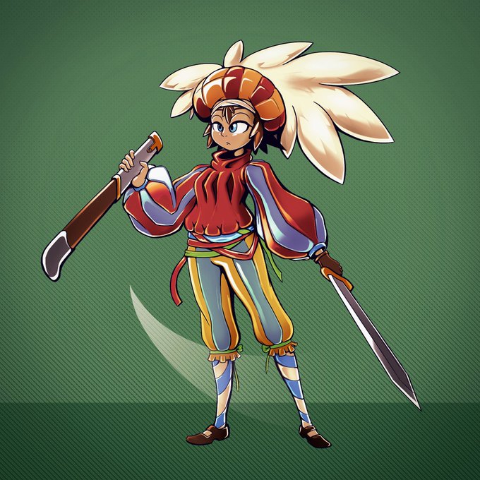

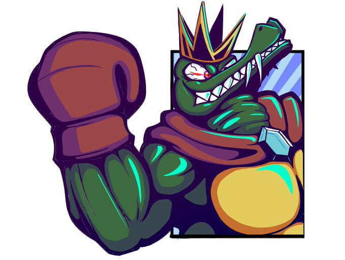
@xeno_toast I love big, blocky cells, but I'm starting to incorporate opacity gradients and gradient maps. I think I can get them to work in motion too.