FONTのTwitterイラスト検索結果。 228ページ目


1/ Us-Jordan Peele
Très bon film malgré les quelques inconsistances, original et bien mené. Les symboles/foreshadowing en font un film-puzzle qu'il faut voir plusieurs fois pour vraiment apprécier. Pas vraiment effrayant, mais la tension est palpable
Lupita est parfaite.
9/10


Busy busy busy. What do you think of the font?
#characterdesign #art #illustration #underthebed #drawing https://t.co/kPVm8Kwcpx


Quick update on the logo design ✍️ Made some Minor changes and step 3 was adding value and font. Last and final step will be detail/highlights/texture, basically polishing it up, the funnest part in my opinion, almost finished!! 😁👨🎨🤩
#logodesigns #progamerlogo #gaminglogo


Stanley won the poll, so Here's a full body of CH 3 "Stanley". I'm Really, Really Proud of how the pose turned out. also, I used the amazing "October Crow" Font by @ChadSavage. #Digitalart #art #Spooky #OC #Originalcharacter #Eye #TVhead


Here comes another character update!
Mikey's update wasn't as drastic as Ace's, this was more of a refinement.
Fixed his face, gave his hat a proper visor, new gloves, replaced the leg wraps with Baseball socks cuz New York and even changed the Team logo's font to be more


"If you wish to find the secrets of the universe, think in terms of energy, frequency, and vibration" - Nikola Tesla.
.
.
.
#handlettering #lettering #letters #graphic #font #type #typography #design #illustration #art #artwork #tyxca #typetopia #typegang


I slapped a few more colours on here, mostly for giggles and practice. With some abilities, and the corresponding HP% phrases. :3c PRIMAL YIZ IS SAD. dglkdg #FFXIV
Font (c) @_yukiflake Get it from their gumroad! It's great!


i need some suggestions guys, what kind font would you guys recommend? (not that good with fonts)


Lydian was created by designer and children’s book illustrator Warren Chappell in 1938, but didn’t really find its groove until after World War II when it was the font for Nancy Drew. https://t.co/h8RlRQUU8O


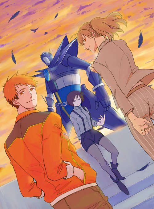
Illustration pour la 2ème série des cartes 9 plumes !
La campagne devrait être disponible dans quelques semaines ! En attendant vous pouvez vous inscrire pour être prévenu dès son lancement :') -> https://t.co/S9mxtfnHA7
Les RT font plaisir ! 🙏


I did not expect this kind of reaction, sooo happy that so many like him!! 💕
Also i was informed, by my partner, that i ruined his ref by using the most boring font ever.
So i fixed it, here is the new font!


Et tandis que sur ma TL les gens font des requins,
de mon coté je préfère le carlin. 🐶


3 Smash Girls ❤️
C'est la première fois que je teste cette colo, bah j'en suis super satisfaite.
Comme d'hab', les avis/ RT font plaisir ~💫
( c'est bon après ça je vous promet vous les verrez plus dans votre fil sorry )


J'ai hésité à y poster mais du coup j'ai fais ça, les interactions entre mes deux OCs me font trop délirer dommage que ça puisse pas être canon-


Hahaha😂 Gotcha two years in a row, supposedly. What do you think of my new eyes? I saw other #webcomics doing it so I thought, "Hey, why not?" And, what do you think of my new font?
#aprilfools #aprilfoolsday #comic #comics #comicstrip #eyeamthefool #littleanimatedme #webcomic

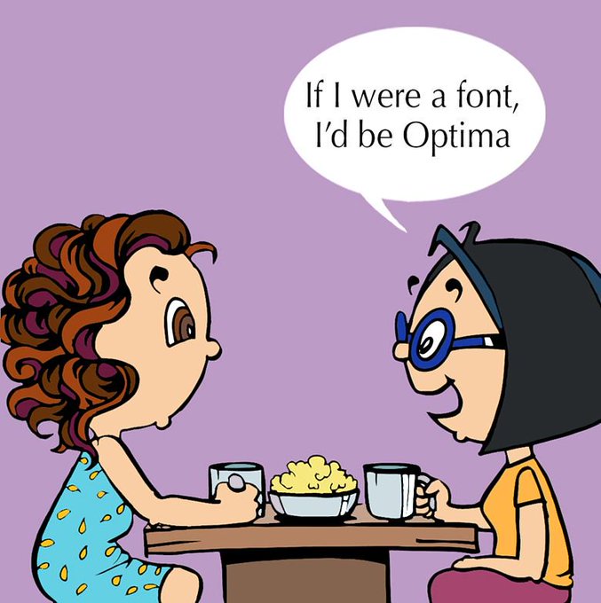


Two Girls Talking Episode 42: Font Identity
#fonts #font #fontidentity #artisticfont #GraphicDesigner #comic #comics #comicstrip #webcomics #funnycomics #funnywebcomics #funny #humour #humor #comicartist #indiecomics #sliceoflife #comedy #webcomicseries #funnycomics #artcomics


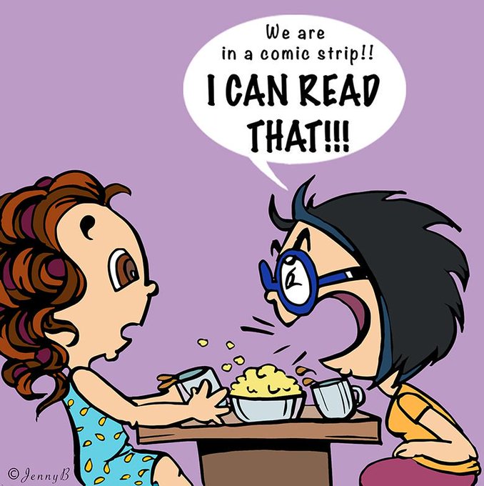

Two Girls Talking Episode 42: Font Identity
#fonts #font #fontidentity #artisticfont #GraphicDesigner #comic #comics #comicstrip #webcomics #funnycomics #funnywebcomics #funny #humour #humor #comicartist #indiecomics #sliceoflife #comedy #webcomicseries #funnycomics #artcomics

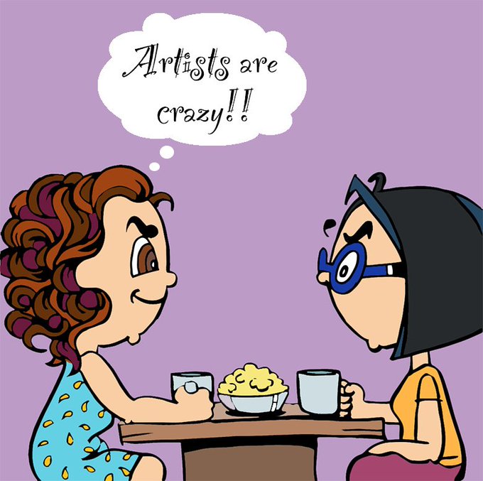


Two Girls Talking Episode 42: Font Identity
#fonts #font #fontidentity #artisticfont #GraphicDesigner #comic #comics #comicstrip #webcomics #funnycomics #funnywebcomics #funny #humour #humor #comicartist #indiecomics #sliceoflife #comedy #webcomicseries #funnycomics #artcomics