INTERのTwitterイラスト検索結果。 746,847 件中 252ページ目


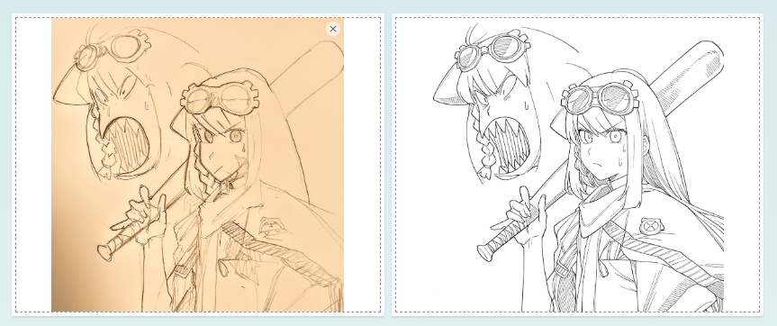
最近、copainterというAIのやつのペン入れにハマってるんだけど
良い意味で「嘘でしょ!?(左のシャーペン落書きスマホ直撮影から右の線画が出力されて驚いた顔)(ほぼ満点)」ってなってる


base used! (i've been searching for og post/artist but couldn't find it; only pinterest reposts, lmk if you find the original link!)


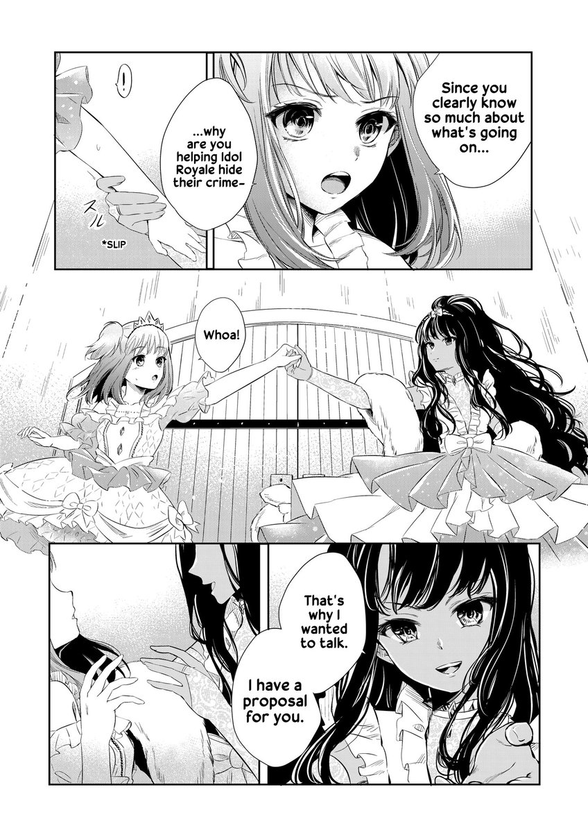
Also when printing in gray the printer might add a weird color tone that wasnt intended so the final printed product will look different than the digital version. Using tone helps to reduce that risk since only black ink is used.

The main reason is: reducing printing costs. A lot of printers only give options to print either in Color or Monochrome (black and white). If you paint with gray, you have to print it in color which is going to cost WAY more than just printing in monochrome.

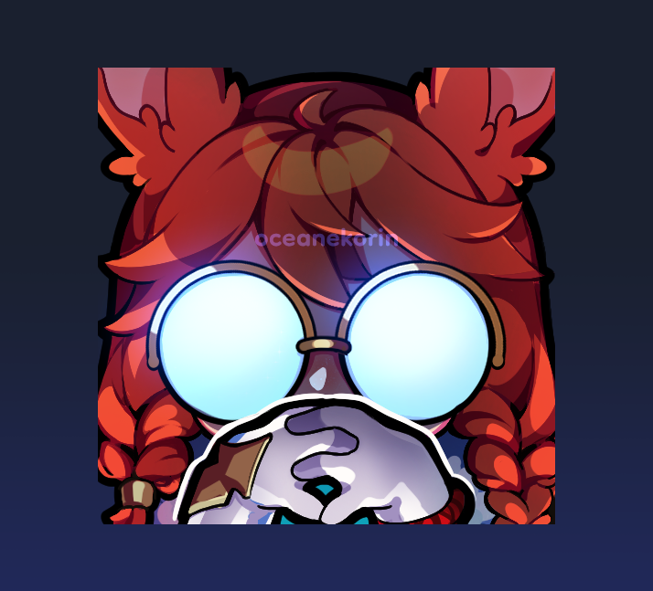
「✨ interest check ✨」
would you guys be interested in a gendo pose YCH emote? 🥺
drop your png if you want to be one of my test subjects! 👉👈


Malice-sama...
rogue intern... please save her... 💀



copainter凄すぎてどう対策していいか分からない🥲
①透かしあり元絵
②透かしの上から適当になぞる(手はフリー素材貼っただけ)
③AIで線画抽出(絵柄が少し変わるけど違和感少なめ)
④AIで適当に色指定して…完成しちゃったよ(なんなら元絵より上手い)どうしよう!!😱


I love her silhouette 🥹
(now silhouette checking is one of my favorite things because some of them turn out really interesting) https://t.co/pX5Y356CHW




@tori29umai とりにくさんのはとりにくさんので元絵の再現性が高いなと感じましたね。
一枚目がsketch2lineart、二枚目がCopainterですが頭のにんじんの形がほとんど崩れてないのがすごいと思いました。




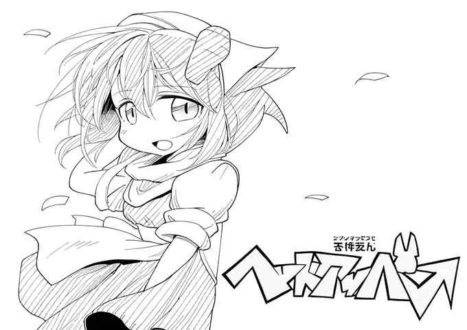
Copainter試してみた。
とりにくさんのsketch2lineartと比較して、
元絵に近いのがsketch2lineart、クオリティ上がるけど自分絵から離れるイメージがCopainterって感じ。
ペン入れの参考になりそう。