DifferencesのTwitterイラスト検索結果。 5,397 件中 253ページ目


More #wips that I may or may not finish??
These are some designs/height differences between Luther as a mortal and when he becomes the Devil. Including how he'd react to seeing his future self.


August 2018 #archivedart #nsfwmlp #catg2018
Size differences! This ended up being the last one before I realised I was the only one posting anything and stopped the event.


tbh keith being white all along doesn’t hold up bc these animators know how to draw racial differences. maybe in the beginning they didn’t put much thought into his reprisal but?? the boy is Asian lmao. why draw yt ppl like this


Forgot to crosspost this: differences between genetically modified humans (GMH) and bio-modders in Runaway to the Stars. https://t.co/XKnZZgEkhJ


I wanted to draw 3 appearances of Wei Ying. And after a long while, I managed to figure out the differences between Wei Ying and Mo Xuanyu LOL
#MoDaoZuShi #GrandmasterofDemonicCultivation #魔道祖师


More Manga colour differences? Okay. Now Jojo cooler schemes change from scene to scene so here are the Digital Manga colours for the first two protagonists: One is brown and black, much blander, the other is purple all round #jjba #jojo_anime #photoshop #STANDPOWER #anime #manga


Let's Go Camping (Title Card) [Coffee Love AU]
A small series I started back in July. There may be some style changes over time or minor differences in quality. Just relaxing and being bois c:
HD: https://t.co/AAjSXsaHnQ
Prisma © Me
Muffin © @sir_fluff_butts


One more; featuring @Henzypoots' #carno-sona and my #raptor sona. Despite their size differences, they're buddies!
#dinosaur #sketch #doodle #art


I don’t think there’s been much noticeable improvement/differences? Everything feels more or less the same to me lol


@GoMPodcast as Malak
@iAmCCNicholls as Juliana Blaze
@TheAtticus as Layne Laughlin @Sirenicide S3E15 "Trinity" - Morston’s best finally meet, but can they overcome their differences and come together? #podcasts #serialized 👼
https://t.co/v2DLP21J7P


.@BBCWomansHour I can’t believe I’ve just heard a woman suggest that women don’t do as well as men in sports as they don’t try as hard. Like there’s no physical differences at all. Oh really?


Oh yeah, I also made a second version of this guy, similar with some minor differences


New page of @halfmancomic is up. This week featuring historical, philosophical and ideological differences. https://t.co/xjgM9idraM #halfmancomic #comics #comicbookhour #indiecomics #webcomic #scificomics


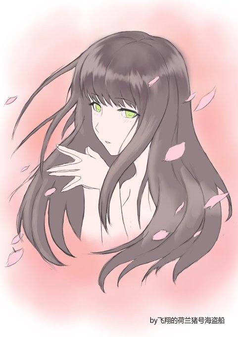
2018 vs 2005. Here's a redraw I did of an artwork I did 13 years ago. There's some differences between and I've changed the narrative. From goth lolita to a ghost.
#art #drawing #sketch #sketchbook #redraw #illustration #thedrawerkring

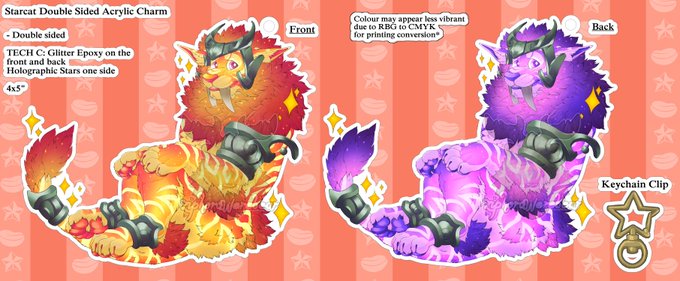

The layout for the starcat charms.
Due to RBG => CMYK there may be some colour differences.
- Double sided image
- Double sided Glitter Epoxy
- Single sided Holographic Stars
- Star keychain
- 4"x5" roughly or smaller


Here are the answers to the Holiday Edition of Spot the Differences! How many could you find?


So @BrianTwelve asked me to fix a thing. Go ahead and play spot the 7 differences!