compareのTwitterイラスト検索結果。 256ページ目


Kate🔥👩🏽
0.025 ETH
Kate is very attractive and sassy compared to her girlfriends. She speaks openly about her interests and defends her opinion. Kate not only attracts men with her beauty, but also with her character.🤭
#opensea #NFTCommunity #NFTFAM


@EwylanaR Thanks for the share!
I have a lot of examples dating all the way back to 2015 but I think I'll show you my stuff from 2020 and compare them to the stuff I do today.


IMPROVEMENT POST!
I always like to re-draw some of my old drawings to see if I have improved or not, so I can compare them against each other.
Time taken: 3 hours 39 minutes.
App: procreate
Device: Apple iPad Pro & Apple Pencil 2nd gen.
#art #ArtistOnTwitter #procreate #draw


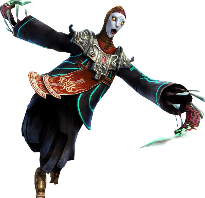


I just watched this and this girl compared pre-timeskip Lorenz to fucking ZANT from Twilight Princess. When I tell you I SCREAMED. I scrome. I was NOT prepared for that
https://t.co/FYAAifJHPh


@mippness This all actually started when i made my first oc ever, Courtney! But you would not know it if you compared her first drawing to her current design lol


@GoodForxYuux I’d have to politely disagree on that front. This turnaround in particular really illustrates how "weighed down" he is with all the downwards sloping lines/triangles. Compare to his "original" concept art where I'd argue he just looks like a generic guy


"obrigado por comparecer e volte sempre~"
@frorinha obg de verdade por essas arte maravilhosa 💙💙💙
Amei de coração


So reinfection by Covid-19 has increased chance of death, hospitalization, and *especially* Long Covid as compared to a first infection; and BA.1/2 breakthrough infections don't build any substantial additional immunity versus BA.4/5…
Not even the least bit surprised anymore 🤦♂️


Fisto never looked good as a real thing compared to his animated counterparts.
https://t.co/70WswQpLwM


I keep looking back at these old Deathadder/Garrison pics from the comic and cracking myself up at how much better they look now compared to That


Some of the graphical art differences throughout Club Penguin are more than shadows and icons, such as these two head items for example. Compare them in June 2006 to them in 2017.


@mikeyfan69420 more from starember+mxtx, in the book the "crescent moon people" are all described as barbaric and violent and they're all portrayed as stupid compared to the chinese characters. the jafar look+making them ugly unlike nonbrown monster characters is so shitty


i think it's poetic that Paul who wanted to be so different from Reggie did display some sort of traits from him when training Ash - Paul just did it in a subtle way compared to when Reggie was trying to teach Ash's staravia brave bird


Concept art of Silvally using its RKS System, used to show what parts of its body will change color. It also can be used as a size reference, being used to compare it to Gladion.
The art is in the Pokemon Ultra Sun and Ultra Moon Essentials concept Art Book


Hey! I made a little sketch to compare a headshot I made the last year to one recently done. Both with the same character ^^
I think i finally found his real body type 🔥


twice a year I draw fanart but also wow so 2015 art is what I need to compare myself to to feel better noted

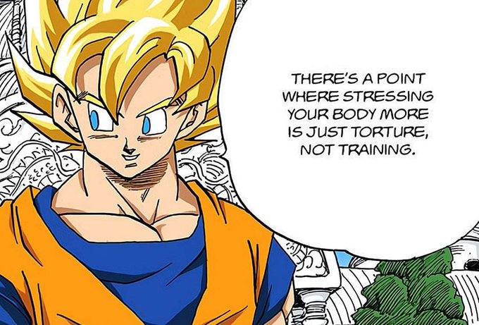
@SaiyanScholarGT Exactly. DBS anime Goku is a training clown compared to the manga version.


I love Princess Peach s' design from the lost levels guide, so I decided to draw one for today at work.
I love how different this era of Mario art looks like compared to today.


Like Natsuo is definitely built like Enji with is broader shoulders and it shows, especially when you compare him to Fuyumi, Dabi and Shoto, who all take after their mother's thinner, frame. Natsuo's probably not as ripped under his jacket as his old man tho lol xD