visuallyのTwitterイラスト検索結果。 3,495 件中 28ページ目
Every time I say I'm not gonna do more with him, I drop a more impressive piece. I think he's just my most visually impressive character.
To clarify, these are the characters visually
1. Gay Rat (🎨 @/vibapop)
2. Kevin (🎨 @/Jinx_doodle)
3. Nay Rat
4. Err0dent https://t.co/xoByjPl7Eu
🗺Regions of Geoda
Traverse the beautiful yet perilous biomes found across Geoda 🧭
#onisquest is designed to be more than just intricate game-design inspired by the indie greats, but also a visually stunning gaming experience through the enchanting artwork of @getaloadageo 🎨
Concepts for the Lost Cyber-Elf, “Elsie”—#MegaMan’s new enigmatic companion.
I’ve been trying to develop a unique shape language for ‘cyber’ effects since I want to make it my own and treat it like magic both visually and conceptually.
i wake up thinking about these two again, the most visually/theatricality stunning game, and the most literarily beautiful game. graphics does not matter if the presentation is good enough on its own, really.
visually, it incorporates early internet imagery, late 1990s web design, glitch art, anime, 3d-rendered objects, and cyberpunk tropes in its cover artwork and music videos. https://t.co/qlxnzu63ks
Hah I'm already working on the continuation of this comic
Have an angy Ni and a visually concerned Kevin
#JustMarianThings ?? featuring my favorite disaster noble girl, from episodes you've seen and one you haven't. She's definitely the most visually dynamic character in The Little Bird of Sherwood #lebird #webtooncanvas #Webtoon #robinhood https://t.co/1G7vdoLjPj
@nya_Deko These, the first two didn't take me as long as the third, a fraction even. But the time it spent to re-learn color theory and visually pleasing shape language made up for it. I really love all three
Somethin that may sound Blasphemous but I enjoy about DeathBattle Fights w/ DB characters is u FEEL How Powerful they are. Nowadays Many of the fights we KNOW theyre Trillions of times stronger than the past but PURELY VISUALLY they FEEL comparable to the 1st NamekFight w/ Frieza
otoya's SRs have been so pretty lately, like, it's no longer a png in front of a blank background, the subject and background has interaction w each other and it just makes it so visually pleasing 🥺❤️
Halo is a product of its time until people understand it's inspirations and where exactly they lie it will not "be back"
This goes both visually and game wise, most importantly it's original visuals are very much firmly set as something that was profoundly a product of its time https://t.co/gcnNJZ5IU2
@porgiexd this specific tweet was visually darker than any of the other tweets on my tl and i need to know what kind of dark energy did you summon to post this
Forgot to post this. I might color it. Maybe. This is Rokan with little Lola.
I know Rokan has a long braid, but I wanted to give them a different look to set them apart (visually).
#iceplanetbarbarians #rubydixon #fanart
Luffy Gear 5 is just too visually pleasing to me 😍
#luffygear5 #luffy #monkeydluffy #Onepiecefanart #ONEPIECE #illustration #digitaldrawing #FANART
@briettina @FreddieWompton No Uni was intentionally made to visually emulate Type Moon (oh and G-Yusuke in terms of Coloring)
Hell even facial preportion is meant visually emulate that style.
The first visually impaired character OTD is Luciel Choi (Seven) from Mystic Messenger! They are canonically visually impaired, highly implied to have ADHD and be bisexual and demisexual, headcanoned as autistic, nonbinary and using he/she/they/mew (canon he/him)
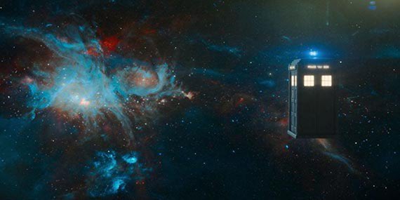
Doctor Who Flux has got to be one of the most visually pleasing seasons of doctor who
mimi and kiki :)
you can tell theyre related bc their icons are visually similar
this is something i did in all my icons of siblings, go look (and rt my stuff)
Past Majimas [2018 + 2019] Redraw looks more visually like the 2019 one, but I tried to pull a bit of color from the 2018 one!


