compareのTwitterイラスト検索結果。 286ページ目


How the model looks now compared to Yesterday !!!
i added shadows, color, Freckles and Skin impurities CUZ WE ALL HAVE SOME !!!
also one has a mask and the others have different beards.
i fucking love the outcome dude its my best model up untill now i think. #3dmodeling


OOOOOHHHHH YEEEEAAAAHH!!!! 🔥
Few compared to "Macho Man" Randy Savage 😁
Retro throwback to the Golden Age of WWF - full of attitude all the way 🙌🏾
#randysavage #wwfgoldenera #wwfattitude


height compare of my character and the main reason I started being nostalgic over 70s cartoon styles again.
People who remember this character get a virtual cookie.🍪
#WheelieandtheChopperBunch #hannabarbera


@Cyanzz2 yes it is blurry, so I'm guessing base on their silhouette
then compare them to SD version of the weapons


2022: Northern Ireland at 18% and Scotland at 19% have the lowest poverty figures in the UK, compared with 22% for England and 23% for Wales. Within England, there are huge variations: London has the highest poverty rate at 27%.
#josephrowntreefoundation #ToryCostOfLivingCrisis


I plan on opening commissions soon if anyone would like to be aware of that,, I also made a new Card too! So hopefully it’s a little more easy on the eyes compared to my last one 🍡
I’m reposting this bc he got sold so wooo! Please don’t copy my art, steal it, or heavy reference


Stream live, Juggernaut is finally over and was a disappointment compared to the previous works of Will, so let's go many years back and play their true masterpiece omnibus that Juggernaut was a pale shadow of https://t.co/bOHpEjDYui


*choking intensifies* ahem s so uh the first two pictures are my old art styles compared to my current ones. lmao
thangk god i improved, i was ass back then

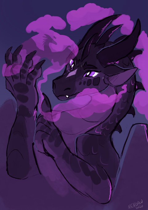


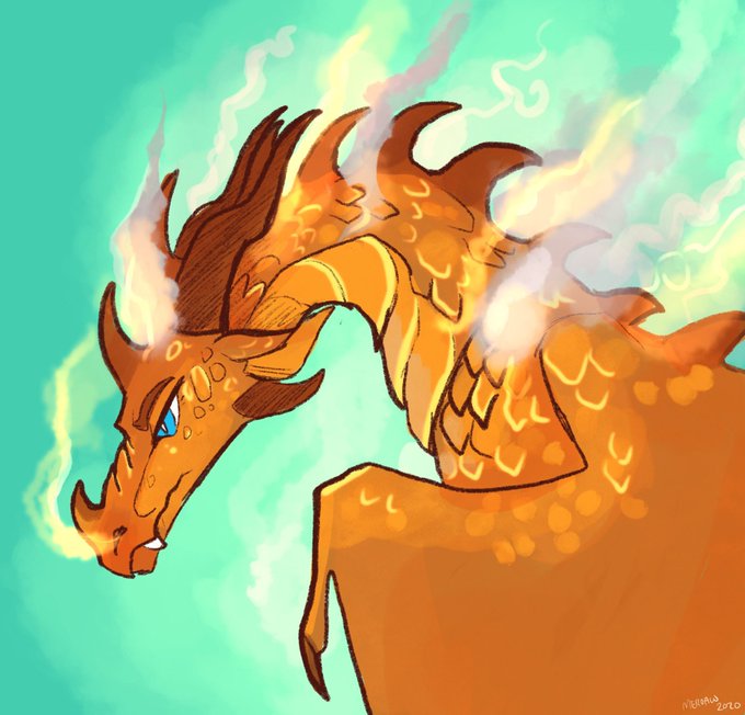
#SaveWingsofFire something about WOF that makes it stand out are the genders, there are a TON of extremely well written female protagonists compared to other books aimed at kids, esp for a series aimed at all kids

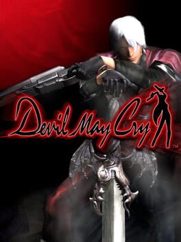
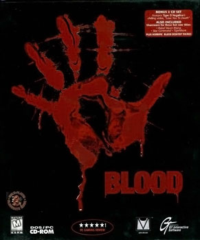

Games that have a killer visual aesthetic that I just can't shut the hell up about how great they look in an artistic point (I know the last one is out of place compared to the rest but it's my opinion so shhhhhh):

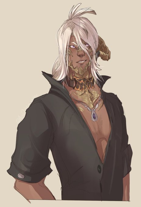
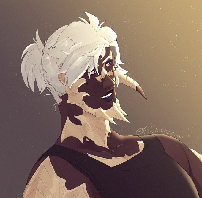
like good LORD my first Tori compared to the latest, I can feel the improvement


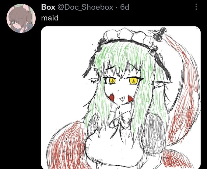


2 years ago Chimi's design used to be like this (left side)
Not much the difference but you can definitely see it if you compare it to today's design :DD (right side)
I should def make a good quality drawing of Chimi's design now
#MySona #MyOC #Digitalart #Design

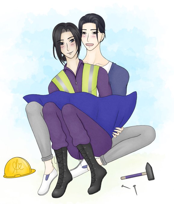
#Xichengclipse2022 Day 2: Rebuild
If you compare LXC‘s broken heart to a decayed building, JC is the architect, construction worker, electrician, plumber and interior designer to rebuild it - as well as it‘s new resident 🔨🏗

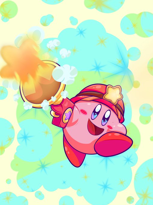


i was practicing some style mimicking and thought it'd be fun to compare it to my more "natural" style.


@Touyarokii This is skyla. These are her two references for height and colour compared to an adult!

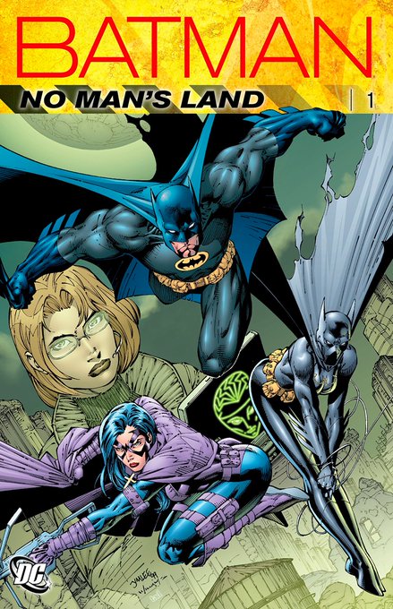

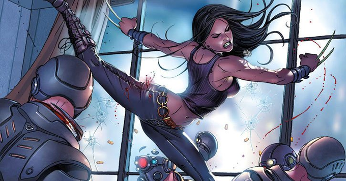
I think that's why modern comic artists have so much to learn from Watterson.
He understood that pen and ink and color were most powerful when they left room on the page for our imaginations to join in.
Compare this to modern styles of coloring ink: