typograpのTwitterイラスト検索結果。 293ページ目

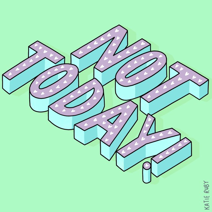
Some times a day in your PJs is exactly what the doctor ordered.
#nottoday #selfcare #selfcareisntselfish #lookafteryourself #pyjamaday #handlettering #handdrawn #notahobby #typography #funtype #funlettering

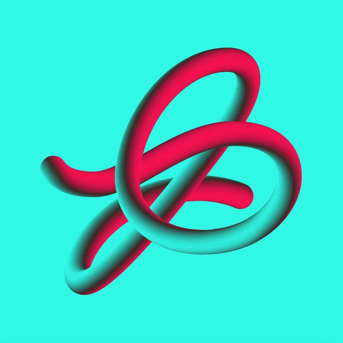


@juancarlospagan is our guest for today! This New York based Designer, Typographer, and Creative Director in 2018 received the Type Directors Club Ascenders Award!
Great to have him as part of this new edition of #36daysoftype!
.
#36daysoftype06 #36days_j #36days_guest

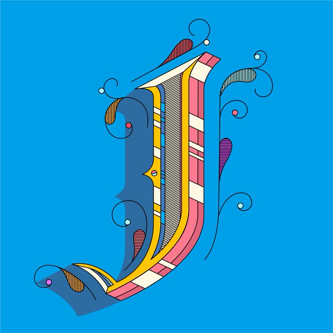


Every day we're hustlin. A little typographic eye candy + #wednesdaymotivation from Irvine-based artist/designer #Tyler Spangler. He was named OC Weekly's 2016 Best Visual Artist, and has a knockout client list ranging from Volcom to Chanel. Find his original designs on @society6


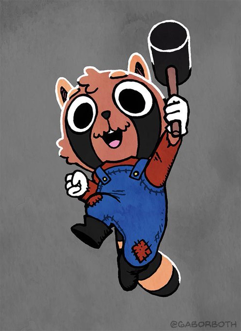
Oh my, it seems to be #PortfolioDay!
I'm Gábor, I do sketches and retro illustrations! I'm also a graphic design student, so expect more vector stuff, logos, and typography soon.
I'm available for logo design jobs, and art commissions both digital and traditional.


H for House
Design: @sahilsadigov Animation: @deym0ss
https://t.co/rjFHFX5Lnu …
#36days_h #36daysoftype #36daysoftype08 #typography @36daysoftype



Oh hey, it's #PortfolioDay! I'm Shauna Lynn, a hand lettering artist and illustrator in Chicago! I specialize in whimsical typography with a kid-friendly vibe.
Website: https://t.co/0hDMNnrb6a
Etsy: https://t.co/jBeP7ozmfs
Email: shauna@shaunalynn.com


Day 8 of #36daysoftype 🤩
H is for Hemispheres! 🔵🔴
#36days_H #36daysoftype06 #typography #animatedtype #motiondesign #motiongraphics #animation #motion #mograph #aftereffects #GraphicDesigner @36daysoftype


Setting the scene with another H-optical illusion for@36daysoftype. Using a limited colour palette is challenging yet so inspiring!
#h #36days_h #daysof_g #36days_adobe #36daysoftype #36daysoftype06 #typography #type #lettering #graphicdesign #brandingagency #bristol #ORCA


✏️ #WorkLifeBalance https://t.co/Phyn6pCGke by Samadara Ginige (@SamadaraG). #Lettering #Typography #GraphicDesign


Check out some dope design and illustration for #36DaysofType (and submit your own). Get inspired by featured design including "F" by Marcos Abdallah and more: https://t.co/kP1aSLiKcJ.
#Ello #TheCreatorsNetwork #36DaysofType #design #illustration #typography #challenge


Behind the scene. #D by Stephane Lopes
For the @36daysoftype challenge, Stephane Lopes has decided to make the leap from lettering to type design with Fontself ! #fontself #36daysoftype #type #typedesign #customtype #typography #handtype #lettering #calligraphy #customlettering


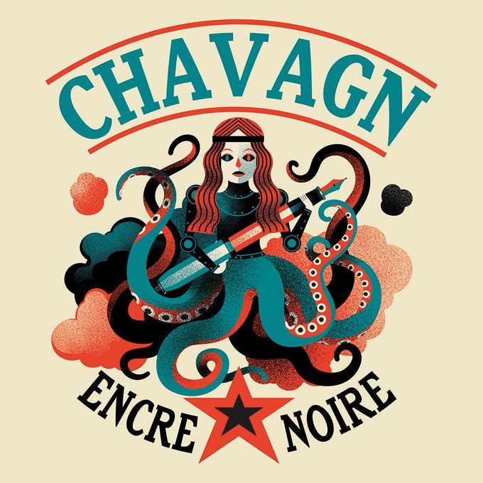
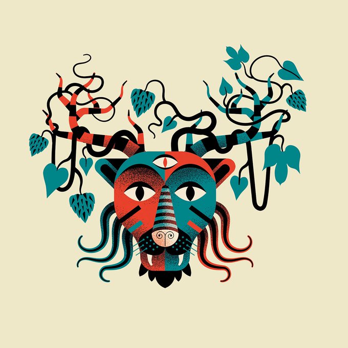

Chavagn Beer Labels — https://t.co/MTGcTHq3su / #beer #illustration #typography


Day 5: E 🐘
#36days_e #36daysoftype + #100daysproject
✨Combining Animal 🐱 themed Typography
#36daysoftype06 #ArtistOnTwitter #artoftheday #the100daysofcreatures #AnimalKingdom @NatGeo #typography #36days_Adobe @36daysoftype #FridayThoughts #animals
👉🏻https://t.co/KbGg8ZSFmB


New artwork for sale! - "Coffee Poster - Coffee Quotes - Tea and Coffee Quotes - Cafe Poster - Quote Poster - Typography" - https://t.co/rUaffTASHu @fineartamerica

No f's given, feeling fabulously fine on this funday with @36daysoftype.
#f #36days_f #daysof_f #36days_adobe #36daysoftype #36daysoftype06 #typography #type #lettering #graphicdesign #brandingagency #bristolcreatives #bristol #ORCA