CONTRASTのTwitterイラスト検索結果。 295ページ目


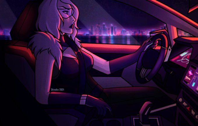

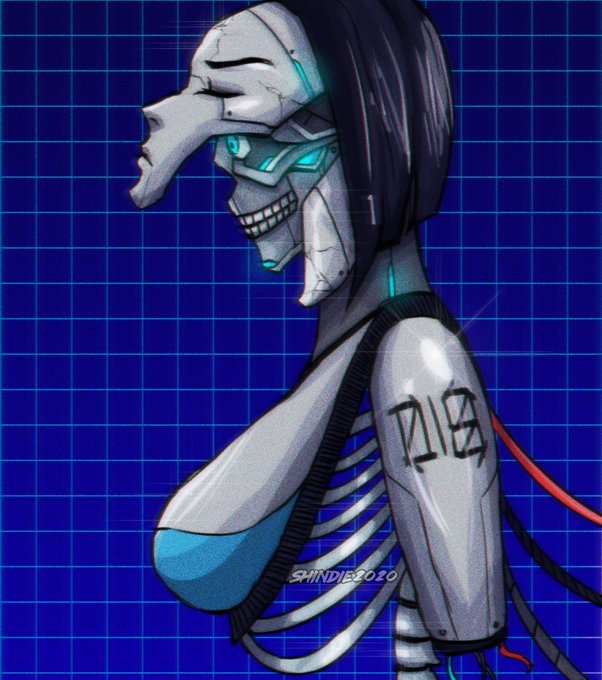

Hi #VisibleWomen! I'm 20-something-years-old Shin and I love synthwave and cyberpunk themes! Contrasting neon and dark colors are my favorites to work with and I'm working on refining my characters/universe lore :']

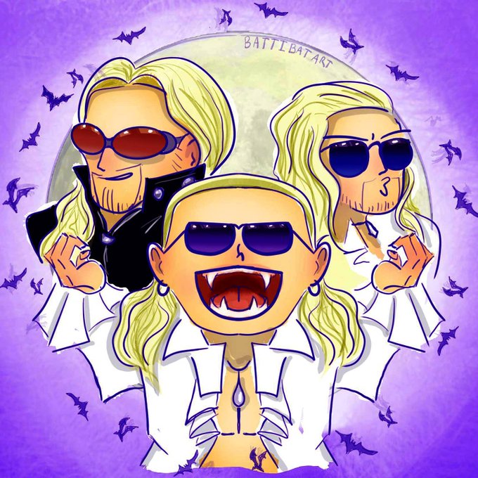
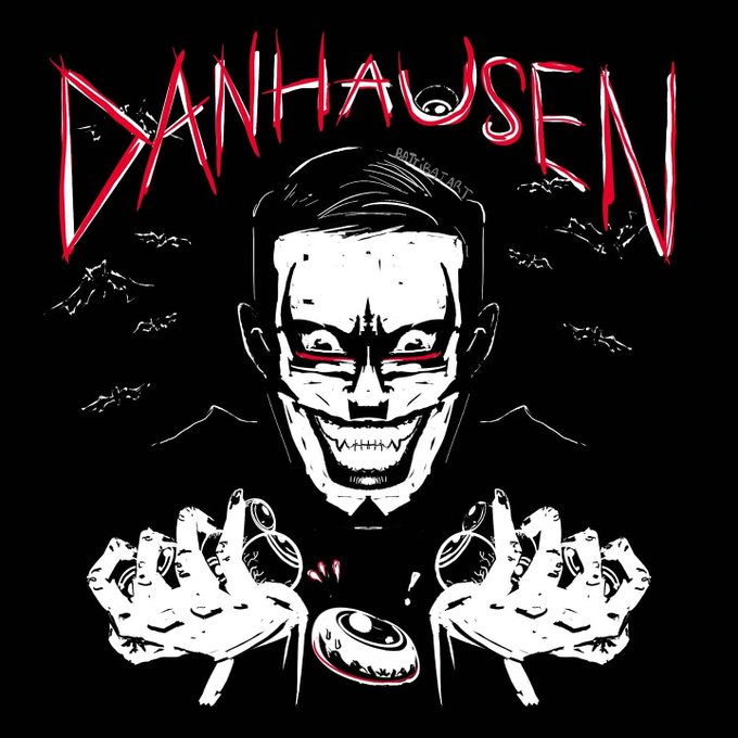

@Nolanium I like to play with lots of different styles, but I love bold colors and contrast and ridiculousness!
If anyone wants to hire, I do have experience designing merch :)


✨ Introducing "Stay Golden" by @cultbitz
Inspired by graffiti and using intense colors and contrasts, this line art is the classic style of #cultbiz! See this newly released artwork now and place your bids here! 👇👇
https://t.co/eLyBALR1MB
#NFT #CryptoArt


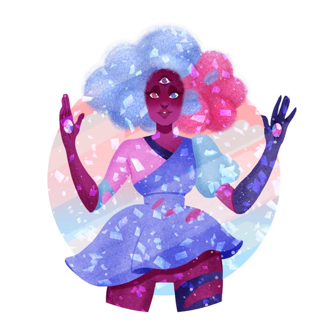

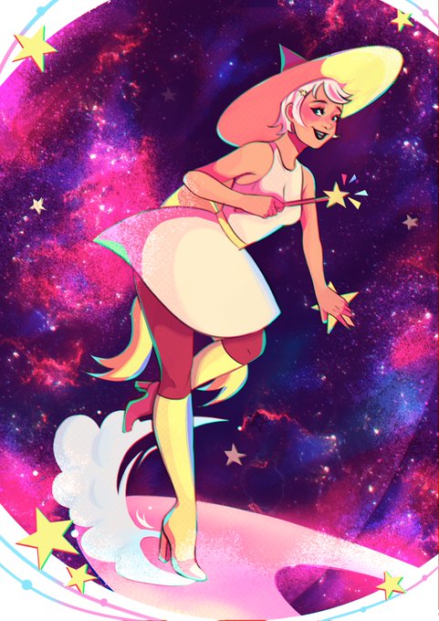
Hi #VisibleWomen ! I'm Jess, a background artist working in animation. I love bright contrasting colours and texture! 💘✨

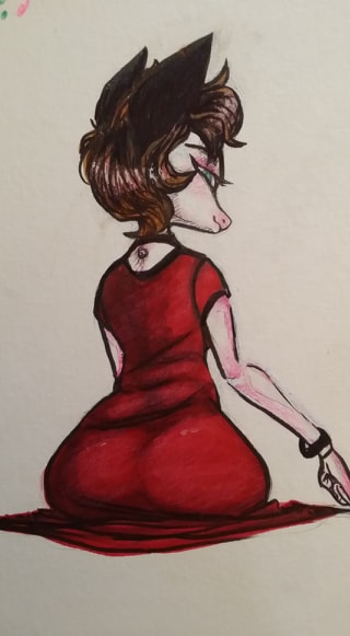
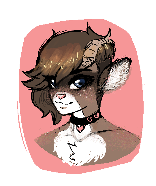
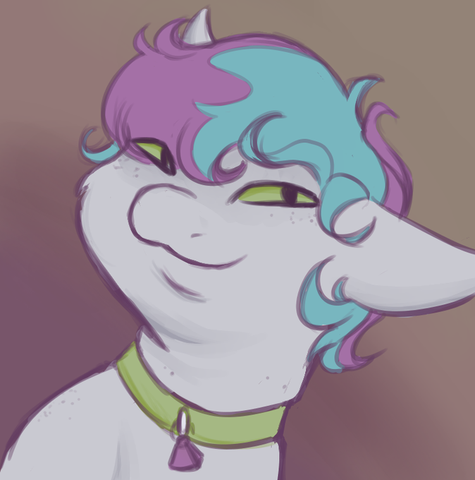

@SemmyJart @SAGAUart In contrast, my partner @SaboKittyKat has been at this longer and harder at drawing than I have. Their are is more cute, aesthetically pleasing and they've got a better handle on color. I'm trying to help them get some more attention to their work.


Second updated portrait. A bit less extreme in the overpaint, mainly a few more shades to smooth it out and up the contrast, but also redrawing the horns a bunch.
#Doom #DoomEternal #DoomHunter #demon #Cyborg #Cyberpunk #Cyberpunk2077 #Pixelart #ドット絵 #pixelartist #gamedev

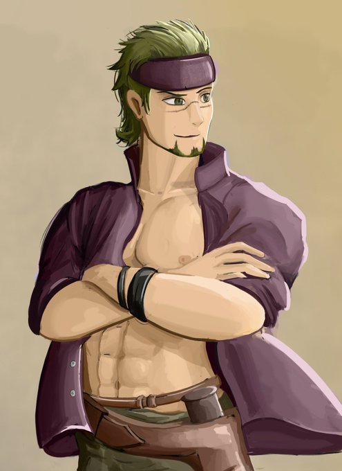
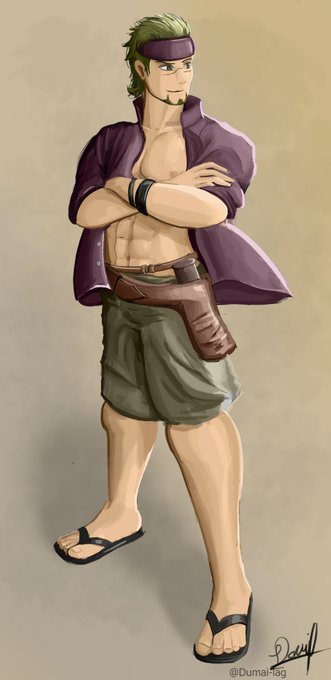
A concept of Summer Gerik
I tried defining a bit more the style with contrast and I enjoyed a lot, I hope you enjoy it too!
#FireEmblemHeroes #FireEmblem


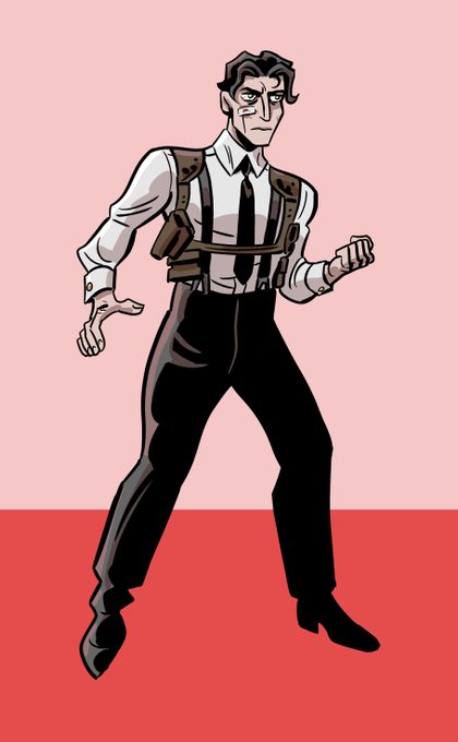
🕸️🩸 STILL MORE SPIDER 🩸🕸️
This time we look a younger Spider who hasn't gone all Tobe Hooper yet -- plus the Tobe Hooper version for contrast 🕷️


lmao I just noticed the contrast between my avatar and my smol hahahaha
#Vtuber #digitalart


I'm trying something different on this one with highlights and shadows that are a contrasting colour. I'm really liking the results so far! #cartoonart #rubberhosestyle #illustrator


@Lavender_Draws no problem! I higher the contrast and saturation so it might not correspond your exact design, here's the original one!


I really like having at least two characters of a race because it helps me contrast them to each other and expand on the uniqueness of each individual character's design.
You can see here that i really went for the upturned slanted eyes with AnKidah which she has in some pieces.

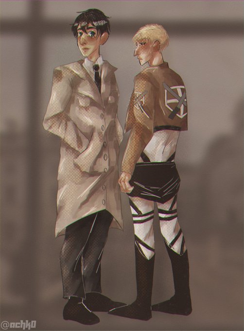
Day 3. warriors/soldiers
#ReiBertWeek
Contrasts
#snk #aot #attackontitan #shingekinokyojin #aotfanart #shingekinokyojinfanart #bertholdthoover #reinerbraun #reibert


Experimenting with adding backgrounds to increase contrast. Watercolour pencils - I really need to work on the technique. Not great yet but it’s good to try new things...

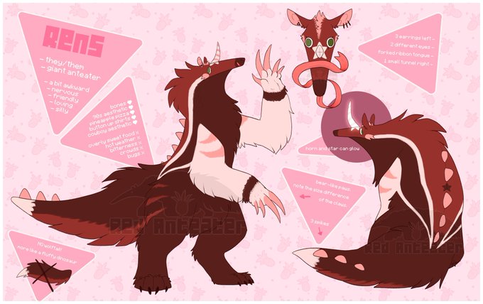
@heresvix Ooh 👀
Here's my very pink sona lol. Would be a fun contrast haha


Trying to achieve better contrast and definition, and give a bit more attention to foliage
is good to redraw old stuff once in a while 🌿
#pixelart #gamedev #indiegame #indiedev


World of Warcraft deserves so much better than it gets in terms of graphics. The art team does stunning work with new zones but the contrast between new and old is increasingly jarring.