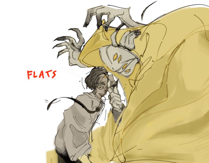
opacityのTwitterイラスト検索結果。 1,337 件中 4ページ目


จะว่ายังไงดี นุเน้นเติมแสงเรื่อยๆแล้วปรับopacityเอา😂😂 ตรงไหนยังว่างๆก็แต้มๆเข้าไปเลยย แต่ช่วงนี้นอกจากลงสีตาแล้วก็เริ่มลองแต่งขนตาเพิ่มดูด้วยล่ะ✨ https://t.co/hMqa8thB8f


ขอแชร์เทคนิคทำเสื้อขุยๆฉบับเราค่ะ ตอนแรกก็ลงสีพื้น ลงลายลงแสงเงาให้เรียบร้อยก่อน เสร็จแล้วเปิดเลเยอร์ใหม่ใช้บรัชแนวละอองมาปาดทับ ปรับ opacity ตามสมควรเป็นอันเสร็จ ถ้าเสื้อเป็นสีอ่อนเราจะใช้ขุยที่เข้ม ถ้าเสื้อเข้มเราจะใช้ขุยสีอ่อนคับ https://t.co/TcYUKiuJHF


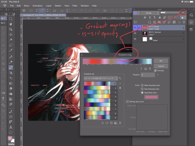

เวลารู้สึกว่างานมืดไปหรืออยากให้มีสีแทรกเลื่อมๆ ให้ลองใช้เลเยอร์ Divide + Gradient map ค่ะ
* ควรรวมเลเยอร์ก่อน
* ปรับ Opacity ต่ำๆ ไม่งั้นมันจะขาวจั๊วะทั้งงาน https://t.co/oVrVoq8Ihd


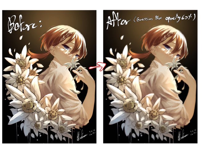
ถ้าอยากให้งานออกมาดูนุ่มขึ้นให้Copyภาพรวมของงานไว้1ชั้น>Gaussian Blur>ลดOpacity ถ้าใช้แอร์บรัชร่วมจะช่วยในเรื่องการผลักระยะของภาพได้ด้วย https://t.co/EjAu6XcLtK


ถ้ารู้สึกว่าสีหม่นไปให้เซฟรูป → gradient map → overlay (ลด opacity) → เย้ะ https://t.co/pIKB4G09bu


❌: putting "WIP" on every WIP I post
✅: putting Rui's face in low opacity on every WIP I post


@TNNIPub You should see the final image (had to fix the opacity on one layer)


Okay which is better I am going insane one has a 15% opacity layer and its a small difference but I can't decide


flat vs gradient map on top of flat colouring with opacity down: https://t.co/LKX9HdO9Mo


A NEW FAV BRUSH
its rectangle and perfect for rendering when put to low opacity>:3


@Vesperis_Art 2. If the colors do not look good together, choose one color that in lines with your picture (I use red for this one) over your coloring layer & lower the opacity to your liking as well, this will blend your colors more.
The left does not have the color. Right does.

@Vesperis_Art I have two actually!
1. If you think your picture is a bit flat, overlay texture on top & lower the opacity to your liking. (Personally I use textures like watercolor, or old paper.)
left has texture. Right does not have texture.


@TAGASAING YEA so i start w drawing pretty desaturated, then i slap on a vivid light layer (random opacity depending on how i feel) and then a tone curve layer!!!! i set them up like this


Let me note this here bc it got me thinking
The way I apply shadow to a flat color drawing is
picking a dark greyish purple, applying it with a solid brush on an overlay layer (layer opacity adjusted as necessary)
Now the gradient, I've done two ways, which do you prefer?


Here are some samples (more on site) and a closer look at the difference between the two styles. Same brush, just slightly different in opacity/stabilization. Type 2 will be more loose by default. I’ll be taking/looking at inquiries, but will not start any sketches until February


@nemkero Ok I’m bad at explaining so I added images but basically what it does it makes all the colors blend togheter in a gradient so they fit togheter nicely and what I often do is do this on a separate layer and change the blending mode to lighten and 40% opacity and boom nice colors