comparison,のTwitterイラスト検索結果。 31ページ目


& for comparison, here are their original designs from ~2015! I don’t think they were terrible but I rly wanted to freshen ‘em up (esp Nefanex whos outfit made no sense given the time period....)


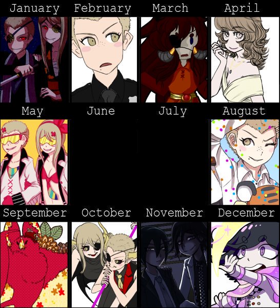

and the previous four years for comparison, as usual!! i'm getting back to drawing more often, and i'm really happy with that. i hope next year i'll have a picture for every month again.


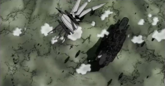


Xiao splash comparison, 1.3 (left) vs CBT (right)
#GenshinImpact #원신 #原神


I don’t care. This is hot. I think it’s the comparison, which makes their strengths shine more.




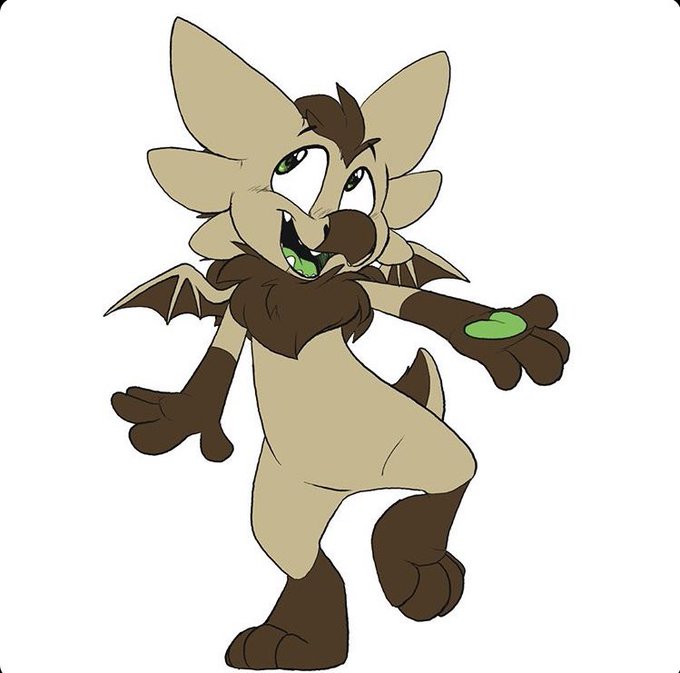
@TheRealSeafoxy Ask my sister. She picked Oakley’s earthy-and-bright-green color palette, I just softened her colors so she appears more friendly. She allegedly didn’t have a purpose for this design choice, huh.
here’s a comparison, original concept (my sister drew) and where she is today!


for comparison, here were her old looks. these have been the same basically since i made each one. time to update!


#半妖の夜叉姫
I was trying to make a height comparison, but it ended up looking like a family photo you hung up at livingroom 😭🤣
all arts owned by https://t.co/8OHEIg3tEl


someone already probably made the comparison, but Ina really reminds me of Mulbruk from La-Mulana.


Size comparison, no i have no idea if they are in scale, thats not really the point of the project, but both the diameter of the Y-Wing Engines and the Tie Fighter Pod are 40mm in diameter


Now talking about the characters! From the four protagonist, the Thief/Ninja is the one I understood the less. Sometimes he was hitting so hard, the Warrior got relayed to the rank of support in comparison, but the problem is that he was very fragile. I loved his sprite though.

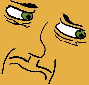


For a slightly more direct comparison, here's some of my first digital art from around that time too


Not much of a comparison, but the left is just this past month and the right is from back in May. Still, progress! If only a little bit.


