CONTRASTのTwitterイラスト検索結果。 306ページ目


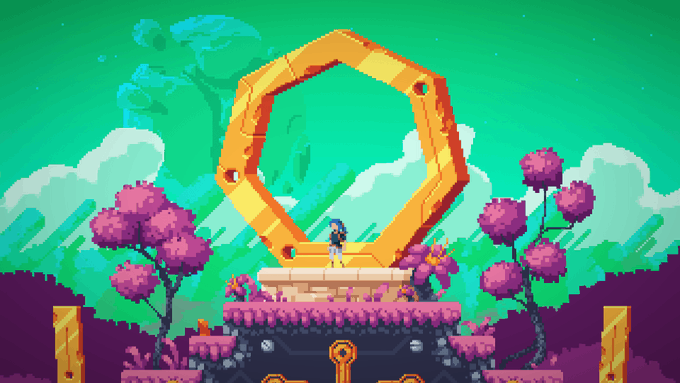


#ArtsOfVibrancy #artofvibrancy 🖤🖤🖤🖤🖤🖤🖤🖤🖤contrast of color and melancholy 🖤🖤🖤🖤🖤🖤🖤🖤🖤🖤


The SA is disadvantaged on all fronts, except for culture: contrasting wit the Citadel power's fairly stoic/rigid portrayal, humanity is framed as uniquely diverse and vibrant, while often not taking itself /too/ seriously or too self-important the way the Citadel power does.


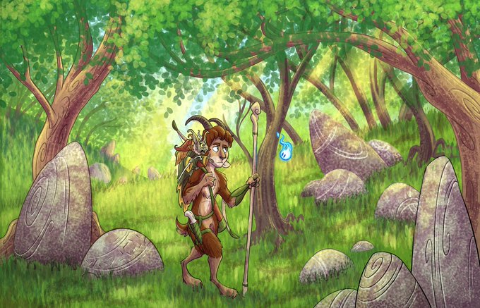
Night and Day.
In contrast to daytime, when night comes and the corrupting mist is near, the landscape begins to twist and become more menacing.
#illustration #fantasyart #artist #comicart


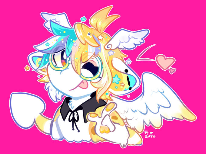

#ArtsofVibrancy oh shoot hi im bear and I love contrasting bright colors (especially pinks) with darks


Seismitoad taking care of the tiny tympoles
#seismitoad #pokemon #rune #runes #dotwork #art #artwork #artworks #blackandwhiteart #draw #drawing #cute #blackandwhite #PokemonGo #celtic #contrast #digitalart #design #fanart #pokemonfanart #dailyart #ArtOfTheDay #ArtistOnTwitter


#ArtsOfVibrancy #VIBRANTART I love using high contrast lighting. When light and colours vibrate against each other! 👌👌✨


✨Criaturas mitológicas-countryhumans
🐴Surcorea-Centáuride
Ama cuidar el bosque, y siente que fue una bendición que su pelaje sea de un tono contrastante a su piel
💟Puede tomar la forma de un humano normal
⚔️Sátiros, Duendes, Centauros de Unicornio
#CountryHumans


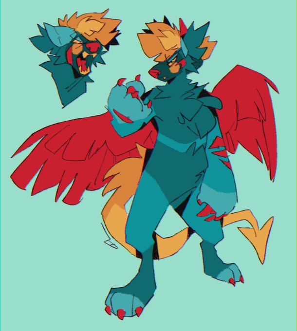


Heya #ArtsOfVibrancy I'm Liv and I enjoy making luminous art pieces in contrast to bold outlines and dark backgrounds in order to achieve a vibrant style. Images used are 2 I made as gifts for @AsexualError and @Honey__Dreams. Another is a commission I made for @Norse_marauder.


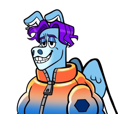
The contrast between faces in the world of dragons 😳🐉
#behindthescenes #NoWayBack


#ArtsOfVibrancy when it comes to red and pink, i love taking that contrast scale and going to 1000 lol

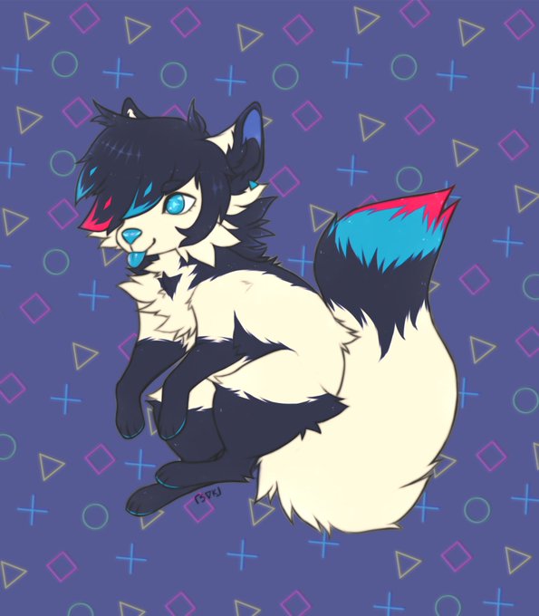


Colors with higher contrast is the best combination✨ #ArtistsOfVibrancy


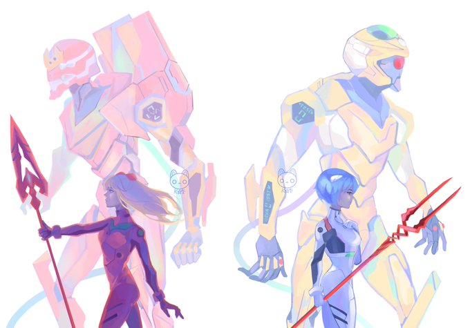

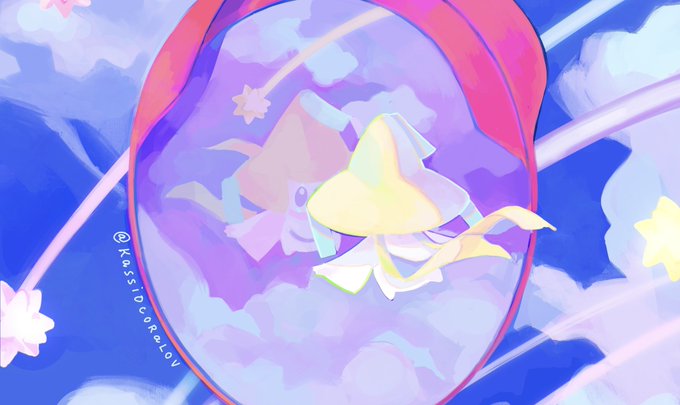
#ArtsOfVibrancy you called? Hello im kassio i live for high chroma and low contrast

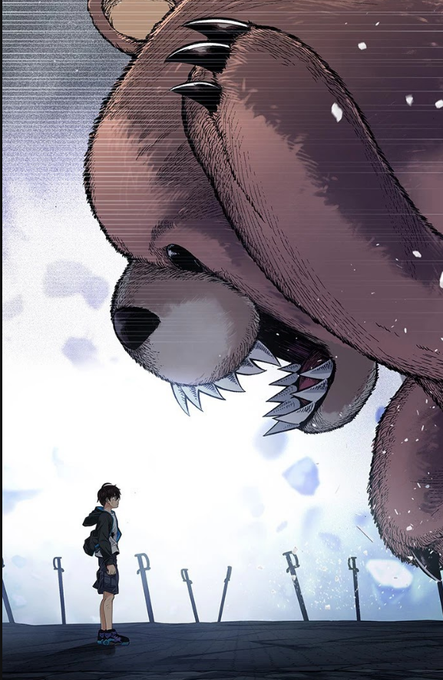


Hi!, I like to draw very colorful art with great contrasts.
I don't usually draw a lot of illustrations but I like to make an effort and do it with love
I hope you like it :D
#ArtsOfVibrancy https://t.co/e7e9FeucIX


@hikikoblue I dont like the contrast with the colors so I also don't with normal eyes ❤


09 not too thin or fat isn't it?i contrast he and Futa,looks like futa more thin than he...maybe because he dont like eat vegetable?