ContrastのTwitterイラスト検索結果。 10,507 件中 309ページ目


First try digital art with pen tablet
Left 2020✨ Right 2021✨
Apakah terlihat impruv?? 🤔
Yang lama keliatan warnanya masi contrast 🤣 https://t.co/spttWzl25X


#drawingwhileblack hihi, Psyche, trans lesbian, aspiring character designer and beginner Everything Else-er. I love women and high contrast art.
👑Art Acc: @laelingeuve
👑CA: $UvePsyche
👑Kofi: https://t.co/ukDnercRn2


An old impressionist style of painting to contrast the modern odyssey that is #Cherry @TomHolland1996 @Russo_Brothers @AGBOfilms @thehideawayent 🍒🍒🍒🍒

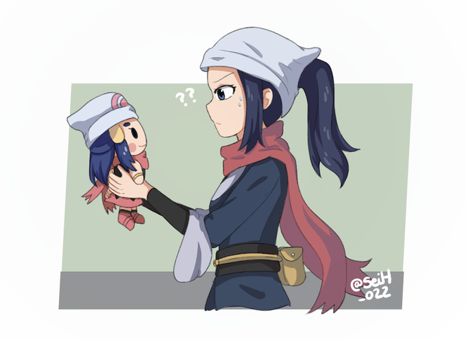
The contrast between them both is too much
#PokemonPresents #Pokemon25 #PokemonLegendsArceus #Pokemon


A tiny sleepy cubone as you wished for @inktron_
#cubone #pokemon #rune #runes #dotwork #art #artwork #artworks #dotwork #blackandwhiteart #draw #drawing #cute #blackandwhite #PokemonGo #celtic #contrast #digitalart #design #fanart #pokemonfanart #ArtistOnTwitter


the first color test i realized was very dull and flat. it also didnt highlight the two characters enough, so i increased contrast and added more detailed shading to eda and laurent


Some animalistic vibes between all the landscapes. Again playing with contrast of saturation, it’s very satisfying to pull back most of a painting and then create small islands of really intense colour. Painted in #Heavypaint.
#digitalart #digitalpainting #paintingpractice


compare and contrast the palettes here for the Rixile pantheon, because this is a literal before and after I actually started using resources:


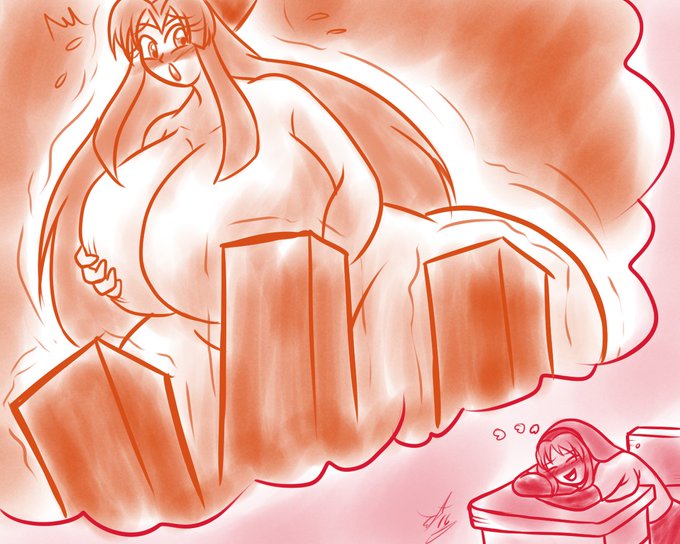
@HartenBrandi You are curious! And also are silly since it is very much Reality vs What I Know You Want
Also us having pics together makes it easier.
I Do think its a real funny contrast. Trying to get from Reality to The Dream
@ baytearte @ cri_twisted


all done~ was inspired by @rt0no 's gorgeous art for this one <3, really happy with the result, though I do realise I really need to start learning and improving contrast XD
#art #ArtistOnTwitter #OC


//Bright colors/heavy contrast.
-
-
-
-
-
-
-
-
-
Ever just draw something really chaotic when you should be sleeping? Yeah idk what this is, I was just messing around with brushes and colors and it turned out a bit scary hh


@UnknownPerson_g My Sylvie also sports black underwear because its a good contrast to her red scars and pale skin and compliments the black, lacy, goth-loli dresses she usually wears. Also, I like the contrast between the naughty panties and her modest clothing; it suits her personality.


Then you have the contrast with art like this, and the book is gonna be a really fun and wild ride.

To complete the trio here is Zygarde
#zygarde #pokemon #rune #runes #dotwork #art #artwork #artworks #dotwork #blackandwhiteart #draw #drawing #elegant #legendary #blackandwhite #PokemonGo #celtic #contrast #digitalart #design #fanart #pokemonfanart #ArtistOnTwitter


bonus flat color, I love adding color splotches in the flat color because they blend into the piece once it's finally all shaded and give nice contrast. #artistsontwitter


Beth Harmon follows my series of The Queen’s Gambit fanart as roe deer!
I like their reddish fur colour and also their wide placed eyes. Also she’s a great contrast to Borgov’s monolithic appearance.
#thequeensgambit #queensgambit


Just finished another illustration ✍🏻
Gotta love lights & shadows ✨
Something cozy, those dawning lights at the end of the day when night falls...
Used this drawing session to prep more footage for a next video too 📽
Almost week-end, hold on y’all 🙌🏻
#illustration #contrast