TypefaceのTwitterイラスト検索結果。 778 件中 32ページ目


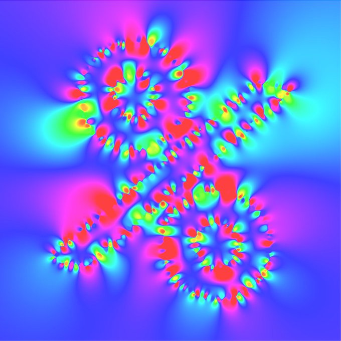
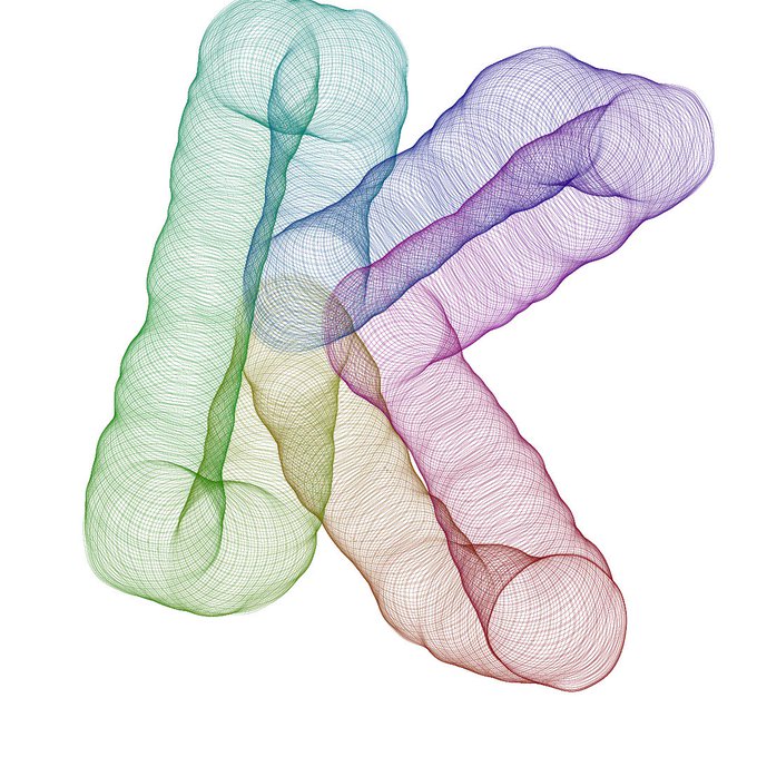
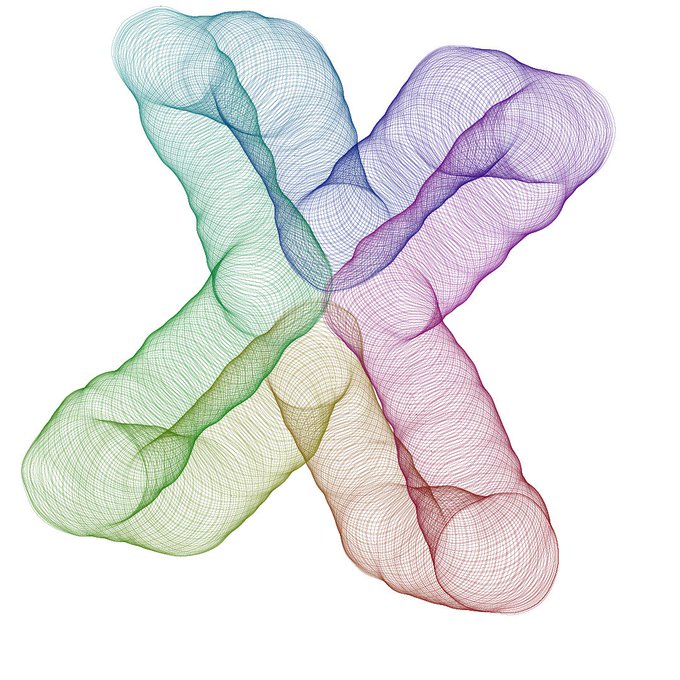
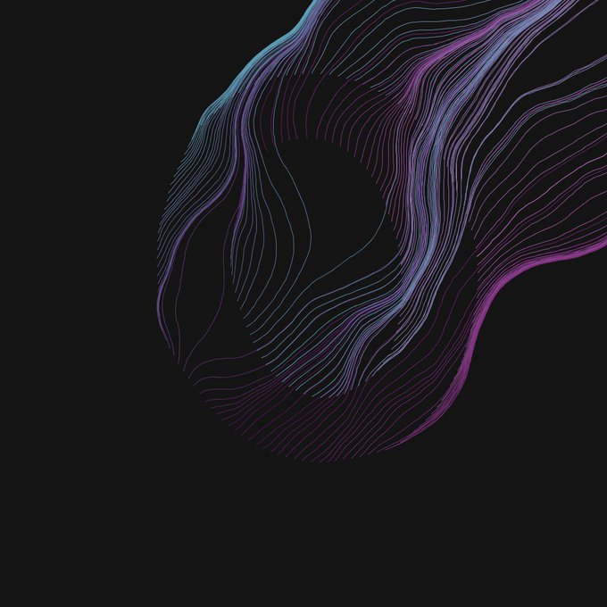
Mikado Typo - GeneTypo 052. Generative Design & Typography. A #generative #typography based on the #intersection of randomly rotated lines on #stroke. #design #genetypo #typeface #processing #proce55ing #creativecoding #maths #lines #mikado #transitional
https://t.co/hYmaqnRq8f


Mikado Typo - GeneTypo 052. Generative Design & Typography. A #generative #typography based on the #intersection of randomly rotated lines on #stroke. #design #genetypo #typeface #processing #proce55ing #creativecoding #maths #lines #mikado #transitional


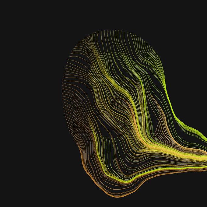
Scratchy Typo - GeneTypo 050. Generative Design & Typography. A #generative #typography using #Perlin #noise & #agents to simulate an scratchy #effect along character's #stroke. #design #genetypo #typeface #processing #proce55ing #creativecoding #typo
https://t.co/IwEsiT6Ybc

I'm bummed about Illustrator because I can't completely finish this until tomorrow morning (I can't use the typeface I chose, nor can I play with it as much as I'd like) buuuuuttt....I'm finally announcing the name of my big web comic! (I'll post the final version tomorrow bbs)


ToothPaste Typo - GeneTypo 048. Generative Design & Typography. A generative typography using iteration, translation & colour interpolation. #design #genetypo #generative #typography #typeface #color #interpolation #processing #proce55ing #creativecoding
https://t.co/ACK8qNHGtB

i did that other oc meme
I can hear my graphic profs shaking their heads at my typeface choice

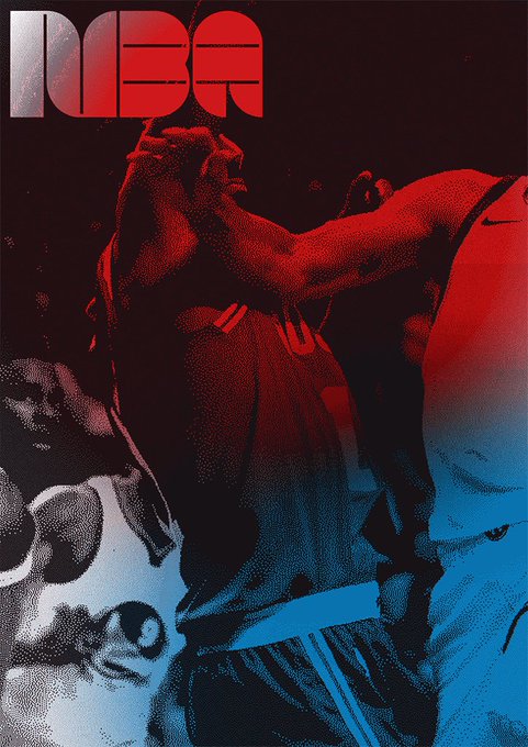
Retro looking typeface based on the form of a basketball for @espn magazine’s @NBA issue created by @twopointsnet. #ESPN #NBA #typography #Graphic #Graphics #GraphicDesign #GraphicDesigner #Retro #magazine #Basketball #font #basketballplayerl #GIF https://t.co/JGaG0BzgqY
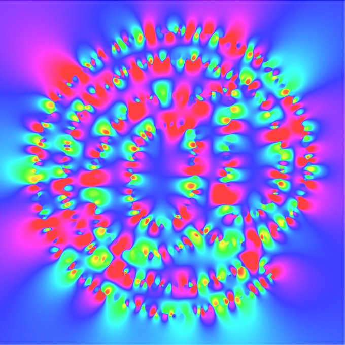
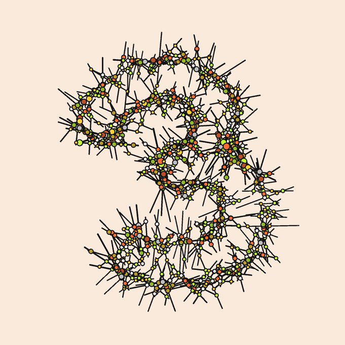
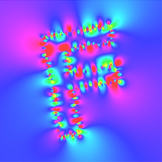
Inverse Distance Weighting Typo - GeneTypo 034. Generative Design & Typography. A #generative #typography using inverse distance weighting. #genetypo #typeface #processing #proce55ing #creativecoding #2d #HSB #algorithm #maths #inverse #distance #weighting
https://t.co/tolpcnFExe


Inverse Distance Weighting Typo - GeneTypo 034. Generative Design & Typography. A #generative #typography using inverse distance weighting. #genetypo #typeface #processing #proce55ing #creativecoding #2d #HSB #algorithm #maths #inverse #distance #weighting
https://t.co/tolpcnFExe

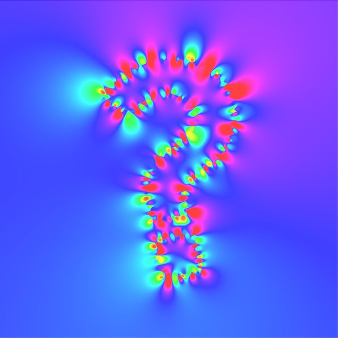
GeneTypo 29: Guts Typo. Generative Design & Typography. A #generative #typography using noise and tweening over the points of the letter stroke. #genetypo #typeface #processing #proce55ing #creativecoding #2d #noise #guts #algorithm #maths #tweening https://t.co/eUcEUeTyIe


GeneTypo 29: Guts Typo. Generative Design & Typography. A #generative #typography using noise and tweening over the points of the letter stroke. #genetypo #typeface #processing #proce55ing #creativecoding #2d #noise #guts #algorithm #maths #tweening https://t.co/eUcEUeTyIe

GeneTypo 29: Guts Typo. Generative Design & Typography. A #generative #typography using noise and tweening over the points of the letter stroke. #genetypo #typeface #processing #proce55ing #creativecoding #2d #noise #guts #algorithm #maths #tweening https://t.co/eUcEUeTyIe


i found a picture of two designers working together to pick a typeface


Formula 1 #rebrand: new logo is much more concise and definitely has a tDR feel to it. Really like new typefaces, broadcast elements look smart. But... the new logo just isn't as clever as the old one, it feels a bit soulless. https://t.co/dEJaYuqyS1 Via @CreativeReview


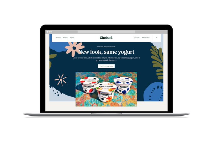

New work! @Chobani has rebranded with a new logotype by @bertonhasebe and a new typeface by Berton + Christian (plus GT America). The rebranding was carried out by Chobani's internal design team. Thanks to Berton for pulling me in to help out!
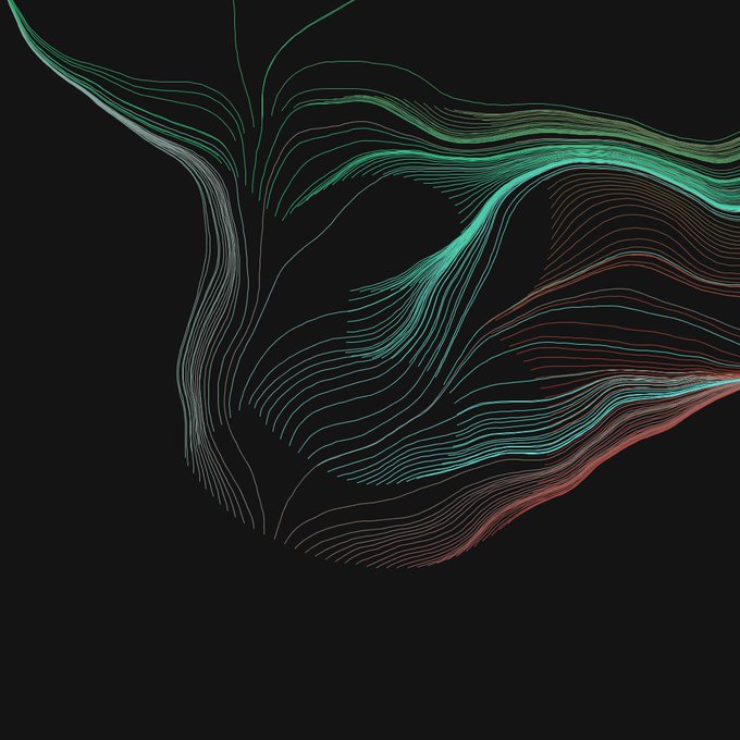

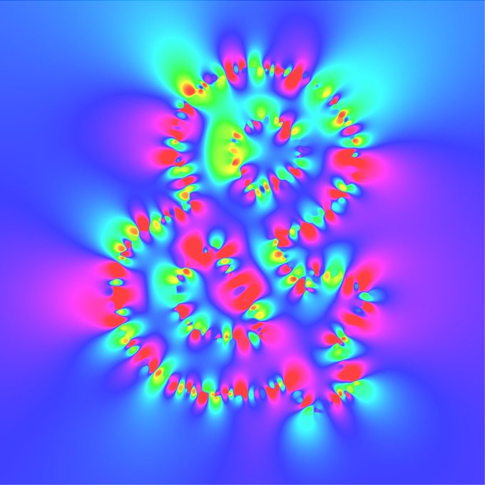
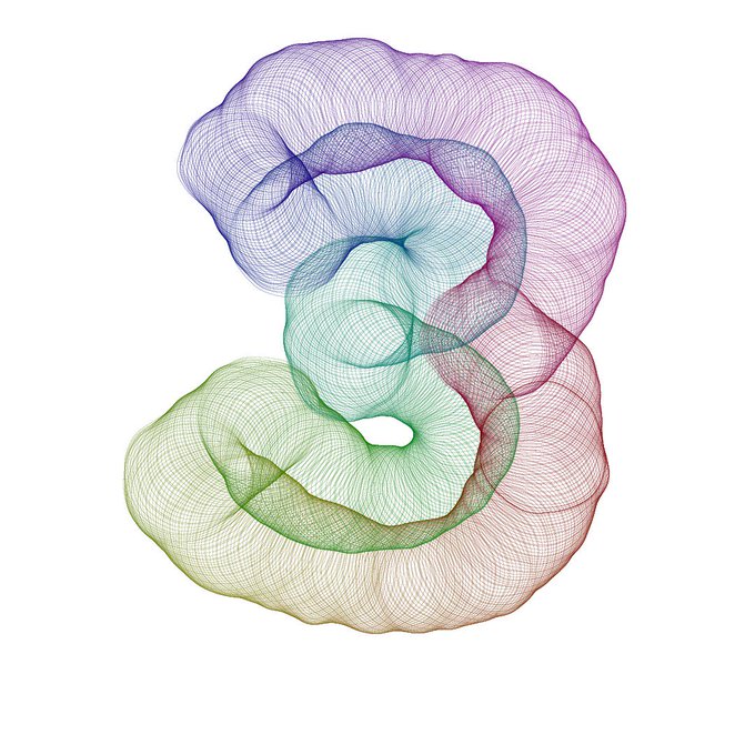
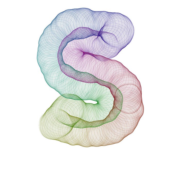
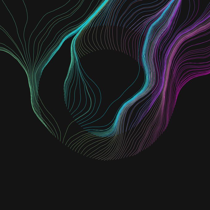
GeneTypo 25: Filaments Typo. Generative Design & Typography.
A generative typography using Perlin noise, angle oscillation and color interpolation. #generative #typography #genetypo #typeface #font #proce55ing #creativecoding #2d #noise #vectorfield
https://t.co/lBbyZmOqrH


GeneTypo 25: Filaments Typo. Generative Design & Typography.
A generative typography using Perlin noise, angle oscillation and color interpolation. #generative #typography #genetypo #typeface #font #proce55ing #creativecoding #2d #noise #vectorfield
https://t.co/lBbyZmOqrH


UTOPIA! for BJÖRK new album we created a new typeface as a structure to make “digital illuminations” grow in various in immaterials textures @bjork #utopia #mmparis https://t.co/aV9vwXAwB6


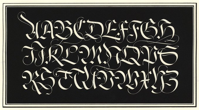

It's Typography Wednesday! Today we're looking at a typeface by one of our favorite typographers, Herman Zapf. The book is titled "Pen and Graver, Alphabets & Pages of Calligraphy", and was donated to us by Jerry Buff. You can view the full post here: https://t.co/4qs1PaZj63


Workday#4 in #SanFrancisco — Another project inspired by my research at @Lett_Arc and a challenge by @typographica. This is a 5-hours typeface based on a poster by David Klein (1958). Big and small caps, some kerning, and opentype vertical positioning to help the rhythm.