CONTRASTのTwitterイラスト検索結果。 313ページ目


*hands you the hardest jungler in the game*
Tried different medias in class today. it wasnt exactly the best, but some photo/color editing really made the colors contrast and pop out. I just thought that Lambs anatomy is perfect for trying out posing practice! #LeagueOfLegends


This Steppenwolf design is so gorgeous.
Very difficult to handle but it looks incredible.
Hope you like this, it’s an old piece I did but with some slight alterations to the light and contrast 🔥
#ZackSnydersJusticeLeague #SnyderCut


Poetic and contrasting yoga | Yoga illustration, Illustration character design, Illustration design


Pictures taken around Lakeland.
I especially like how the Crystal Tower lights up in the dark to contrast with its surrounding.
#FF14 #FFXIV #FF14風景 #ffxivsnaps #GPOSERS


@Loopifyyy @101cryptoart I'm interested!!!
Here's some of my existing work, I make heroic fantasy art with vibrant colors and contrasts
You can see more on my portfolio https://t.co/effWAVnvae


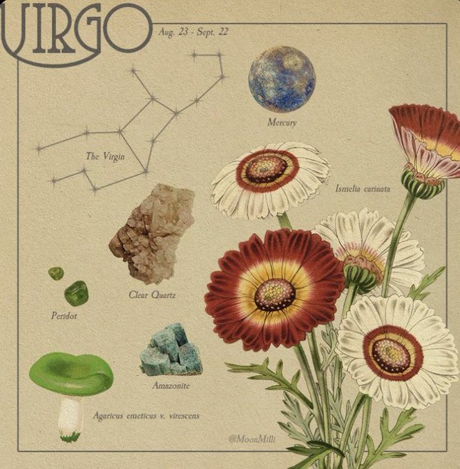

@1pouniette J'oublie qu'on a le même ascendant krkrkrkrkr
J'ai des sacrés contrastes pour ma par aussi olala


I like the fact that they imply multuple time that Prototype's Gilgamesh is actually pretty civil compared to the usual guy from Fate. Its nice contrast.


Doodle of my bird wearing some stockings and shorts. I think the background is a nice contrast


The One Rose cover design was handcrafted using no stock graphics. The entire design is a blend of textured and clean vector artwork. I wanted to create something eye catching with contrast, impact and intensity.


Day 29 of drawing something!
I can’t believe it! It’s been a full month since I started :00
I tried to stick with orange for the character with one contrast (the hair) how does it look?
Anyways, I hope you have/had a great day :>


The Goemon anime follows the same beats with the needed variations, but the difference is that Hattori-kun is at heart a comedy series with a focus on the everyday (more or less), in contrast to Goemon’s elaborate setting with an evil villain threatening Japan and the earth.


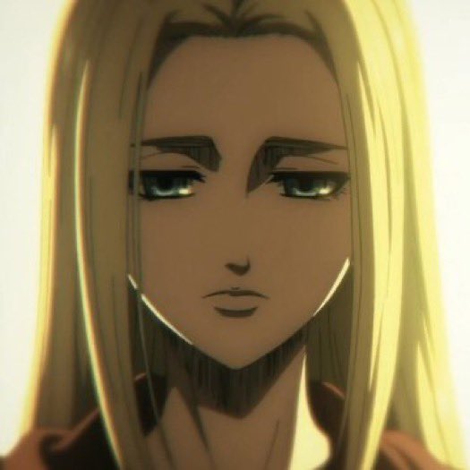
// aot season 4 episode 10
•
•
THIS EPISODE GAVE ME WHIPLASH OMG WHEN THE WHOLE CREW WAS BLUSHING AT EREN’S STATEMENT IM GOING TO CRY ok but seriously the contrast between the flashbacks and the present is just *chef kiss* very depressing but realistic I loved it #AoTSeason4NHK


Minion of Set saving humans from minion of Nibiru
#seth #egypt #ilustration #drawning #highcontrast #nibiru #anunaki

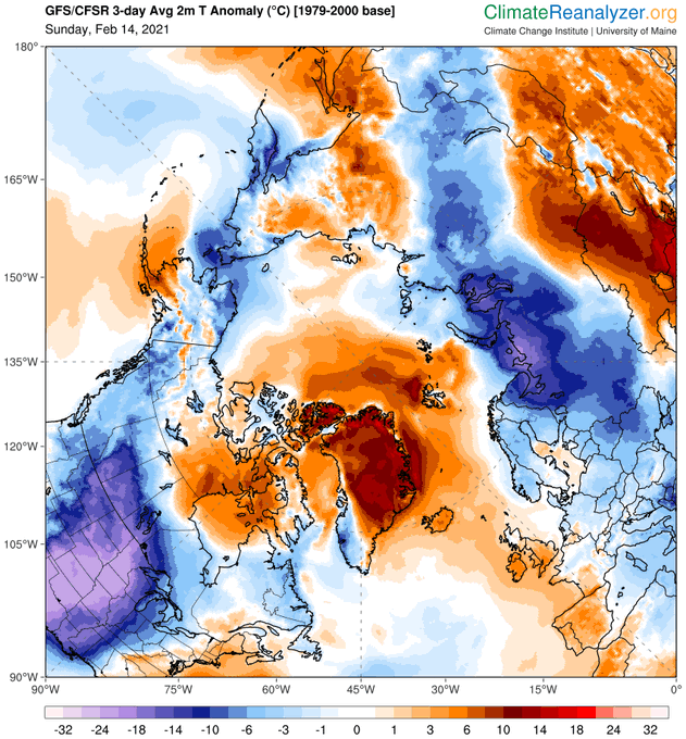
Stark contrast with most of Greenland, where temperatures are 10-14⁰C above average. Another anomalously cold area in NE-Russia. https://t.co/khw5lqVzFE