ContrastのTwitterイラスト検索結果。 10,507 件中 315ページ目

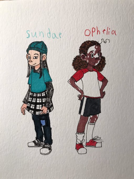
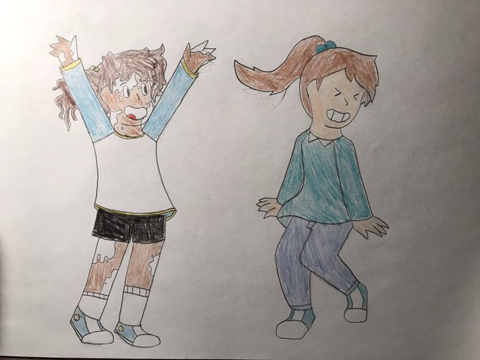
(Redrawn old art) It’s been awhile sense I’ve done water color....the designs are OK the skin color and clothes colors are way off I didn’t plan it stupidly they look too Christmasy with contrasting colors but at least I tried
I may try again later with plan

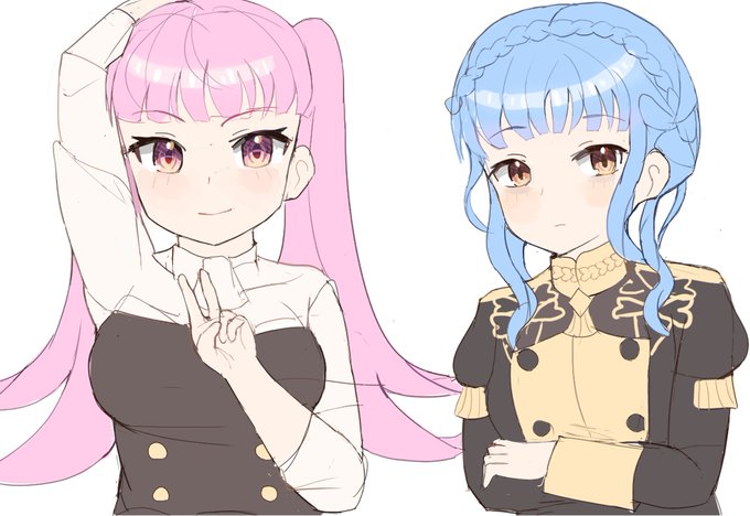


Love the contrasting beauty and ferocity of this #fantasyart
Blood and roses by Alaiaorax https://t.co/nSd5QehzMl


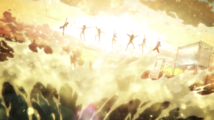
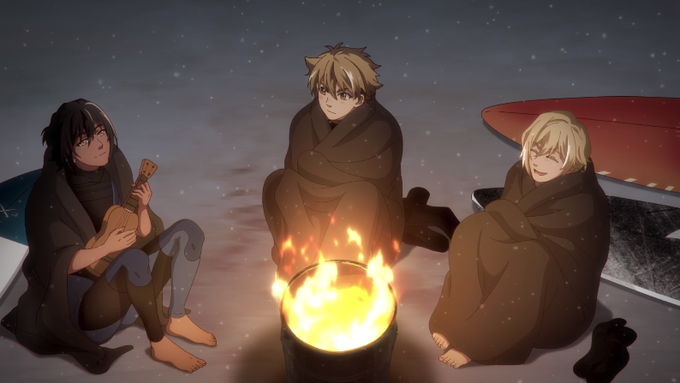
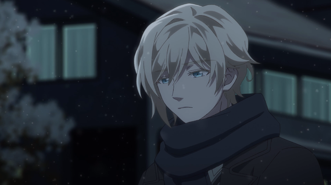
WAVE!! - Episode 4
L'affrontement entre Shô et Nalu était plutôt sympa. Une bonne ambiance entre le groupe de personnages se dégageait à la fin de la compétition, en contraste avec l'ambiance hivernale qui s'installe par la suite et cette fin assez surprenante !
#waveanime


i truly do love this funky fire wizard 🔥🐱
.
.
.
#criticalroleart
#criticalrolefanart
#CalebWidogast
One with and without a brighter contrast overlay.
Couldn't decide, liked both. LoL.
(Part of something bigger, but i liked it too much, so he gets his own portrait)


LRT I LOVE doing this. Throwing a weird color in as light accent or as a base to build on is great for depth. It works great for clothes, but it's good for hair and metals too! Choosing a brush with a texture to contrast also does a lot for a little!


@theshyestfox AAAAAAAAAAAA---!!!! 💖💖💖💖
Yesss it's pretty much contrasting his motive lmaoo! x"D
Thank you so much Beeee!! 🥺💕💕💕💕

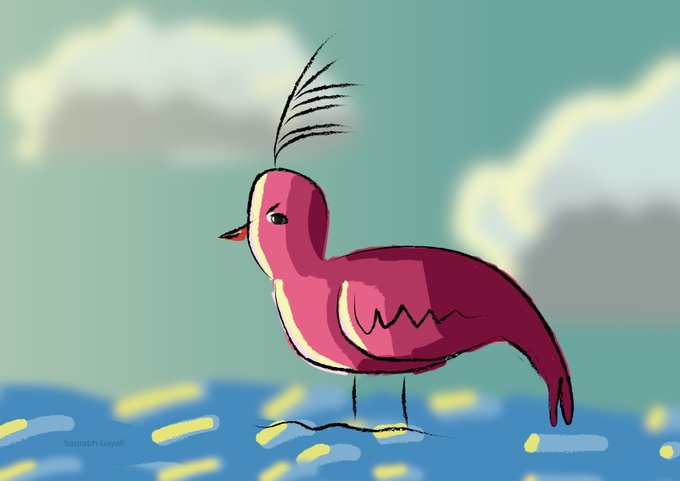
10 Min artwork in lllustrator. Project name birdie. practising using different light colors than usual ones and still getting contrast colors in CMYK mode.
@illustrator @Adobe @behance #2dcg #vectorart #2dart


@JOEZCafe__ V2 Miku's silver gray shirt provides a nice contrast between her ghostly complexion. The exposed shoulders neatly divide her body into separate sections. overall her colours are balanced. V3, V4x, and NT use a white shirt and the white top just kinda stops at the skirt


Contrast by Oxygene
🎺 https://t.co/ix3kAaJ7Hy
🎥 https://t.co/c9ggSqD8yX
This #msdos demo won at Saturne in 1996 🏆
#demoscene 💎
#creative #programming #realtime #3d #graphics #visuals #pixels #effects #electronicmusic #computerart #digitalart #visualart #art


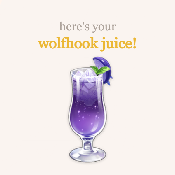
You've received a delivery! Genshin Cafe is happy to relay this message. My name is Barbara and I'll be in charge of this order today!
---﹤୨♡୧﹥---
from: anon
to: @C4TGIRLF1SCHL
"i saw that you got diluc... ! contrasts bestie !! but i do hope you end up getting xiao as+


@mippness @partyblook Ello!
I'm Nkowsarn (or Nko for short)
I am an amateur artist who just likes to draw girls in all sorts of outfits. I am a huge fan of experimenting with contrast and weird highlights
Here's some buddies I know @vanilla_juniper @partyblook

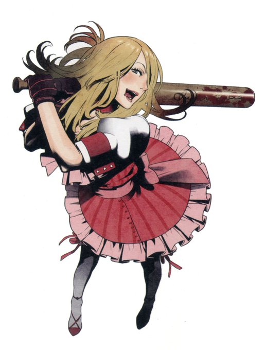
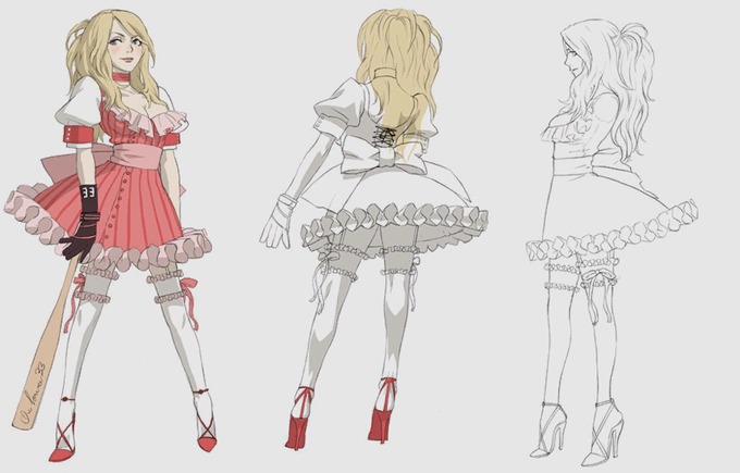
i'd be remiss if i didn't mention a NMH girl here, so have Bad Girl, aka Charlotte Birkin. her character is really cool, i love the contrast in her design (frilly dress + leather gloves is *so* cool), and also she's a hot lady with a bat and cute boobs okay what more do you want

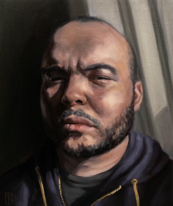


Oil on canvas board
10 x 12”
January 2021
Beginning to really get into the swing of working with oils and colour. In case you can’t tell, I love painting high contrasts.
#oilpainting #painting #portrait #portraitpainting #drawing #art #artistsontwitter


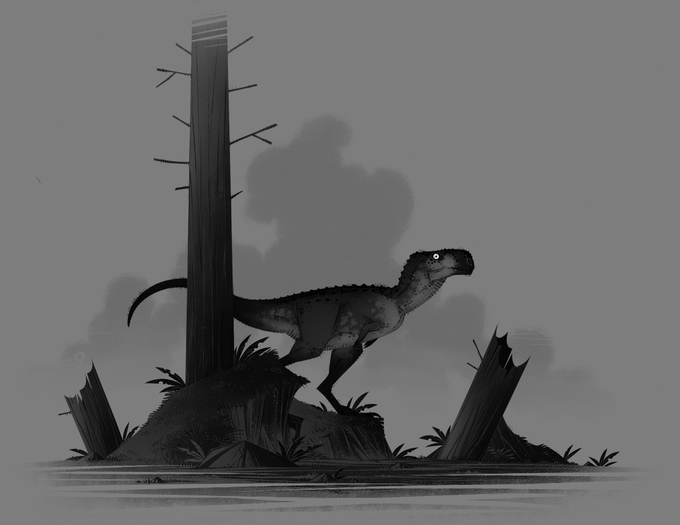

Doesn't really work for mine unless I crank up the contrast, but still fun #paleoartnoir https://t.co/J1MznxzCz9


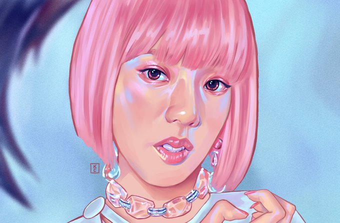
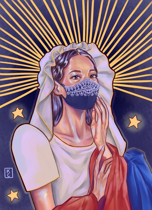
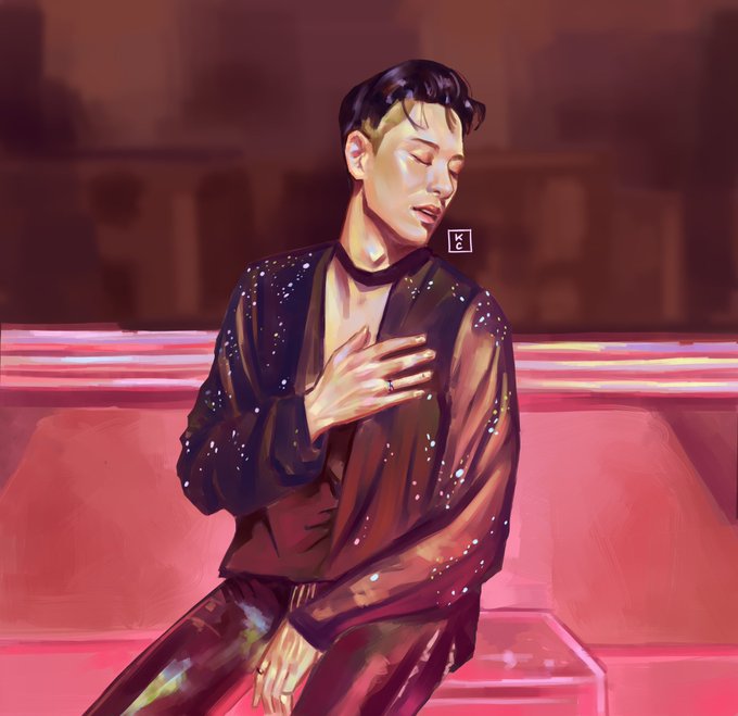
@SAStudioADHD Haya Im Kee and I enjoy drawing stylized art of people, women, and K-POP in vibrant and contrasting colors ♥️♥️♥️
#artshare


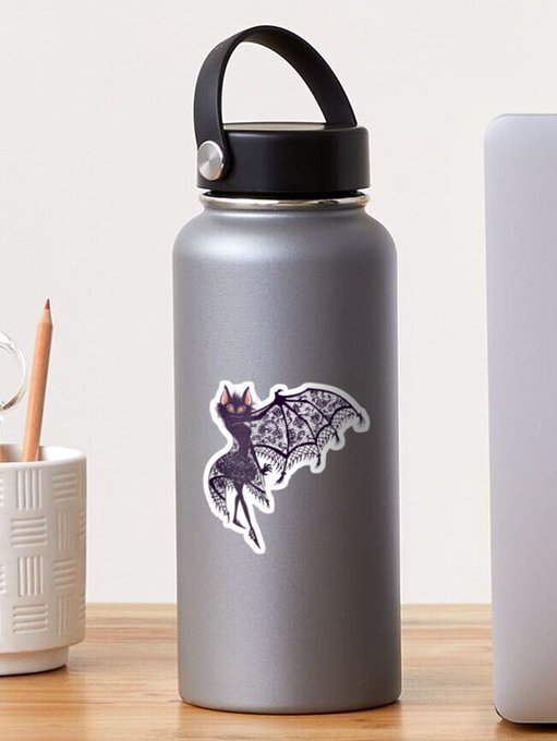
Some people have bought my high-contrast tutorial on gumroad and some stickers of Kyara fom RB! Yay! Thank you so much! 💖
Here are the links in case your're interested in getting them as well 😊
✨RedBubble: https://t.co/sjsCkGJDtt
✨Gumroad: https://t.co/AyOsElPoJA


ngl i love seeing the contrast between the parts i've rendered and the parts i haven't lmaoo


Estudando o mestre Frazzetta, achei muito interessante como ele usa basicamente 3 grupos de valores e da esse contraste top.