ContrasのTwitterイラスト検索結果。 10,815 件中 316ページ目


#ArtsOfVibrancy you called? Hello im kassio i live for high chroma and low contrast


Hi!, I like to draw very colorful art with great contrasts.
I don't usually draw a lot of illustrations but I like to make an effort and do it with love
I hope you like it :D
#ArtsOfVibrancy https://t.co/e7e9FeucIX


@hikikoblue I dont like the contrast with the colors so I also don't with normal eyes ❤


09 not too thin or fat isn't it?i contrast he and Futa,looks like futa more thin than he...maybe because he dont like eat vegetable?


My @withFND genesis #NFT will drop within 48 hours🌐
The 'Future Paradise' limited editions will be in direct contrast to the 'NO FUTURE' series dropping simultaneously on @rariblecom ⚡️
The one constant?
You'll never experience the future - only the present.


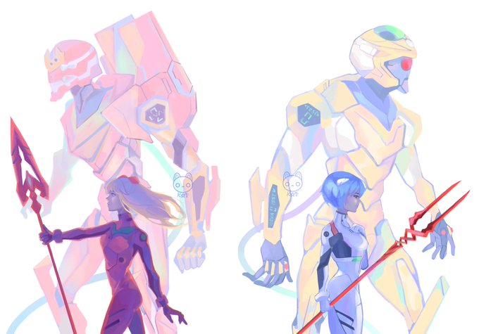
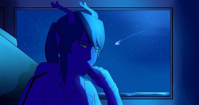
#ArtsOfVibrancy Time to go back to playing with strikingly vibrant colours and contrasts ✨


Does mine count? #ArtsOfVibrancy
I like contrast, bright colors with dark colors


#ArtsOfVibrancy My art isnt overly vibrant, but using high contrast neon colors has always been a favorite of mine. While working, I like to give my colors a dangerous and "toxic" feel to them, and it suits quite a bit of my own graphic design choices.


A wild seel has appeared for my dad
#seel #pokemon #rune #runes #dotwork #art #artwork #artworks #dotwork #blackandwhiteart #draw #drawing #cute #blackandwhite #PokemonGo #celtic #contrast #digitalart #design #fanart #mlem #cute #pokemonfanart #horn #seal #ArtistOnTwitter


"The Path Illumined" and "The Faerie Grove." It's been fun going back through my work and finding complementary or contrasting pieces!


¿Saturado y contrastado o menos saturado y deconstrastado? Mis ojos y no distinguen que está bien y que mal. X.X
#drawing #myartwork #conceptart


The contrast 🙂 both of my Ults are releasing a comeback this month. I'm both happy because IT'S MY SEMBREAK SOON, but dead because these concept are literally up my lane and i- 😭 P'ROLD IKAW NA PO BAHALA SAKIN
#ATEEZ #에이티즈 #fever_part_2
#Pentagon #LOVE_or_TAKE


"Brave Heart" by Nathalie Marino reflects her bold palette with gestural brushstrokes, contrasting tones and lush textures. This painting won 2nd Grand Prize Award in a juried international exhibition. https://t.co/3gPXpgQyxl


bro..... the colour palette contrast is 😙👌
@CNDLidk #doodylidk https://t.co/NvObjbTuao


It just occurred to me that I never shared this one full in public. It's back from 2018 for the stickerbook 'KlebMirEine'.
I don't like the colors so much anymore. Nowadays I would push the contrast more. But the motive is way to funny to not share it with you xD


@OnikumaRyuujiVT Ohhh, I really like the 3rd, mostly because it's such a contrast to the 1st one! It's always so fun to see how wild hair would look when combed/gelled! >w<
As for hairstyle suggestions, maybe something like this, just a bit more unkempt?
(the art is my own, so I'm not yoinking!)