CompositionのTwitterイラスト検索結果。 14,894 件中 33ページ目
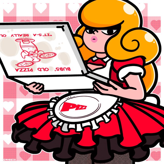
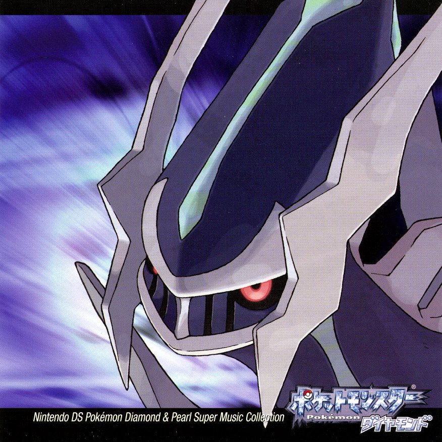
These two character illustrations weren't initially supposed to fit together, but I liked the idea of their poses and composition subtly mirroring each other...
... and the client did, too. 🥰
Tagged by @DuckyDeathly to post red art!💖🐦💖
For all my love of pink, I don't really have too many compositions that focus more on red, hope these will do!
I'll tag @lashiec @Yajuuraku @DroseAttack and @_Saane , and anyone else who wants to QRT with some red art, go ahead! https://t.co/xvqui6wQxP
This Nuggs has been traced from Pinamel's Nuggs pin, and they monetized it in multiple ways. The third image is an overlay of the original art to show it's traced. Notice how the 4th image of Nuggs doesn't even the composition or Angel's pose.
"The Havoc Tree" is a composition of #hedonistic, macabre and #sexually explicit abstracts. Each element in this surreal book is cryptically poetic and the writing is uncompromising in its rampage through violence, sexual depravity & madness. More here
https://t.co/Z2VCp3QkJW
GN dear friends 🖌️
I loved this piece so much that I decided to make a big painting based on it, IRL.
It is from WET COLORS series and it is available on @formfunction
The composition , palette and transparencies are adorable!!
🥰
🔗
@p0nyplanet I’d say these. I like my lighting on one, the details for second, and composition for 3 and 4.
hello! i have started sharing process/composition/sketch things on patreon
and also drawing bl
you should check it out if you've wanted to see a) how i go about making my art, and/or b) the extent of my depravity
Awesome composition created for the cosplayer @marjorui_ as Mei Mei from Jujutsu Kaisen.
If you have a cosplay photo and want a composition like this one, DM us for more details!
#cosplay #cosplayer #composition #photoshop #DigitalArtist
Sometimes, I post here too XD
Even tho it's a bit off, I'm pretty happy with the composition of it!
Initially, I entertained the idea of the Jack holding a sword on his shoulders, but I eventually discarded this concept as it was too limiting for the overall composition.
"Composition of water, light and fog"
#AIart #Aipainting #stablediffusion #stablediffusionart
@_line_dot_ I think using single colors isn’t anything to feel bad about, especially if you’re creative in their use. I always love how you implement different colors into the composition. For that kind of artwork, I think shading would bring down the overall impact
my favourite one below 🙏
Composition VIII, 1923 #vasilykandinsky #wassilykandinsky https://t.co/x2f2hlIPHt
titanfall mech by jean delville and sophie anderson and mandy jurgens and artgerm, retrofuturism, moody atmosphere, cinematic atmospheric, cinematic lighting, golden ratio, perfect composition, elegant, no crop, extremely detailed, 4 k, hd, sharp focus, masterpiece #AIart...


