ContrastのTwitterイラスト検索結果。 10,507 件中 333ページ目


Thought I’d share a time lapse of the painting process. I’ll usually have my reference next door - colour selection can be tricky as drop selection tends to make my art look flat. I customise to get better depth, contrast, and tones for my paintings.

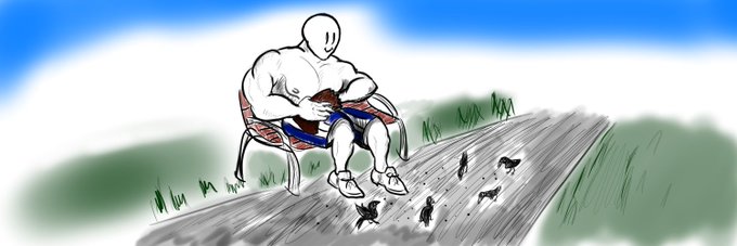
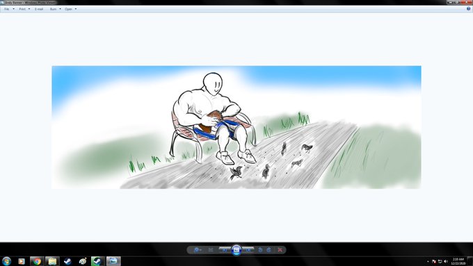
So the new banner I just added is supposed to be more saturated but twitter for some reason turns the contrast down making it really dark and I don't know what to do about it. Pictures are what it looks like on twitter and on windows photo viewer. Should be looking like the right


not to post too many WIPs but I'm actually excited about this?? (I'll probabyly do some color fiddling tomorrow there's like no contrast here lmao)


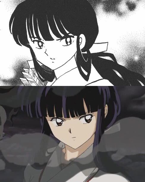


my piece for @dimitri_zine !!! highlighting "reunion" & the people most important to him contrasting with his self isolation ✨
thank you so much for letting me take part!!


contrasting, new hairstyle
#furry #furryart #furryartwork #furryfandom #furryartist


Oh dear, someone reminded me about the XJapan art I used to draw. I'll just put it here and laugh as it's too much a contrast to what I do/like now 🤣🤣🤣


so, kousen.
despite his clashing representative colors (blue+red) and tattoos, his personal fashion is v simple, mostly consisting of black, white and gray basics+washed out denim. just a nice contrast to his otherwise ethereal appearance.
#geniusmagic #dcdnc


@yuana_lee i always love seeing the contrast between our two characters lmao


Imo the key to drawing hair is not being scared of adding large differences in brightness between the "clumps". Hair is dynamic, and goes from really bright to really dark depending on the way light hits it (aka hair needs CONTRAST). #art


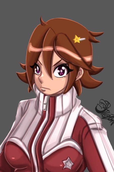
OC - Tina Polar
I did something different, in which I used greyscale painting techniques and then used colors and contrasts to give it a unique look.
----
#originalcharacter #originalart #artstudy


@PanScoli Don't judge him too harshly, he still needs more painting on him (and the emote needs some higher contrast after testing).


"Do you wish to join me on a stroll, young one? It's quite delightful"
--
In contrast, yet complimentary to Timekeeper Jon, we have @lucahjin as the Millennial Tree, a more benevolent keeper of time


Ausra Osipaviciute ( @aography )
is an international Fashion, Portrait and Lifestyle Photographer and Videographer currently based in Dubai. Her imagery is distinctive for its intensity, use of contrasting colors, juxtapositions, unexpected locations, and movement.

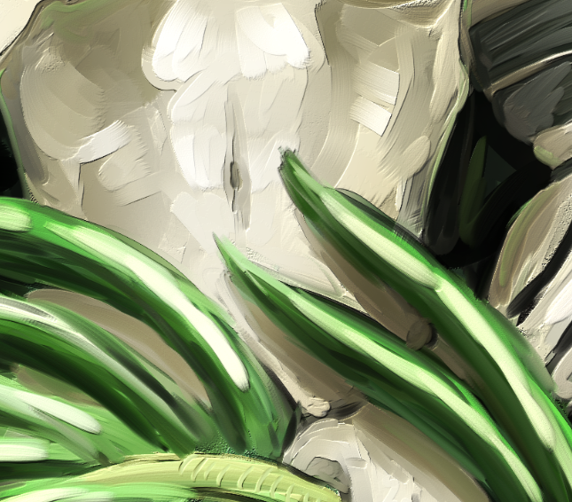
@xunvyre i like it too. i especially like the texture at the end of it and the...like...value and contrast which is what ive been trying to push more


Wanted to practice backgrounds in contrast to how a character would look in the world! #oc #ocart #characterdesign #cartoon #art


Charlotte is a weird character in Brigandine: TLoRunersia
On one hand the backstory of a child playing female characters in theater and having a feminine sense of self being contrasted *+=_hormones_=+* (aka the curse of puberty) is very realistic and interesting.


Tested out a color variation on a whim and this is way less shadowy so it's got a different feel but also contrast is a wonderful thing