ContrasのTwitterイラスト検索結果。 10,815 件中 335ページ目


Sup! I'm Esylus! I typically create fanart in a very distinct style with clean, bold lineart, glows and high contrast
https://t.co/7VDeuoyYbo
#portfolio #PortfolioDay #fanart


#PortfolioDay
Hello~ My name is Gabriella, Graphic designer and Illustrator from Chile.
Currently working freelance while expecting to move out to Tokyo in a couple of months for studies.
I draw high-contrast portraits 👁✨
💌 https://t.co/BpNWrrdq57
https://t.co/uJMtfSmxoI


It took a (very) long time but I finished my drawing!
This is a practice drawing for composition (framing), high contrast lighting, and hair complexity ^^
時間かかりましたがやっと完成しました!練習絵です!


this is so fucking stupid but my last three pieces has such a strong contrast its making me lose my shit


Sana maapprove na para makatulog na ako 😍
Changed the colors and added some details para mas may contrast.


me odio >< quise intentar eso de colorear en blanco y negro y no puedo, no me queda y pierde el contraste q le doy, además cuándo se lo doy lo q hace es saturar el color (y oscurecerlo, pero no qiero un oscuro intenso,nosesime explico):(((aaAAAAAA


3. Destination
The clouds points right at the destination. The contrast between the clear path and the density of mountains also helped in guiding the eyes.

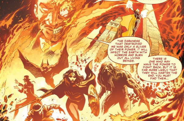
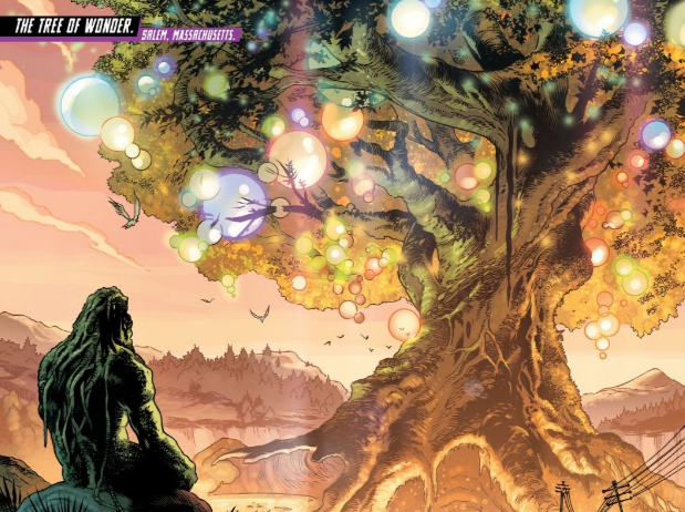
Speaking of hot, the designs here with the fire are so well done. Especially after being contrasted with the beauty of the Tree of Wonder.

Louise Forbush spent 12 years studying the Sogetsu style of ikebana, Japanese flower arranging, with her sensei Kosho Dixon. From ikebana she learned about contrast, color, texture, shape, size, focus, line, and most importantly, how to achieve asymmetrical balance.


T: My Greatest Joys
This work is on the theme joy, I Had very little time left to do it si it was more Challenging for me. I don't usually use a color palette so Quality normally i fail in the contrasts and saturation but it does not matter.


I'll do a more elaborate thread on these designs in the future. For now, I'd love to hear what y'all think! What is the vibe that you get from them? How do they compliment/contrast against each other? Which do you prefer?

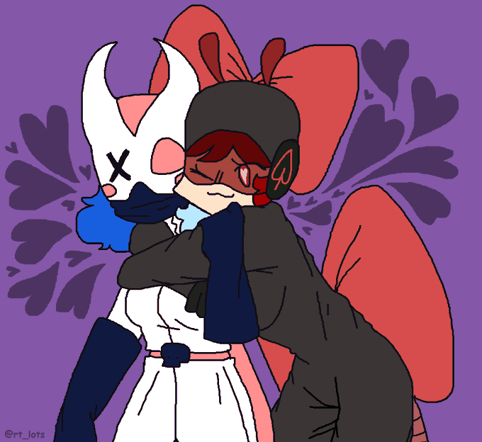
dont fuck with us buggle shippers we cry at the color purple
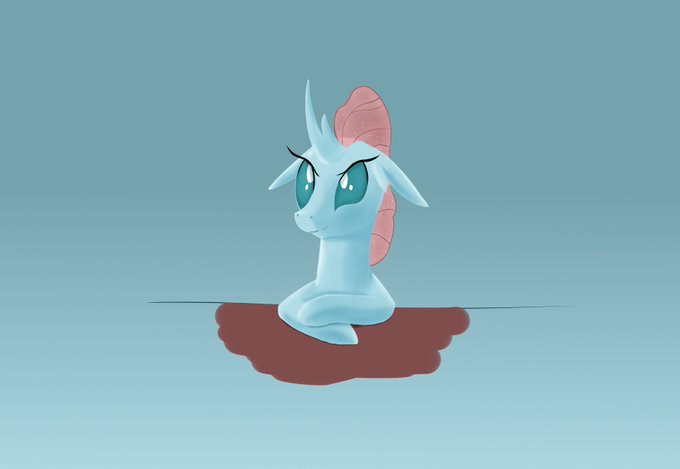
puddle of course belongs to @fluffy_glass
fun fact i changed bug's colors because her bow color was basically just puddle's pink but less saturated and i wanted more contrast


Ana'tole na Dure - [ #Warcraft Commission ]
Ana'tole na Dure = "I will do it for nature", a druid saying. I tried to play with the colors a bit more on this one to create some high contrast between tones I don’t use very often. || #Shadowlands
🍁[ https://t.co/MlL6j2CMgX ]🧝♀️


10. Ready Steady
That's just pure Rin stylishness. Rocks the street fashion so WELL and that high-waist short looks absolutely stunning but the big collar and big sleeves REALLY makes the difference. i love the contrast between the bare skin and the big fabric. gorgeous.


Opposites & contrasts are a major theme of Yashahime. Burn pays special attention to this as we next see Sesshomaru and Jaken standing from behind, both are staring at the underworld on a large rock, paying homage to the impactful sentiments of Sesshomaru’s iconic "Fukai Mori"...