gradientのTwitterイラスト検索結果。 8,720 件中 358ページ目


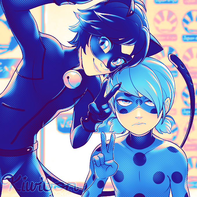
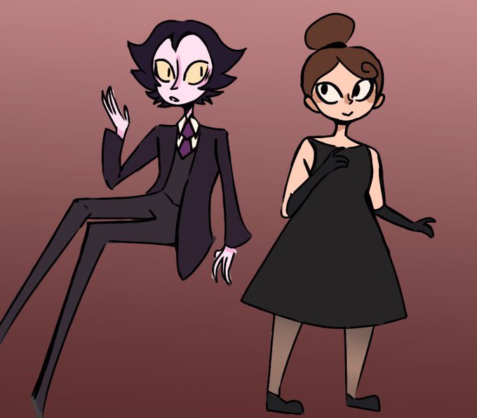
IRL vs Persona ✨
Kinda sad I couldn’t do the blue hair gradient but eh https://t.co/Ky3NMlisZ5

I can't believe how well this gradient map works with them damn


@LifeInASek To help with visibility, I went with the gradient approach. As moving forward, I want the anime visual to be the main eye-catcher.
My friend's content with this, so I guess we'll roll with it. Appreciate the feedback though!


I did the thing! My fave palette came from the gradient maps I have downloaded in CSP. I don't think I tend to use palettes really, but this one makes me happy. Now on to some cute OC art for today 🥰
#5minuteartist #ArtistOnTwitter


Cute and pretty oc 😭 commission for @Arwyn_27
I love her dress!! With those lace and gradient color, just perfect 😘👌🏻 thanks for commissioning 🤗♥️


Wanted to put up a design in my AC island where I hang out when I'm looking up at the night sky.
Natalie came out alright, I'm gonna need to simplify that background gradient. Also I gotta add a shooting star.
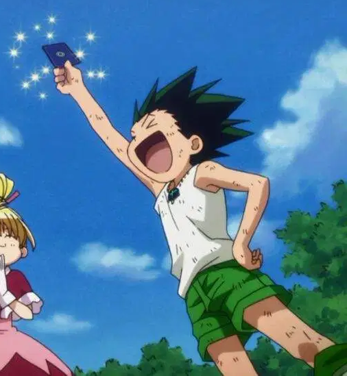
Pose inspired by Gon from HxH.


@softpuppi Thanks for the chance.
(Sorry about the repost realized one of my bios had gradient.)


i followed @bluefley 's amazing tutorial on using gradient maps and had fun drawing a quick Brigitte! a little challenging but I think it turned out ok. 🥰
#brigitte #OverwatchFanart


Base colors for the first three done
I decided to put some gradient in the base colors and the final results are usually great


hello i guess it's #PortfolioDay i am jamie and i do all kinds of various art things. i like gradients and bright colors ✌️


oh sweet, Kotobukiya shared the final version of the Lio scale figure—they went with a lighter pink to showcase the transparent moulding but kept the flames in Lio’s hands non-transparent to preserve the original color. the gradient looks amazing!
https://t.co/YlVOkvrvpH

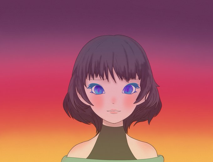
It’s a lady. #art #Digital #digitalart #gradient #gradientbackground #manga #AnimeArt #anime #girl


Supposedly it’s some kind of world kissing day? So have a pointless collage...with a gradient! #robron


@Dommer4kill Like I said earlier I want to forget this one I made September 2nd 2016
Color palette is nauseating& distracting, the design is cluttered, and the usage of coloring it digitally was absolutely horrible with inconsistent gradients.