ContrasのTwitterイラスト検索結果。 10,816 件中 363ページ目


boyfriend and I made OCs together so I drew them because I love their contrast so much q w q
also yes, if you were guessing fox made the guy bc of the turtleneck and red hair, you were right


Below are the original images. I modified the contrast for the one in the post. I should probably adjust my monitor's settings @_@


Finally sat down and drew Cookie's partner, Jazz the (blind) Cheetah. He's definitely meant to be the more calm and thoughtful of the two, to contrast Cookie's bubbly and excitable personality.


The fact that they all seem to be sideying something on their refs is on purpose. It makes them come across as more antsy.
It also contrasts them with Clementine who
1. Has her eyes covered and
2. Comes across as more bold with her pose


couldnt get the perf dragon for Ray but these are quite nice...IDK which one to keep tho, both cool help.....
black wing one has more contrast, Ray's hair is black, marks remind me of their angel form - while the red wing is more unified and the marks look like their scars


the contrast sucks on this but have some spooky season art 🖤
@TheRealElvira #elvira #elviramistressofthedark #halloween #art #illustration


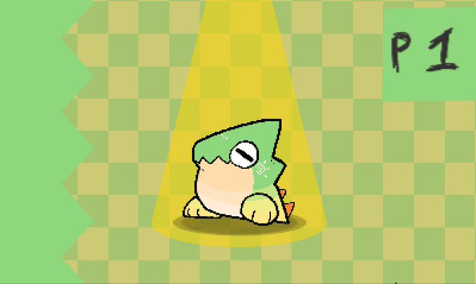
More testest #FEHeroes emotes. I feel like you need heavy contrasts with lineart or colors when you shrink them down super small. Drop by, say hi and see how they look on the super secret discord: https://t.co/f4jaqtcDHU


I noticed when you chose a certain option, you mentioned how it’s because of the contrast from the black to the white. I think I should’ve added the colors. Sorry but could you help me again?

hahah I think it's bc of the contrast with the background. Also the colors looks way different here than in the psd file idk why :c https://t.co/7HsFqD43Vw


This print of my old, 2011 wolf drawing received the black marker/color pencil “touch-up,” this afternoon. Adds a bit more contrast & dynamics. Yea, nay?? When in a creative rut, dig out some older works & fix ‘em up a bit, right? 👍#art #artwork #drawing #pencildrawing #wolf

#DragonDrop's player select screen now uses Dynamic Repalettization for all the background assets! I still need to play with the colors a bit to get better contrast, but what do you think? :D
#screenshotsaturday #gamedev #indiedev #gamedevelopment


Here's my own coloring rendition of a ghost girl piece drawn by my friend, @hooksnfangs, Initially I did it with a green background for contrast as well as to reference Danny Phantom but the blue looks a lot better. #ArtistOnTwitter #FANART #ghosts


Doodle
---
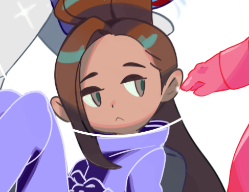
Still figuring out Garlic Boy's colors but I wanted him to contrast Yuri


“Hejira” (https://t.co/ACEFYxddok) by Gastón Fuoco for @sudtipos is a collection of 4 very different display fonts that nontheless share a common set of visual features.
① Serif, Thin & Spiky
② Sans, Broad-Nip Style
③ Flashy Op-Art Serif
④ Hi-Contrast Fat Face
#366fonts (291)


Ayer me vi un dorama de 3 capítulos...
los 3 capítulos más intensos de la vida
#Contrasol #illustration


In contrast to big boy Trunks we have the littlest Pepper. little fun facy shes in her 40s.


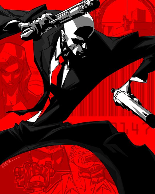
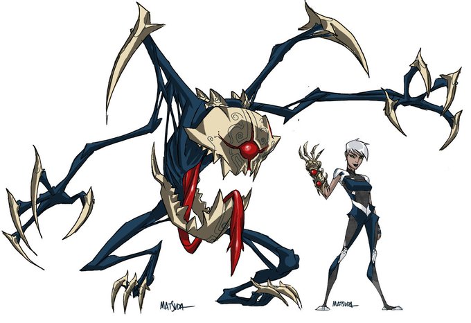
been studying a lot of jeff matsuda stuff and i really love the shapes he uses, very contrasty
a true master of the saturday morning cartoon energy


Fallout deathclaw mom
Been doodling a lot of monster girls lately and I loved the conceptual contrast this one had the most.