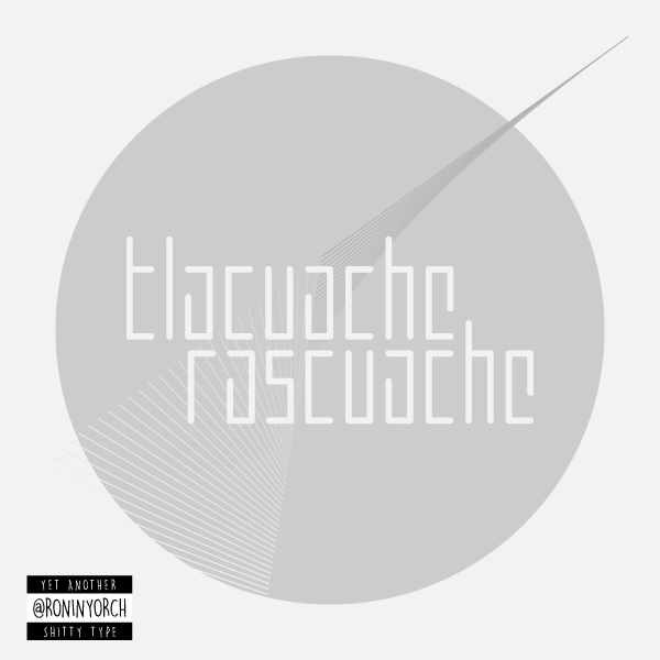
TypefaceのTwitterイラスト検索結果。 605 件中 5ページ目


posture check - my upcoming clothing brand, experimenting with custom typefaces.


Drawing typefaces means understanding the way in which counter-forms are balanced against shapes, how the dynamics operate between the two. The aim is to create a dynamic from left to right. And for this, there is nothing better than to observe them in mirror.


Aliénor Display seeks to convey elegance in its purest form. The connection of stems to serifs gives it an original, sophisticated identity...
Download FREE trail ➡️ https://t.co/feanhZasip
#type01 #typedepartment #font #fonts #typeface #typefacedesign #typefacedesigner


SUMO Display Font | Maxim Taloverko 🙌
SUMO is inspired by Japanese Letters 👏
Full project here ➡️ https://t.co/6KgQmyAXzp
#type01 #typedesign #typeface #typedesigner #graphicdesign #graphicdesignstudio #design #typography #typefacedesign #type #displayfont #displaytype


Ardoise met the needs of publications. By extension, it met the needs of a newpapers typeface featuring a low contrast, straightforward forms. The verticals metrics and proportions of Ardoise are calibrated to match Mencken.
➽ https://t.co/Cie5hXC4Iw


@unistorageunit @mossys_art Oh yeah for sure. There is some creative love in the design, (Pic related) And if you look at other 80s corporate art its mostly geometry and typeface especially in the computer industry.


Which one is your favourite? 😍
I thought I’d share three of my favourite typefaces that I’m using a lot of at the moment, they are:
1. Barcelona Nights Script
2. Delvey Modern Serif
3. Backyard Garden
These are all included in the font bundle on Etsy from Beck McCormick!


Vifellia #typeface by Bagerich Type Foundry
Test out + purchase here >> https://t.co/Ks8Pup4CvA
#type01 #typedesign #typdesigner #typefoundry #fonts #font #typefacdesign #bagerichtypefoundry


Chinta Fitri Brush Font https://t.co/yiBTPfM3D8 #stylishfont #font #ScriptFonts #alphabet #script #opentypefont #handwritten #ScriptFonts #calligraphyfont #typeface #fonts

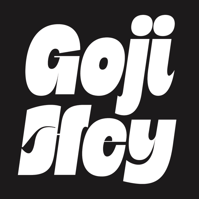
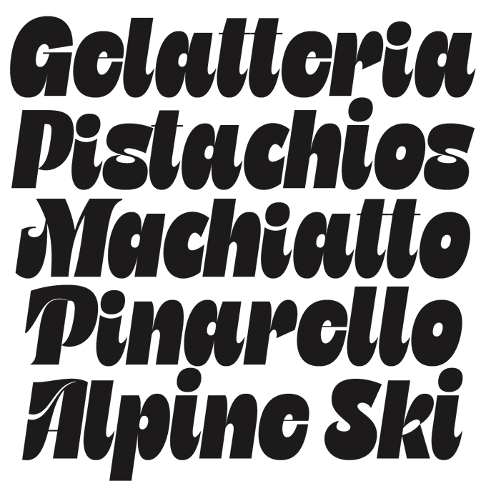
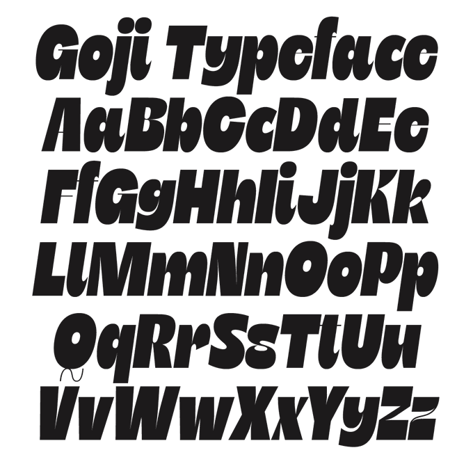
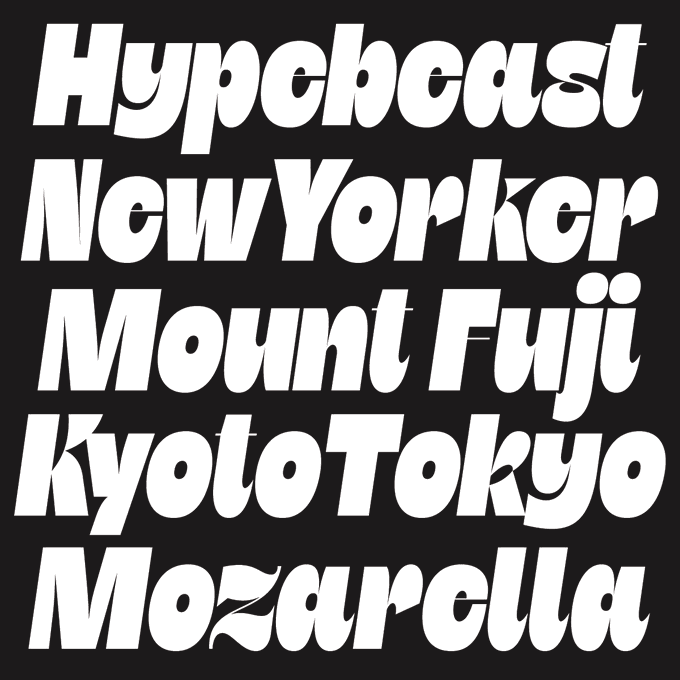
Goji is here. My latest typeface is now available from @typeverything. It's fun, friendly & summery. Hope you like it: https://t.co/FH7sAq0Ni5

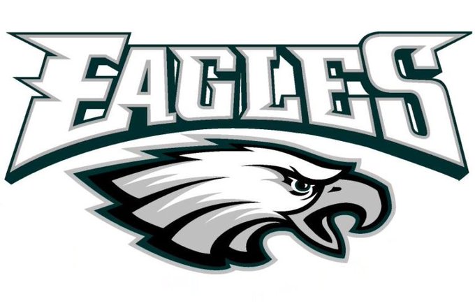

consulting the typeface master himself, @jeeveswilliams, for his opinion on the new Philadelphia Eagles typeface (current left, new right)
looks boring and uninspired imo, the current one has big 2000s feel to it which isn't necessarily bad and it at least has some personality


Artwork:
Modified bespoke painting by myself.
Typefaces:
‘Kern’ by @pizzatypefaces.
(A) ‘Tenebras’ by Doménico Barreto.


Dimenctionary | @ivan7castro ✨
"During the 36daysoftype, I pushed myself to run a different concept experiment..." 💥
Full project here ➡️ https://t.co/pcgvOZ8zHe
#typedesign #typeface #lettering #36daysoftype #dimenctionary #type01 #font #fonts #typedesigner #graphicdesign


When Le Monde Journal was developed specifically for use at small point sizes (below 10 points.) Le Monde Livre works beautifully for book typography, magazine settings. Italics more fluids.
➽ https://t.co/IatbPFMejj
— — —
#typefaces #fonts #glyphs #typography #logotype

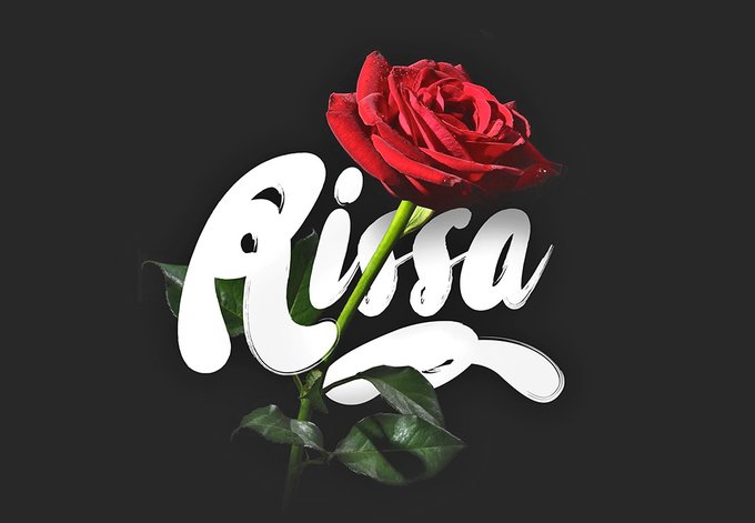
It's time for light, beautiful hand-drawn fonts! Meet Rissa, a stunning typeface that will give your designs an authentic brush handcrafted feel. Such display font just won't be left without admiration! https://t.co/1ZUdvki0d2


Designed by @xxdupre, Mislab is a slab serif typeface that was thought to be brighter and more legible than most others. How? By combining the strength of a slab serif with the lightness of a sans serif!
➽ https://t.co/x6ooCkptq1


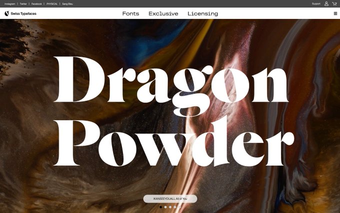
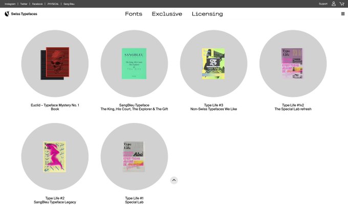

▷Swiss Typefaces
人口1.7万のまちveveyで、ロールスロイスやリックオウエンスのフォント開発などを手掛ける。30歳前後の小規模組織。インスピレーショナルなフォントブックみたいなものを作っては世界中の一緒に働いてみたい会社や美術館などに送っているとのこと。
https://t.co/b5XZ65HMmX


30 of 365 | "ONEK-HOTOK"
@/onekgram's new typeface is out! I was given the chance to try out the font early & I had tons of fun using it in different styles. I can definitely say that this is a font most of you could find some sort of use of - No matter the genre. Go get it!!