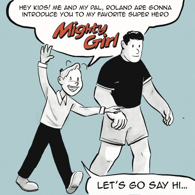
font.のTwitterイラスト検索結果。 258 件中 5ページ目

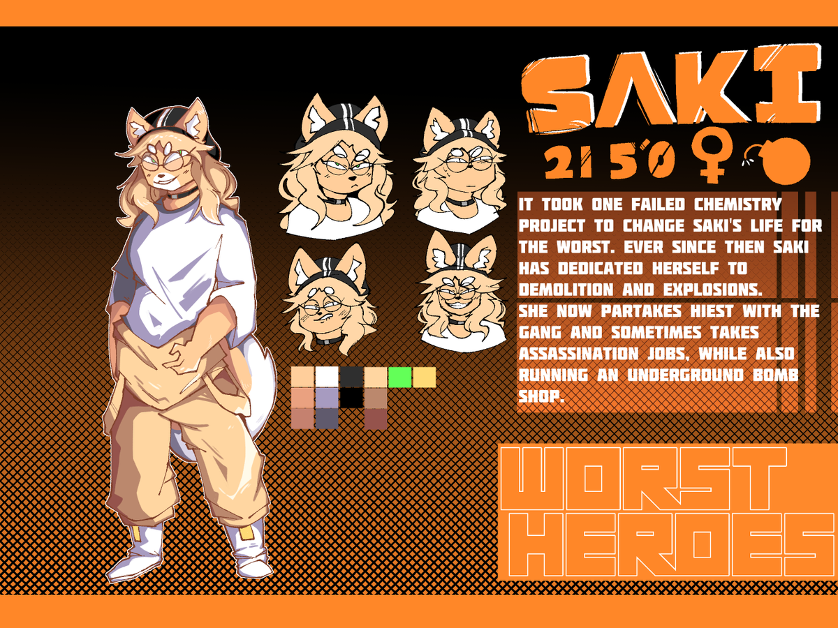
"Saki the demolition girl"
I spent about an hour looking for a simple font.


also related, PLEASE do not use a small font size and also be mindful of your font choice. Small font size is obviously hard to read and certain fonts can be hard for people with reading disabilities. Honestly just use Comic Sans, it's unironically a great and accessible font.

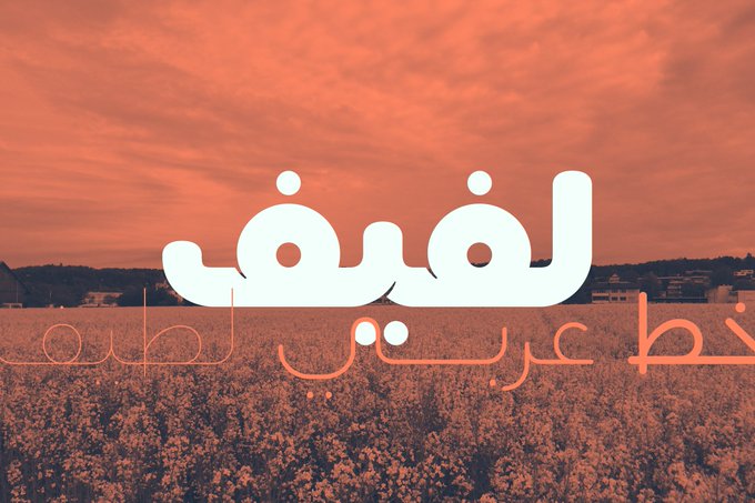


Lafeef - Arabic Typeface (version 1.0.8) is now available through HelloFont. Check it out!
https://t.co/yZ63JpnWGT
#arabic #typography #typedesign #graphicdesign #calligraphy #typesetting #design


It's gonna have to be a custom number font for @cavs. Probably a hybrid of Tautz Extra Bold and Friz Quadrata Bold. Exact @WashWizards number font.


MORE STEVEN UNIVERSE ART | Beach City Drift!
A follow up to my last Stevonnie art, with custom text that I rendered in the Steven Universe logo font. I like to think this is the cover for Stevonnie's debut album
i'm open for comms y'all!
#StevenUniverse #stevenuniversefanart


@Rugdog @surgingdragon @otop1_top1 Fixed again and i dont know i did font...


I draw this sticker last night as well and I love it lol. Proud of the font. I used to do a lot of calligraphy, but it didn't translate the same to digital, but I did it lol.
#furry #Fursona #commissions #YCH #furryartwork #ArtistOnTwitter #digitalart


@promienisonca I asked a friend of the author today about his work. The text has been edited down to the font. There was no permission, he did not even know about the existence of the translation. And these are works for the largest groups in VK on fandom
Original/Translate


Love the B.Positive font, with a Vectorheart-style 'digital billboard' effect & the 'Techno-Set' flyer with 'Dr-No' font.
Image #4 showcases the very popular-at-the-time barcode motif


I felt like drawing and didn’t know what so clearly the most obvious solution was to draw @friccafracc’s Font. This was an art fight attack but to be fair I probably would’ve drawn him eventually anyway


Notably, the unreleased version of the book uses old looking photo frame with different Hilda's handwriting font.
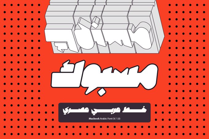


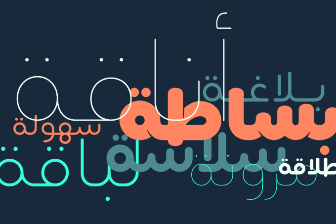
'Masbook' is a new Arabic display font. Check it out on my Behance profile: https://t.co/FjTfAsEqLT
#arabic #font #typography #graphicdesign


@voolingeveryday @MasterMatt64 @HamonBeat Fine? I mean yeah Araki's art is good but that font looks so tacky, it's a literal newspaper font. Where's the stylisation like the JP volume has? Better yet, you compare it to other Languages and it looks even worse in comparison


That's a shame. The font I used for Harmful Park is actually a modified version of the original Battle Network font. Them replacing it with a fixed-width font is just bizarre. https://t.co/UfAYHXvrzr


my buddy .@sugiegg did these great pieces for me, thanks lad!
Thinking about updating the ol' YT icon and Twitter with these, what do we think boys?
There's me as drawn by Minoto, Cassandra by herself or Cass with the channel name. Maybe I need a better font..

Ok, working on some different inking options.
1. Traditionally inked and *gulp* hand-lettered.
2. Digitally inked and using a comic font.
Any thoughts / preferences?


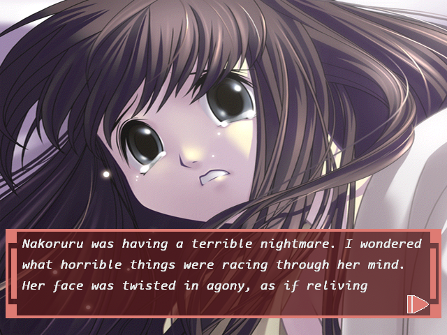
I've been busy for the past 72 days since my last update to the Nakoruru translation patch thread over on the Dreamcast-Talk forums. The task? Implement a new, half-width font. I'm not ashamed to admit I'm beaming with pride and joy right now 🥲
Thread: https://t.co/leUqNPMmk6


