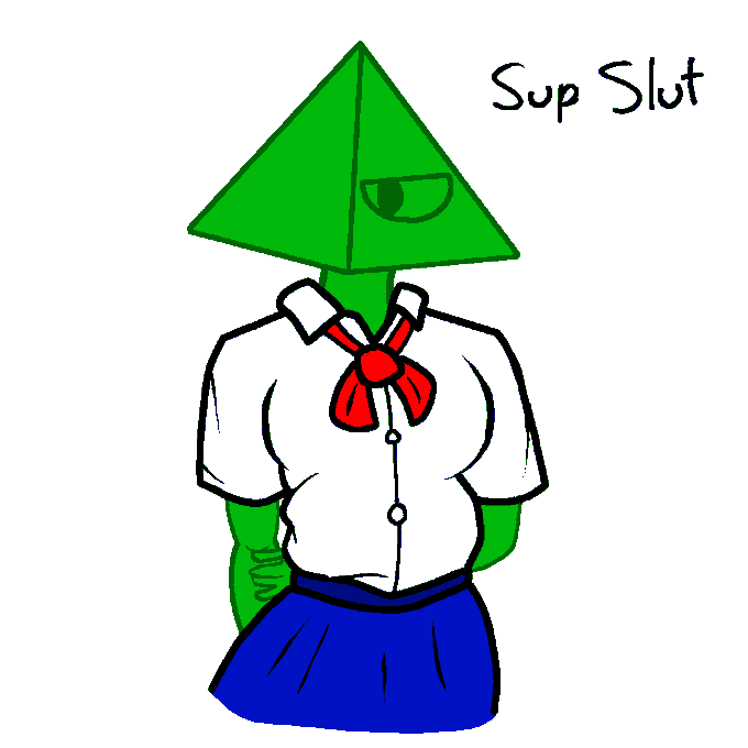
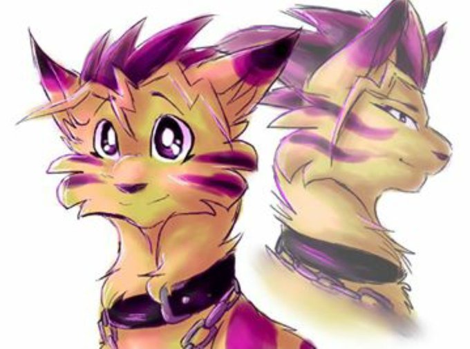
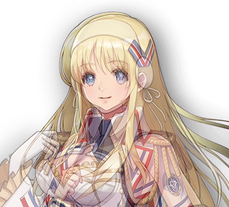
comparison,のTwitterイラスト検索結果。 1,078 件中 41ページ目


@zerowondering In fact, I feel any NPCs in Smash end up making the roster look better in comparison, especially with how their designated "mascot" is Waluigi.
Which brings me to the following:
I'm gonna predict Spring Man being the next in line for loser memes if not shown as the ARMS-rep.


Stenna's got a new look! Here's a quick side by side comparison, old on the left, new on the right. What do you think of her new clothes?
#screenshotsaturday #madewithunity

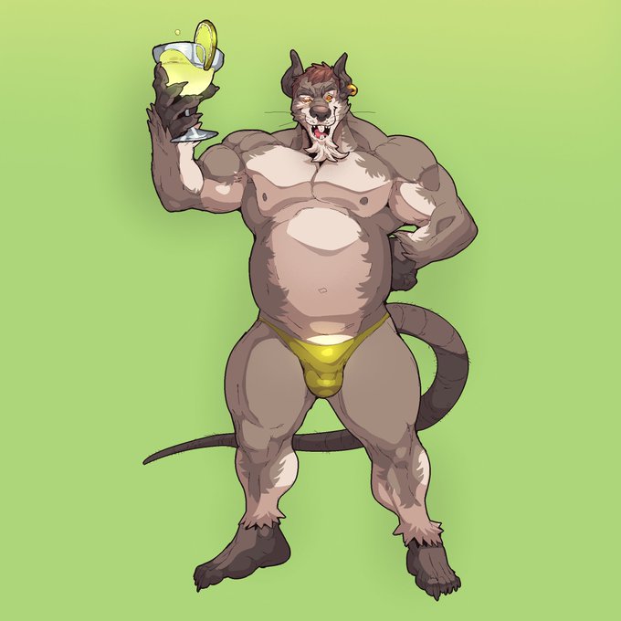
for comparison, by the way, here's rat arlo before he became a ferret. It'd be something akin to this but possibly rounder gut/bigger muscles (artist is @/fizzworks)


For comparison, here is how Helena and Zuhra's models used to look in the old style. Quite the makeover, wouldn't you say?


Another concept-to-final comparison, Endless War!
The original concept, left, was drawn by @Starmangsr while her final design was by @drawkaya.
Did you notice her necktie is in the Rowdy and Killer colours?
PLAY THE GAME:
https://t.co/rsAN1InWHp
@ENDLESSWARrfck @TPCrastinators


In comparison, this was my first and only completed piece of Zuberi from 2017 like ooof I feel I improved ✌️

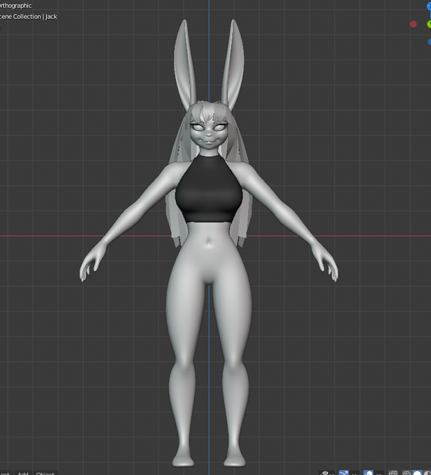
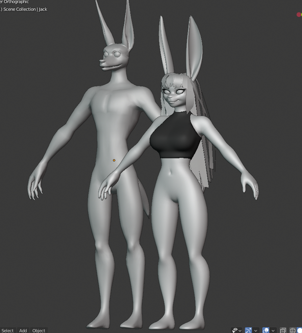
more Ruby and a Jack for height comparison, not sure if I should try tackling the hair with particles or just use curves like normal 🤔


Progress so far!
And added Julia for size comparison, since i noticed many people don't realize just how big Jerome really is
Julia is 156 cm (~ 5'1 ft)


A two-panel comparison, wahoo! Basillus' intro needed dialogue cleaning and redrawing. (lol he looked so short) Photoshop has a new tool that lets you draw symmetrically making front views easier to draw. It's nice. =w=


2019 and 2018's Mermay's for comparison, as well.
Last year was a simple skill-assessment sort of redraw of my first ever Mermay, this year I wanted to go for something a little more stylistic and filled out (with an actual background this time no less)


Another old VS new screenshot comparison, this time including Team Lust! 💕
#indiedevhour | #visualnovel | #gamedev


for comparison, adult tika and eve are not nearly as similar. these two are just ouch


For comparison, here’s the one I did before.
This is some bad Picasso style bull shit 🤣🤣🤣


I tried my hand on coloring something so have this Hidan bc I'm still Naruto trash weeb and he's my fav
Original drawing for comparison, had to twig around with the line to make things work
Chapter 323 page 5


And for fun comparison, here’s a piece I did for @EDGEinthewild exactly one year ago.

@PHONEGUYSIMP i just got used to it 😳
i honestly think i draw worse on tablet than finger o-o
just for comparison, left is one i drew on the tablet, the right is on a phone


Here's an interesting comparison, on the left is how I used to shade where I would shade each individual colour separately, on the right is how I do shading more recently where I use a single colour with a multiply layer for the entire image.
#ツイステファンアート


I wanted since quite some time ago to redo some drawing. Here there's a sketch comparison, hopefully I can finish it and see the full change!