compareのTwitterイラスト検索結果。 22,425 件中 403ページ目


@toadrey_ yeah! ive made 200+ mcyt drawings since i joined september 2020
first is december 2020, last 3 are from this week.
easier to compare 1 character
ive seen so much improvement in myself AND so many other creators!
this community is such a good one for inspiration and motivation


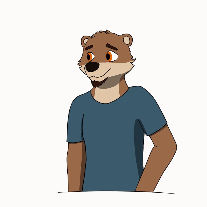
new chase sprites, this time more stylized
-will now only contain the top body to give more of a VN feel compared to the old sprites
-please I need help splitting the work I'm going to die
-animated with CSP's animation features (very cool)
#echovn


I am also doing chibis! These will vary style-wise, so you can give me a general idea of what style you want! They will also be a little more cleaned up compared to regular sketches.
No color: $15
Color (with flat shading): $25


i thought my region deserved better than to be compared to milk so here r the sova babs sans milk https://t.co/3oOC8ujTrV


This was meant to be a sketch to compare my progress but uhhh,,, couldn't resist,, original from 2018 in replies
It's messy but that's the fun part /lh


So why would I want to be a VTuber of my OC Sin Juyo instead be a normal live streamer since my face looks okay?
Reality is boring compared to fiction. I'm honestly a boring person but my OCs are interesting and fun.
So it'll be fun that I RP as him.
#VTuberUprising #Predebut


#genuary2022 day 10, Machine learning, wrong answers.
I work on ML, so when I first saw voronoi art I implemented it in JS as kNN with k=1. It works but is super slow compared to normal voronoi stuff. With k>1, the results are really cool though. #generativeart

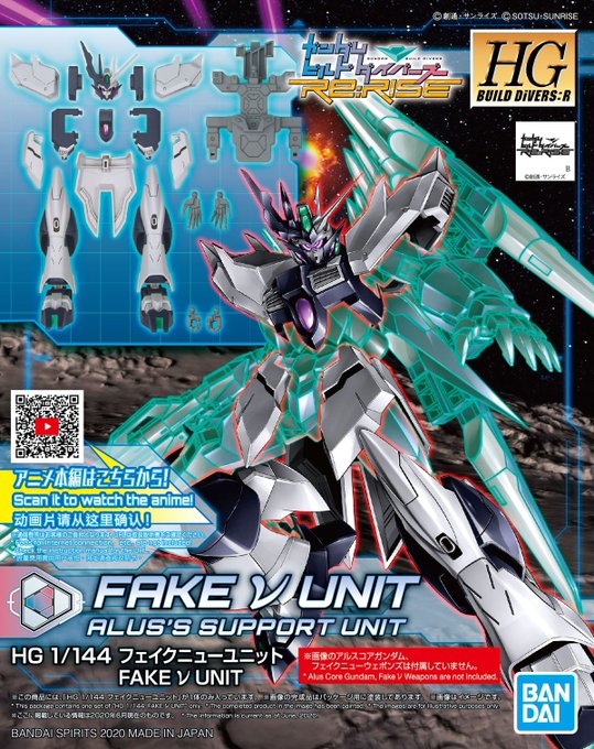

As Alus makes his bid for conquest by copying Hiroto's PLANETS system, he made the Fake Nu armor, and while it was effective in the field, how well does it compare to the original Nu? Will it prove to be just for show?
MS Fight, Ready? Go!
(Submitted by @Chanellmann)


I should have waited a day to post this one for the tag #1月10日は椛の日
So instead lets compare my 2022 Momiji to my 2021 Momiji. Drawn exactly a year apart. https://t.co/7OKfJhS663


im really happy with how this turned out, this is probably the most pleased ive been with one of my arts in a while.
im even more happy if you compare this to the first art of sana i did when she debuted in august... yikes. at least ive visibly improved a lot


You know I never noticed how structurally similar their swords are from each other, especially with the small wing near the base of the blade
Only thing is the hilt of the white sword that extends over one side of the grip, compared to both sides for the black sword


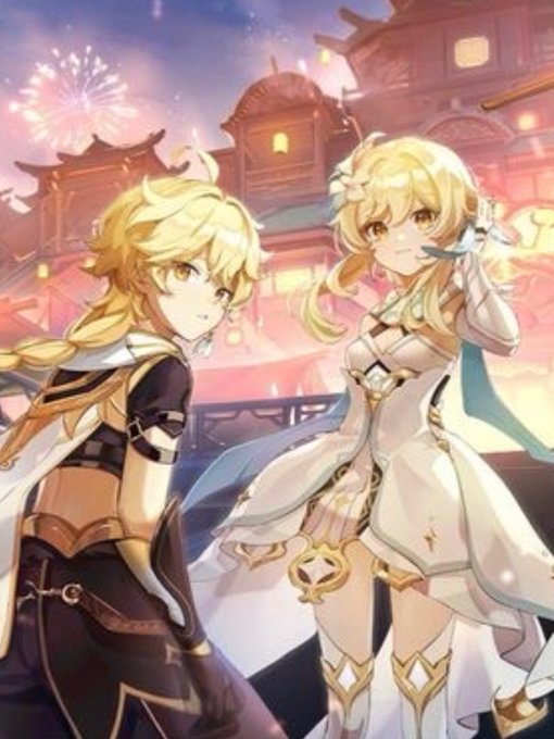
one thing was I changed Lumine’s posture/pose. Compared to aether, who is more melancholic+sturdy, lumine appears a lot more lighthearted and flowy??? Her expressions are also always made to be more excited and friendly which is why I:


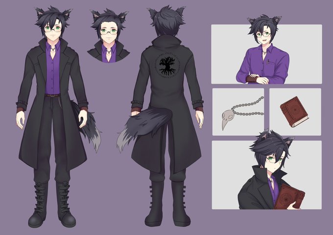
@CuppyCakiee Mine’s a fairly simple design compared to a lot of others, but I love it - especially the hidden lore-related Easter eggs ^^


I should really redo some of my old chapter images with some of the new knowledge I have about lighting and proportions and perspective and all that.
Like look at this new Duke compared to this old Cameron. Imagine how much better Cameron would look with Duke's lighting!


See this going around. Just want to clarify, this is a commission I got from Gainoob on DA. The OC's are Michelle Lancesseur (mine) and Grazia De La Corte (@ShenPlease). Here's some additional Michelle comms I have gotten to compare in the reply!

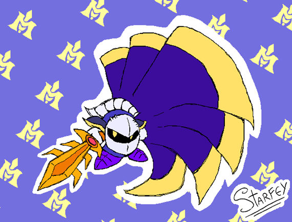

This actually isn't my first time drawing Meta Knight, but the last time I did was a good while ago. It's fun to compare the two and see the improvements

