ContrastのTwitterイラスト検索結果。 10,503 件中 405ページ目


Re post with no background and contrast adjustment. #starfox #anthropomorphic #anthro

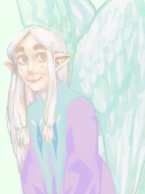
@verysmallshark's yovshir!!! if u can believe it, this is actually the higher contrast version.....,,, i had so much fun drawing her ears & i rly hope that shows

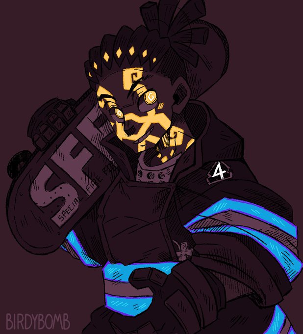
Been catching up again on the manga and ugh I love Ōkubo's character designs 😳
#fireforce #ogun #ogunmontgomery #atsushiokubo #atsushiohkubo #fireforcemanga #sketch #fanart #digitalart #contrast #artistontwitter #twitterart #manga #mangaart #オグン #炎炎ノ消防隊 #EnennoShōbōtai


okay help me choose, contrast or not contrast?
look my portfolio here! https://t.co/1vX0pYewDr
support me here: https://t.co/e9VlLu0Upd


Bueno, traigo a alguien xd...
El nombre está por verse, tiene 16 años (más o menos) y representa mi parte más cariñosa y sensible.
El color que más contrasta es el rosa, que representa "amor" en este caso, pero también tiene colores azules, que representan tranquilidad e...

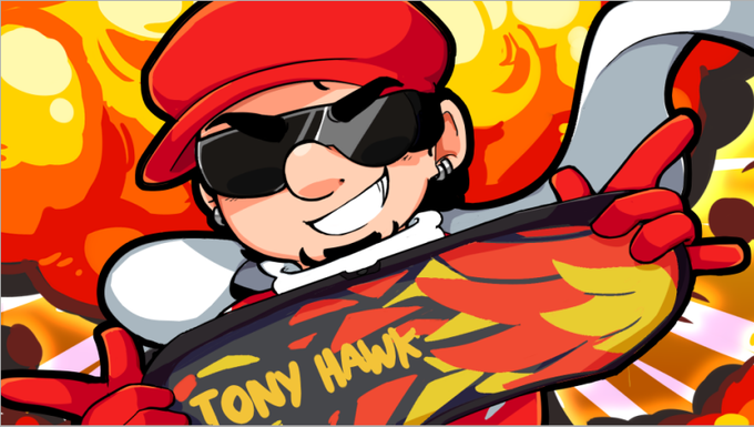

lembrei de um funfact aleatório que, originalmente, o fundo da thumbnail do ffg de tony hawk shred era pra ser bege, pra ser uma referencia ao primeiro episodio do freaking rangers, power rangers 64
acabou que mudou pra roxo pra dar contraste, mas as listras ficaram ainda kkkk

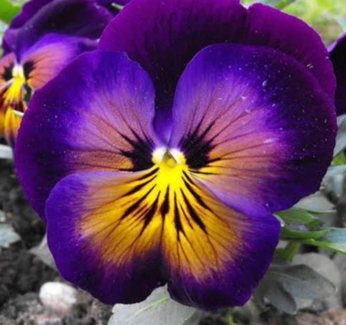

@AzeniaAi I love pansies, because they have such beautiful contrasting colours. 🥰


#hlvrai a sweet moment to contrast their actual relationship in the show sjskjdjs


Claremont treated the X-Men as an ensemble, and, though he clearly favored Storm, even she would pass in and out of issues without a consistent central focus. In contrast, when Claremont left, Wolverine dominated all issues and the group dynamic may have lost its balance. 3/5


Guess my posture contrasts with my art quality qwq...


High Contrast | #형원
The power of the two toned hair: unleashed.
#FANTASIA_X #HYUNGWON #MONSTA_X #몬스타엑스 #MonstaXfanart @OfficialMonstaX


left is my favorite one cause I'm the antithesis of edgy and I like the contrast with the default
and right isn't personally my style but I still really like it


the contrast between these is absolutely hilarious and tbh pretty bde despite knowing hes just covering his ass rn


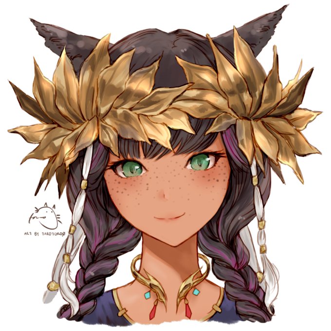
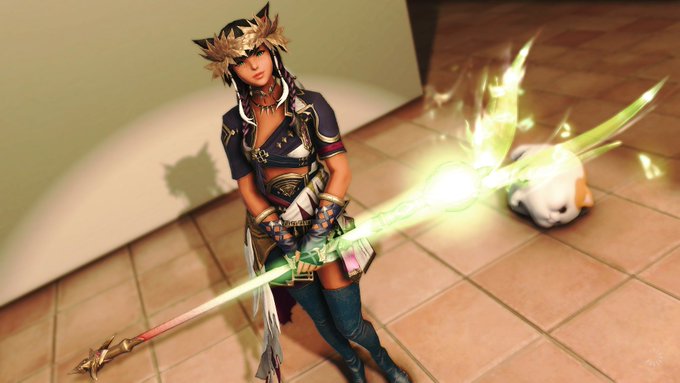
#MaySketchaDay 5/31 - som greek inspiration today - working on the contrast


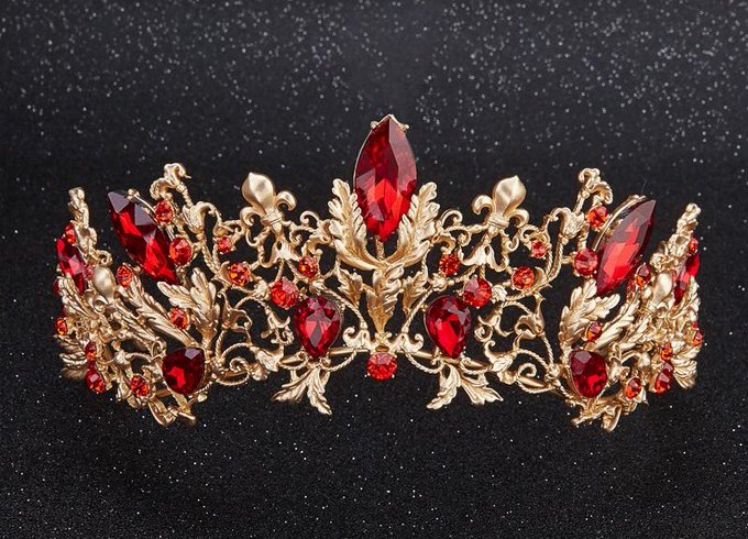
Kuko
-Varied gem shapes that reflect his funky personality.
-Balanced and regal despite the sharp contrast in colors
-Red for passion, desire and emotional intensity
-Sharp, but subtle frame. He seems to just be an energetic boy, but he is very rooted by his mental fortitude

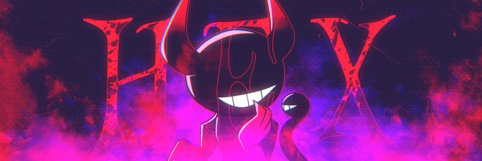
Oldest (I could find) vs newest
I finally learned what contrast is https://t.co/ImSevL7TtB

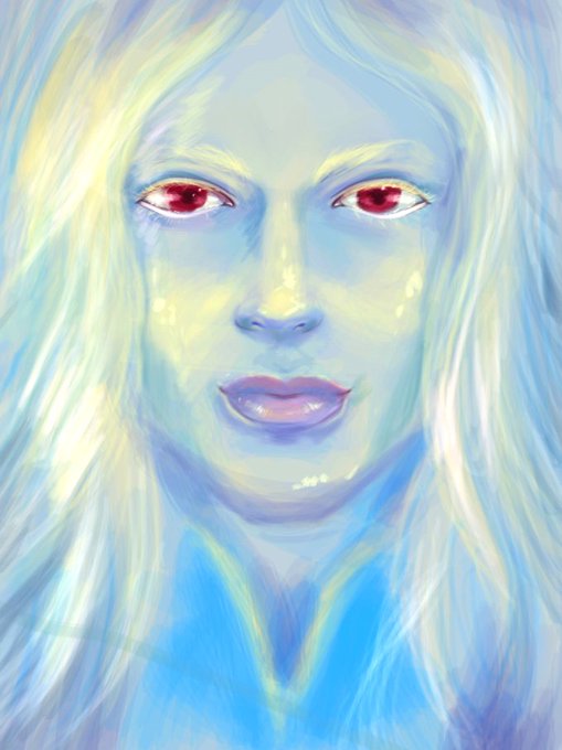
Hier j'avais terminé celui-ci aussi. J'aime beaucoup les couleurs, je commence enfin à comprendre un peu comment ça fonctionne, mais je fais pas assez de contraste. ça arrive piti à piti. Je sais surtout que je vais m'entrainer à dessiner les yeux T_T ! #Hubrys

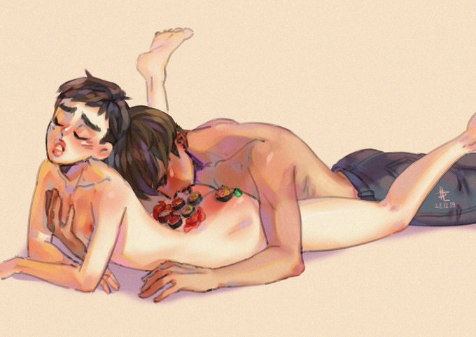

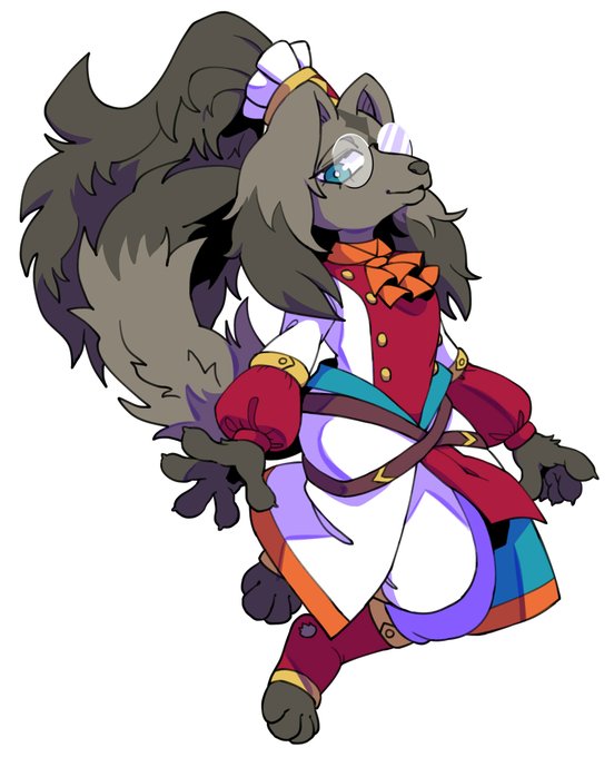
Gluttony&Nigrum.
Two are contrast characters. In a certain sense.
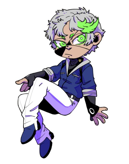
Cute chibi by a wonderful artist.
・Art by @ferretamazing / Thank you!
#Zimniy_shram https://t.co/osYyJ2tsoW