CONTRASTのTwitterイラスト検索結果。 406ページ目


Watercolor #painting of the dramatic #storm sky, titled "Sky No. 6'" (30 x 40,8 cm, 2017). I just love those contrasting colors!
You can find the original watercolor and signed art prints of it here:
https://t.co/BO4WBzUoE0
https://t.co/cSVqObweKm


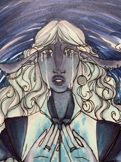
I'm currently practicing different skin tones as I'm still struggling with finding the right color palette especially contrasting light and dark skin tones knfvjndvjkdfndsjkng THE STRUGGLE IS REAL
#TheLegendOfKorra #korrasmi


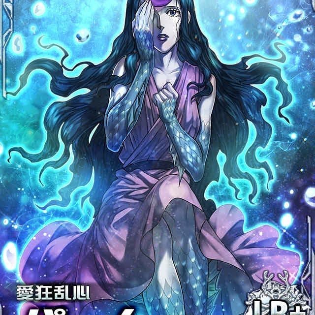
Palm Siberia - Hunter X Hunter
Format A2
13h20
Contrast Boosté + Real Version + Model (Carte)
🖤♥️[RT VERY APPRECIATED]♥️🖤
ps: Bon il rend largement mieux en vraie, la version retouche PC a fait ressortir plein de pixel avec le contraste
#hunterxhunter


The contrast between Gin's desire for revenge for what was "taken" from Matsumoto, and Matsumoto being able to let go of the past, to me was one of the most profound yet so subtle parallels in #Bleach.


A successful colouring practice with a Diablos from my Academy of Men idea. I felt that soft shading works with the reference I used here because the contrast in values weren't so dramatic. The green skintone helps loads because I don't have to deal with human undertones lol


Are you telling me that there’s a possibility of two contrasting settings in the next #AssassinsCreed?! Let me know your thoughts, speculations and wishes for the next game and let’s find out the truth together at: https://t.co/Ag1gyu7BSW #AssassinsCreedLive


Elena Lázaro @aecomcientifica:
"El fact checking o verificación de hechos obliga a cualquier periodista a contrastar la información... ¿Qué ocurre? Que las instituciones tienen una credibilidad y generalmente no se cuestionan"
Por @Elkokoparrilla
▶https://t.co/MA0ahkTPIe


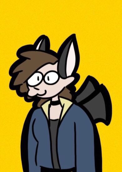
Ok but contrast her with the old rantsona I made a year ago... the improvement...

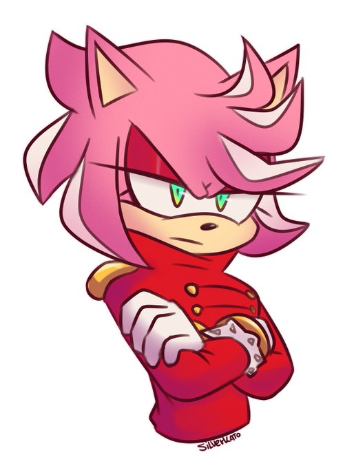




Contrast that with what the Hanna-Barbera series was allegedly going to be like. Carl Wilson is strangely depicted as an over-eater (when in reality, it was Brian during this period), Dennis is into kung fu... There's a funny animal sidekick or two. It's... Something.


Playing with lighting, contrast and focal point.
#art #drawing #illustration #character #story #digitalart #digitaldrawing #digitalsketch #sketch #concept #lighting #procreate


Hace poco me estaba alegrando xq encontre el tema de historia y mi hermanito me escucha celebrando y me dice "encontraste eso menos al amor de tu vida"
JSJSJDJSKKA PTMR



bro i was so ugly omg. bitches contrast went up after i stopped going outside and dyed my hair back to its natural colour. https://t.co/lgzNkUcEW3

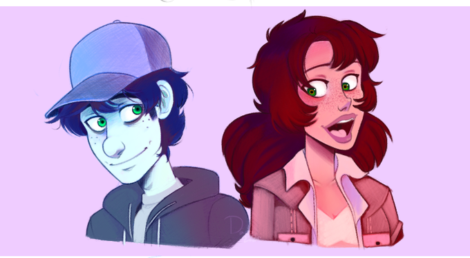


A #patreon commission for @ValBellanaris' Zilry! Adored painting all of the contrasting tones and little details.
Reminder that there is still a patreon commission slot open for May!
#dndcharacter #dndart #commissions


Anche oggi vi presentiamo una delle opere tratte da #NuName2, del 2014. La 4° #illustrazione apparsa sul volume era "Contrasti" di Silvy chan : un'avventuriera in salsa #steampunk che protegge un #pandarosso! https://t.co/ceIDhrIPLG


This week's prompt is Still Life! Still Lifes contain contrasting ideas of beauty, impermanence, frailty and power. Create a Still Life that uses objects to express your ever day experience. See link in bio for more on our 10-week prompts. #StillLife #TSA10weekARTchallenge

