readableのTwitterイラスト検索結果。 908 件中 42ページ目

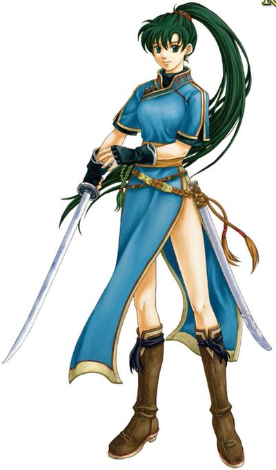


@poondonkus @hannahpikanya it feels like they want roy to "fit in" because his original design is very simple and readable, but starting with like, awakening, they decided to start over-complicating everyone
they keep trying to do this to lyn


@Camarasasaurus @slothwerks yeah, i was thinking that on the left variant the little symbols of monsters/towns/treasures would be more readable, also could add some animations to them. but it might be little bit inconsistent then...


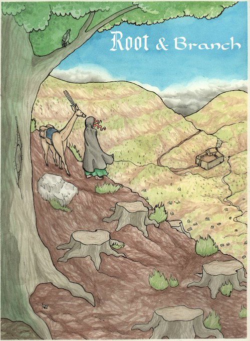
Would you like have your very own, super shiny, copy of Root & Branch Book One?
116 glossy, full-color pages packed with adventure and magic
Re-mastered to be less cringey to the now more skilled artist
Re-lettered to be more readable
Will get you hooked
https://t.co/E4jrlZNa3e


Chapter 6 of the light novel, "Amitie and the Girl of Love" is now readable on our tumblr!
https://t.co/0i2Q0plyuc


@TCDResearchColl @HerbariumDonna I, along with other volunteers, have been tagging her images with a machine readable tag in .@BioDivLibrary Flickr feed. Every time I come across her work her artistry makes me smile. See https://t.co/lICYU3mXfo


💥✨HOPE KILLERZ - Chapter 3 is UP on my PATREON! ✨💥
It will be readable for free on webtoons by the end of the week. For my patreons - and those who want to read it now! - just follow this link➡️: https://t.co/1NDVGOYKFB
So, what are your theories about the villains?! 🧐


https://t.co/YjGKgPYGoQ rest is there. Messing with fonts now, the old pages of this are quickly becoming unreadable.


We are working on a simplified and bolder version of our Streamline Emoji 😃
To make them more readable at small size in the context of a chat app.


making myself a new icon
will prob end up removing the hat to make it more readable


https://t.co/YjGKgQghNq <rest is there. Reposting since even if it's not as readable here there were still mistakes that needed fixing.


After fiddlin' with Locators for even longer I did a quick pass on the babby to see if the animation is possible and it is and im so happy T_T
Made a few mistakes I gotta work but but I wanna make sure he is still readable, so I may lessen the shoulder motion/counteranimate...


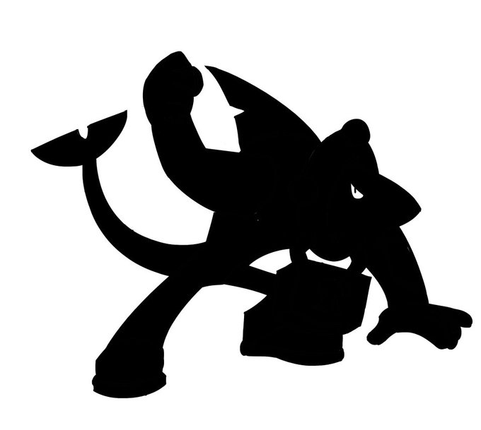
Scrafty does not understand the mail system but he likes to ride - the pokemon style is very charming in its simplicity, you can really tell it was carefully designed for readable sprites and internationally distributed animation.


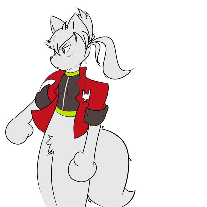


https://t.co/zXNvdfuN69
@aCarriageReturn has put together the LN entry for "Lazy Dungeon Master" -- already readable via J-Novel Club, vol 1 will be out as a full ebook on August 5th

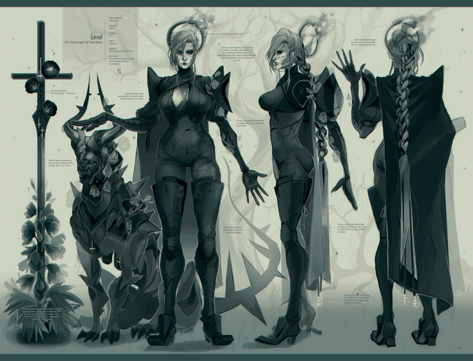
Uriel - The Archangel of Salvation | Bigger, more readable version is here: https://t.co/Driz3Q7Pz6



I just realized that the full comic isn't readable?! I'm sorry for that ;; It's based on a fanfic called "Electric Moment" from @cityofnumbersix 💜
#bnha #bokunoheroacademia #bnhabakugou #bnhakirishima #bakushima #kiribaku #轟出 #切爆 #mha #ashidomina #bnhamina