ContrastのTwitterイラスト検索結果。 10,503 件中 425ページ目


There's a neat contrast between the Invinci-Children in their two covers.
Marky is uncertain, perhaps a little insecure, while Terra is determined and strong.
Always thought it could be hinting at how they eventually grew up.


In contrast, investigators do ordinary research on Valentine's day.
There are full of people, so they may find a corner to sit down, eat and discuss😌
(It's about stolen chocolate? Or looking for love? Ha, Mr.Hein may not be good at this...)
Happy Valentine's day~🍫 https://t.co/35TcctU229

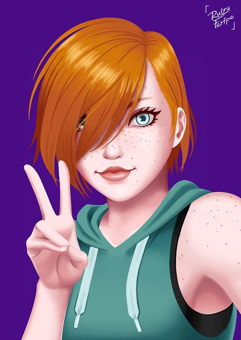
A selfie like drawing of my OC Cassandra i did for a game on twitter. Need to practice more contrast and hair!
I need to stop being lazy and finish her official concept!!!
#Illustration #drawing #digital #digitalart #digitaldrawing #painting #originalcharacter


@CeeHaz I think more or less the clothing remained the same with some minor changes, but the eyes, physique, and overall presentation greatly contrast one another. I welcome this new design and I'm amazed how far I have come since humble beginnings.


LWA & Arakawa Under The Bridge, 2018 & 2017 probably, big contrast, huge poppin colors, welcome to my twitter

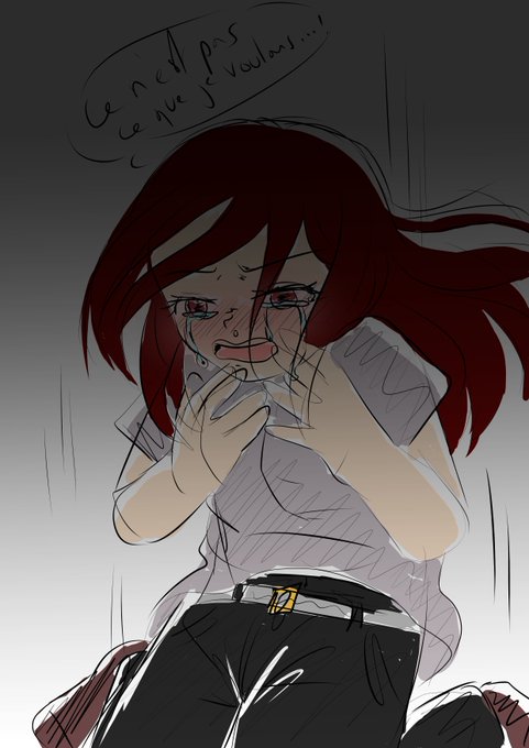
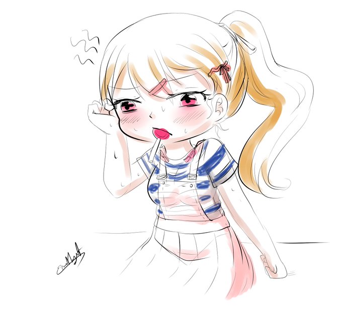
Two colored sketches of my ocs : Cherry and Fuku ^^ Ambiances contrast is so violent xD

A selfie like drawing of my OC Isabelle i did for a game on twitter. Need to practice more contrast and hair!
But i really like this hair style i did on her, better than original!
#Illustration #drawing #digital #digitalart #digitaldrawing #painting #originalcharacter


Not so little red riding hood.😁
Happy Wednesday everyone!
#wrongsideart #littleredridinghood #wolf #fairytaleart #fantasyart #horrorstories #drawing #draw #inkart #stipplingart #handdrawn #darkart #creepy #beautifulbizarre #contrast #ink #art


Shadows will use one value and be low in contrast. Once the flat shadows are in place, there is more room for information in the lights. There is a subtle gradient as the light falls down the form, but it is very subtle, or else it will start to compete with the shadow value.


'Hebridean Seas' by Mark McCallum reflects our dramatic, changeable Scottish weather. Bold, almost vertical brushstrokes, deep, contrasting colours and the addition of texture through sand from location convey vigour and grit.
https://t.co/sBSmFB2sPI
#seascape #art #stockbridge

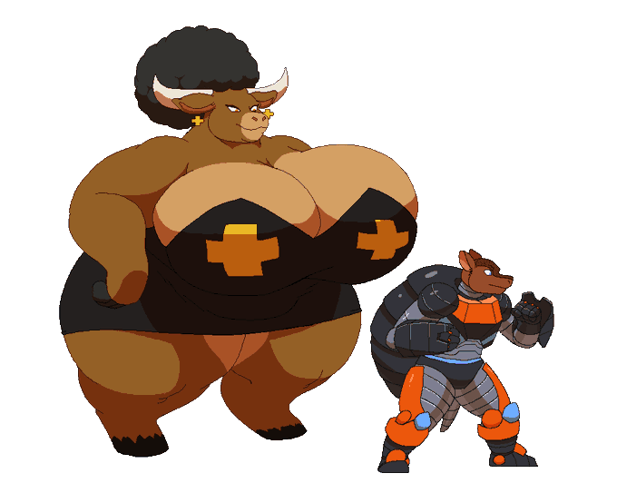


and the contrast of the humor vs how serious the other route was. And look at them, this is plain greencore





The pathos of Christ condemned stands in dramatic contrast with his image of a tyrant king leading by fear. Women running from Satyrs (1850), Ecce Homo (c1851), The King Continues to Reign with Order (1851) & Bathers (c1852)


Skage got a color and contrast update in the new chapter. Not only to freshen up the old concept but I noticed that I spend some good time on adjusting his contrasts in particular.