comparison,のTwitterイラスト検索結果。 44ページ目


And comparison, Old vs. New, Idk why I have so much trouble with torties and calicos but like? Hey yknow! Whateves!


Also some of the design process sketches so far, was trying to do a design different from the last. Starting with thinking about the silhouette in comparison, and exploring different shapes.


For comparison, this was her initial design concept back from 2017 I think?
I've improved ✨✨✨


@ledrew @WorldPrayr @radioshowccc @SylviaS43317546 @IsaaMobile1 @Carole77777 @PamMktgNut @NH_Hockey_12 @GreenSkyDeb @91Psalms123 @JuliannebyGrace @Blessttt @SandiHKaye @janlgordon @Mary39800280 @BubleFanGermany “For this light momentary affliction is preparing for us an eternal weight of glory beyond all comparison, as we look not to the things that are seen but to the things that are unseen.”
—2 Corinthians 4:17-18


Throne WIP2, heres the older one as well for comparison, feel free to critique!


Teeny tiny half-assed info page to complement Albel's ref to show what to expect from him as a character.
REUPLOAD EDIT: Very sorry. Added average pony mare and stallion bars to the height measurements for better comparison, to give you a better visual idea of Albel's size.


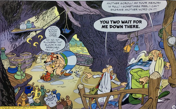


Here’s my drawing of an Asterix cartoon panel. Really happy with how this came out. The original is here for comparison, and pix of the drawing in progress.
This took ~12 days in my spare time. iPad Pro with ProCreate. Calligraphy Script brush.
@Procreate #Asterix #FanArt

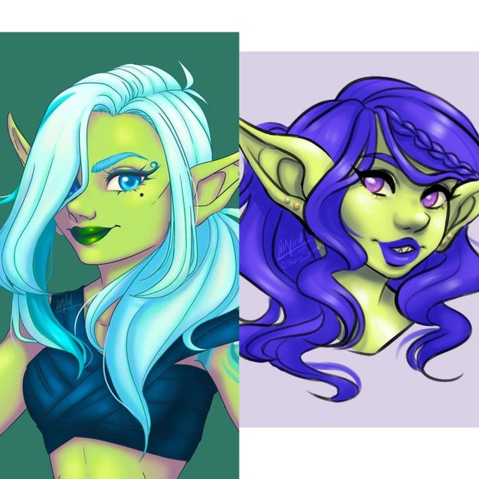


I didn't draw that incredible Krabby/Crabrawler comparison, but I did make that Pidgey/Pikipek and Vulpix/Zorua comparison.
It came with a re-styled Growlithe and Rockruff as well.


@georgexgordon that’s not even a fair comparison, the Marvel mobile games have far better character designs :,)


Just a fun character comparison, still got some work to do in the gym. Also selfie!


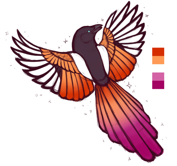
for those of you who like seeing WIPs and for the sake of comparison, have the R O U G H sketch and the slightly less rough sketch. always funny to see what a difference the polish makes.


More stuff with them including their size comparison, Shay as a kid and her eating a whole ghost chicken


Bluestar comparison, Old vs. New! I really like the new colors ^^ The old shape seemed boring to me, even tho that's how I picture her, all sleek, this is good too :3


Ready for this? Tawny comparison, Oldest vs. Old vs. New!


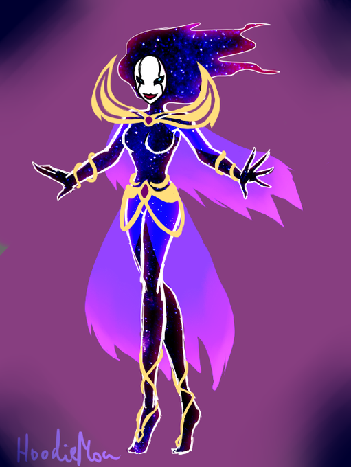


In comparison, here's her old look from 2015 and 2013 respectively.