ContrastのTwitterイラスト検索結果。 10,503 件中 446ページ目


the way his golden skin contrasts beautifully with the white satin mmmmmm


Plus, just look at the contrast between the official posters and this "leaked" image. Even though I don't like the Movie design, I can admit the posters are professionally edited (even at lower quality). Look at his fur textures! The leak doesn't match them...


Royal elephant named Khushi Khan. Left late 17th/early 18th cen. Khushi Khan has decorative orange markings on his forehead, temple & ear. Right late 18th cen. & based on the earlier work. Striking contrasting tones between the pale trunk & the black body #Art #History #Rajasthan

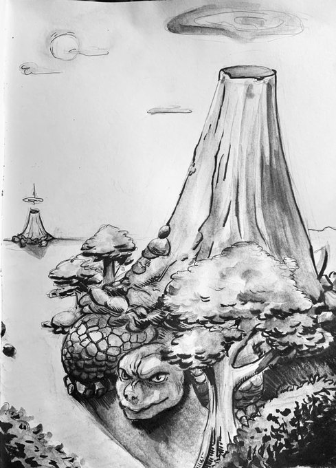


Inktober Day 12: "Candles" #inktober #inktober2019 #inktoberday12 #witch #witchsona #candles #levitatingcandles #witchhat #selectivecolors #yellow #red #contrasts #copics #inkandpen #traditionalart


Intraoperative contrast-enhanced ultrasound for cerebral glioma resection and the relationship between microvascular perfusion and microvessel density. https://t.co/N7ugKftLhP #BrainTumor #aneurismacerebral


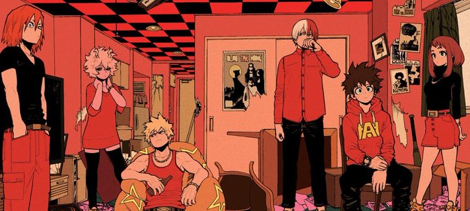
My Hero Academia trivia ch246:
Deku + all six class 1-A ladies + Nejire Hado
(a nice copic pen spread! contrast with the digitally colored spread from 243)


Nagha's alternate gear color compared to the previous artwork : https://t.co/i83nbIRjE9
Is this more contrasting colored gear looks better than the previous default red color?


concept arts for Observation Without Misery's high-contrast sparkleslugcat #Rainworld


Looking at that Pandy & Retro comic again, it’s really interesting to see the contrast between ImaiToonz and Imaishi’s take on the them during Dead Leaves’ production. ImaiToonz’s being more detailed and comic book-esque while Imaishi’s was more loose and angular.


'Contrast' a group exhibition of artwork by @max_angus , Paul Bartlett, John Foker & John Hatton highlighting their contrasting approaches to the subject of nature. Opens this Sat at Waterston House, SOC HQ, 10am-4pm till 19 Nov. Entry is free, all welcome https://t.co/xn33lb6MR6


"The Otherknown", by my friend @longlostlora, looks cutesy at first glance, full of round shapes and soft faces and high-contrast colors. This is an important impression; it's one of its primary visual markers, and also one of the primary methods by which it lies to the reader.


Wasn’t happy with the digital highlighting. Redid it with gel pen and gave it more contrast with the Bic (physical), then used different filters (digital). Much happier now.
#PenDrawing #WeirdArt


Hello there #PortfolioDay
My name is Ivan, and I am an artist and some times even an animator...
My art style based on strong colors, contrasts, and harmony.


#Inktober-day 8-Fio from Porco Rosso. I admit that this is based heavily on a frame from the film that I just love. I always liked Fio as a character. Her “smart and tough” girl spunkiness is a big contrast to the mature glamour of Madame Gina. #comingsoon #inktober2019

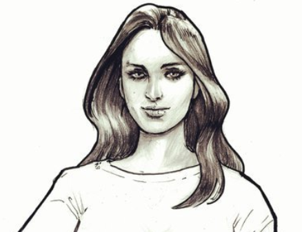

Riley and Adobe: sisters, and a study in contrasts.
#comics #teamcomics #indiecomics #Mythoverse


Hi! I'm Dorian and I am a Digital artist whose work is all about colors, contrast, and contemplation.
#PortfolioDay
https://t.co/pqkYR8ANwc


Some more #40k Nurgle following on from yesterday. Trying out color first, I think I underestimate how much contrast the black will add and stay a bit too light. More practice needed!
#inktober2019 #nurgle #chaos #plague #warhammer40k #markers #prismacolor #drawing #mrjackart