realisticのTwitterイラスト検索結果。 28,527 件
#JohannaTheChocolateLover
Work-in-progress portrait of Johanna by artist @UnoMitsuko. Her naïve, cheerful smile is beautifully captured in his hyper-realistic oil painting style. 🥰
I basically live by this mantra; it's what makes oil painting so fun. Nothing is definite and everything is always changing, the only danger of it is over rendering.
I don't like rendering hyper realistic and wanna let the brush strokes speak for themselves
Kaguya Sisters (TMNT 1990 live action ver)🐰🩷🩵💚💛
I designed this design with the idea of making a mascot suit specifically for a female suit actor. (This is the limit of what I can draw on a realistic stick.💦)
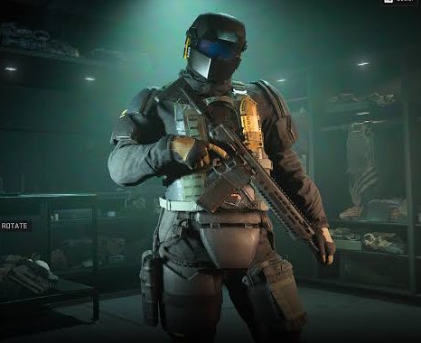
They are not "realistic" military skins, but I love seeing them in game.
A semi realistic redraw commission for the scene showing Ichigo from Daling in the Franxx anime
...
Commission done for @IchigoLover1776 also feel free to check their other twitter @TimelyIchigo015
#DarlinginthefranXX #ichigo #commissionart #Commission
Sharing one of my recent done commission... its a semi realistic redraw of Fiona crying in spy family anime
#SPY_FAMILY #Fiona #Commission
I WANT THEM TO MAKE GOOD GAMES INSTEAD OF BLOATED BULLSHIT WHERE YOU CAN SEE THE PORES BREATHE!
This looks more than fine and if they make a good game that's better than any boring garbage graphics showoff.
Go play your realistic male woman depictions instead. https://t.co/pEg8H842Pe
I don't just only draw realistic guns and Madness combat style stuff if you want to see something else.
Original concept designs, characters, and more.
Did some few adjustments! I rarely draw semi-realistic so might as well make this my best one!!! https://t.co/Cln0DcVkzG
I am rooting hard for my boy, YES. He's godly strong and he deserves to show it off. But realistically speaking, I think Jura's still unbeatable at this moment, and would no doubt prevail over Kawaki AND Boruto easily. Their strength is not enough. #BorutoTwoBlueVortexCh24
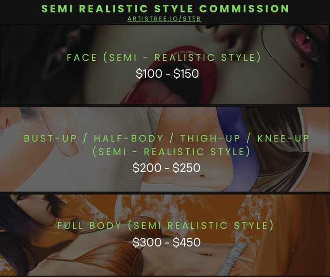
Hey guys! 📜Updated Commissions List!
I’m offering semi-realistic & anime-style art — rates in the images. Request a commission here: https://t.co/POUYfLJwY6
P.S. I Might be offering character sheets soon! (DM me if you want.)
RTs & shares appreciated, thank you!
Some robot models have very realistic synthetic digestive systems.
They can get noisy though.
Sorry I didn't make a proper sheet for it but I can also do chibi drawings, they start from $10 each character but the design will be super simplified. I can "copy" styles too if u want me to do certain styles from some franchise (tho I can't do realistic art)
when I want to draw something realistic,but also want to draw hololive... so it come out
.
.
.
#RaorArt
I do rather hate the idea of any realistically existing brand, model of weapon appearing in a completely fictional world, it's like watching a silly commercial to me.
That's why I've completely customized my world with an exclusive modern weapon aesthetic. https://t.co/LwEltIc8a5


