proportionのTwitterイラスト検索結果。 9,792 件中 462ページ目


Process of the painting. I sketched out the face focusing on angles and proportions, this probably took as long as the painting it's self. Then I painted in the local colours, building the values on top of them, but only using simple brush strokes, layin… https://t.co/ukuXm6TxrL

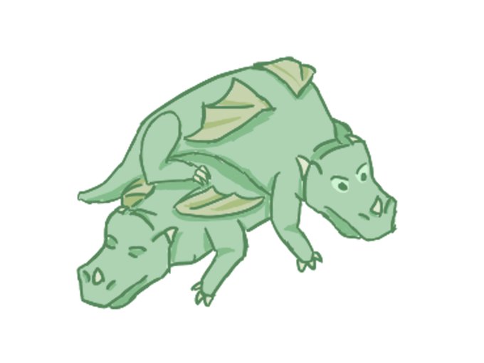
Ddday 3, have a pair of badly proportioned hatchlings #dddragons


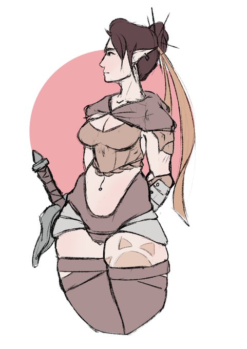
I uploaded an image of another character that I’m working on at my #DeviantArt gallery. I thought I would go ahead and upload a smaller version of the image here. I like the color palette so far, but I need to adjust her proportions and try a different style for her outfit.


A muse comes down from Mount Olympus... #DivineProportions
A heavenly new dining experience from Shotgun Carousel on sale now at @thevaultsuk


The last request I did throughout last week. Tried a different head position so it's proportions are off. Still making progress.
#requestedart #art #artrequest #demongirl #Digitalart


The difference 13 days can make. I need to be more thoughtful with how I’m proportioning characters, because it makes a lot of difference. #comics #characterdesign

i need to actually study real faces before i try to do realistic proportions guhhhh


ah, these proportions are shit but i worked too long to give up. I love these two characters


Tried to focus more on readability than exactness. Wanted to bring out more form than just copy the reference. proportions are off in the rear but for 30 min I call it a success. I'd normally take more time on the rough to fix that rear, but my back was killing me, so meh.


Felt like drawing and practicing with my proportions. It... turned out alright?


Today i drew #Broly from that trailer we got yesterday, happy to be a #DragonBall fan! sorry how i drew him when it comes to his body proportions, i hope it's okay...it been awhile since i drew dbz. 😅 #DragonBallSuper #DragonBallSuperBroly #DragonBallSuperMovie #FanArtFriday


what if:
#caulifla and #kale were proportioned like universe 7 saiyans
#dbs #fanart #dragonballsuper


MOMO. I feel like I could've done better with her proportions... <_<
#BokuNoHeroAcademia #MyHeroAcademia #MHA #fanart #AnimeArt


Many, many months ago I created this piece, and only now did I realize what was irritating me about it: her face and legs looked odd proportionally and her arms were too thin.
#succubus #pinup #nude #horror #villainess #illustration


[arcemalva] recent appdates
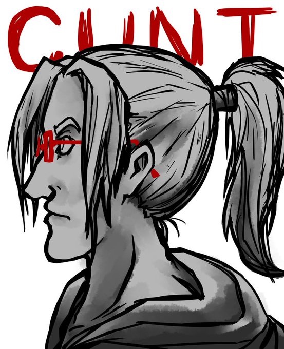
. stitches' fb is still 8 heads proportionally, so looks too tall, but fixing the separate lineart, colours & shading layers further is a pain 😴 next time!


The Julian Thirst is Real.....
(Also I feel like my anatomy leveled up at some point but my proportions leveled down lol 💀💀)