CONTRASTのTwitterイラスト検索結果。 464ページ目


@blizzagadyne THE CONTRAST AND COLOURS DEEPENED MORE SHOWED HE HAS BLUSH IM CRYING HAR DER


Today's #mermay prompt is #witch 🦇
It's an experiment of painting + high b/w contrast w/ hardly any shading. Opinion? 🤷
#mermay2019 #mermaychallenge #mermayday22 #mermaid #mermaidart #gothic #blackandwhite #grayscale #monochromatic #digitalpainting #illustration #digitalartist


Another film study - this time from Tangled!
Went over the hour mark by accident this time. I shall set a timer for my next one!
It was ace focusing on lots of colour & natural shapes in this. A big contrast to the Kung Fu Panda study I did =]
#art #MaySketchaDay #digitalart


A wee tutorial I did a while ago for a friend.
you can do some pretty dynamic things with just a few colours! contrast and focus is everything 🌝🌚


Working with limited tones allows the artist to play with values and contrast.
“COLLAB: Devilman” by @OSHredART: https://t.co/S4CUnagpBA
#DevilMan #DMCB #Anime

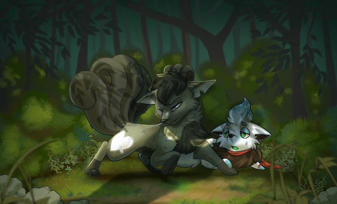
full render commission for icy_vixen via FA! i learned a lot from this piece and still pushing myself on colors n'contrast | dA: https://t.co/3gmeoHiIE4


This was a fun one. Completed commission for @BurrPaws, featuring his Char Aslan on the left, my Siberia in the middle, and my new Char Asher, on the right. Decided to go for a more contrasty lighting effect! Quite like it.
High res (40 megapix) on my patreon :)


The contrast between the conditions of those doing the work and those enjoying prosperity is drawn clearly in The Ragged Trousered Philanthropists.

Spectral tails are rendered in a luminous blue, forming a magical contrast against the lush, verdant forest.
“Reflection” by @CaraidArt: https://t.co/AbiOJoVmna
#Kitsune #DigitalArt #Monk


We love this piece by @Planet_Ella (on IG) with it’s nod to Art Neuveau, created in #ClipStudioPaint. It’s both elegant and graceful while the contrasting color palette and balance of light and dark make a powerful impact.


Necromancer vulture priest.
#sketch #illustration #art #design #lineart #ink #digitalart #traditionalart #drawing #characterdesign #penandink #painting #highcontrast


hmmm im messing with paint-y coloring again and it seems like such a fun contrast against pixel lineart hmmmmmmmmmmm
oooh what if I color the lineart too- 👀👀


All done with this! It was really fun working with colours I'm normally scared to go near!
#BANANAFISH #ashlynx #bananafishart #anime #fanart #digitalart #vaporwave #artistsontwitter
( yes I deleted the original to make a 5% change to contrast nobody but me will even notice )

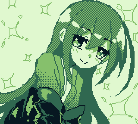
"can you draw Shion from gj-bu?"
well, yeah, yes i can, im actually surprised of the contrast here, hue hueu hue , I hope you liked it fren~


One of four
I love the textures and contrast in this 24x24 inch acrylic gallery canvas painting.
The strokes are so bold and free.
Where to go next ? That is part of the fun.
I will work on the other 3 for a bit.


Una sencilla pa la bandita
Practica de verdes verdosos con un contraste bonito, no me ayudo nada que me intentaran robar y me lastimarán la mano, oof
#original #digitalart #CLIPSTUDIOPAINT #green #Casual #mangaart