ContrasのTwitterイラスト検索結果。 10,822 件中 465ページ目


God, I’ve always really liked Lunala’s shiny form
The colors just contrast so well from it’s regular form


I love the contrast between Touhou's Hisoutensoku on the OST cover and the in-menu sprite.


Did a couple of colour treatments. Not a fan of either really, but I think lessons learnt are don't do a too detailed sketch to begin with if painting and stay low contrast as you can bump it as it gets nearer end of painting.


i just realized that the shading and shiney contrast extremely. and i dont care 3 musketeers!!!!!!!!


Another #Spinel from #StevenUniverseTheMovie because I can't stop myself. I love so much the rubberhose animation contrasting the more modern movements of the other characters!
#StevenUniverse #suSpinel #suspoilers


drew a Black Hole Icon to contrast with this icon i made a while back! #ArtistOnTwitter #alterego


It was hard to pick just #4styles actually, so I tried to go for the most contrasting selection possible? I confuse a lot of people XD but my flexibility keeps me earning money
#art #comics #comicbook #graphicnovel #bookcover #manga #comicpages #artist #illustrator


I also made another version where I do a goofy face for my 2nd channel. I'm planning on using either one with the blue background, but I'd like to know which variant is the best between with or without eyebags, and if I could use another colour to give a better contrast.


It's tough figuring out my most contrasting examples...that I'm ok with posting. #4styles


Great idea Jen!!We💙shadowboxes.Yes, in @morphiapp you can convert images (pngs+jpgs) saved on your #iPad into 3D models using the add image button but make sure they are high contrast,line drawings.Black+white silhouettes work best+experiment w/line thickness,esp for #3Dprinting https://t.co/WEMTF04yFI


My #4styles represented by 4 diff. chromonauts from heavy inks and schrunchy colors, to chuncky paint blocks, to heavy shadows and contrast, to short and stonky shitposts 👺👍


@Proteus_Ridley Hopefully that'll work. I downsized it, put a boarder around, and upped the contrast.


so...#4styles huh?...
1. my go-to, cell shaded style.
2. pixel style which is basically my usual style but pixels lol
3. fake woodcut/high contrast style for creepy things
4. scratchy simple style for lil personal doodle comics :)


#4styles
-balls to the wall atmospheric vibes
-balls to the wall high contrast and roughness
-balls to the wall punk-esque photomanip
-soft pastel colors


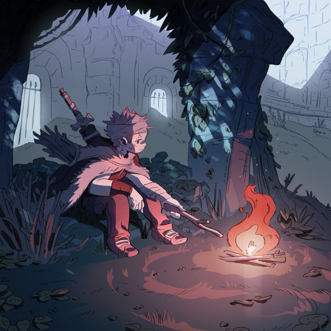
Some changes and similarities between my styles, but what stays the same is that I love lighting and contrast a whole bunch! #4styles


wanted chapter 9's cover to contrast chapter 2's...... we went from "yay superpowers" to "oh no superpowers"


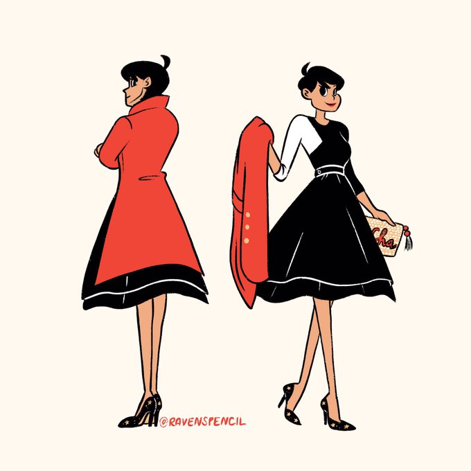

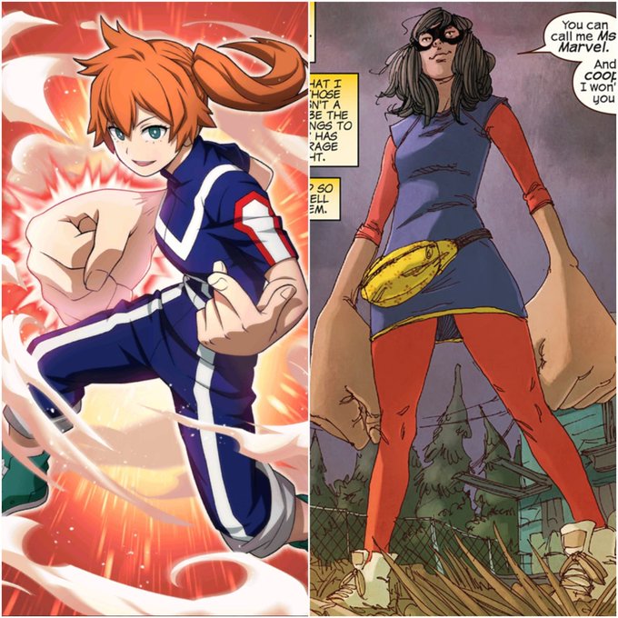
Se elas se encontrassem elas seriam melhores amigas instataneamente e só a minha opinião importa blz? Obrigado.