ContrasのTwitterイラスト検索結果。 10,822 件中 479ページ目


https://t.co/GAOy2eO13Q
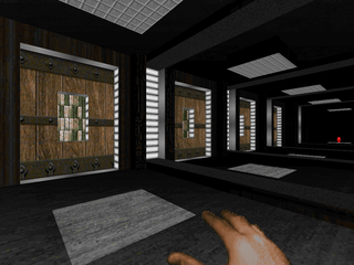
Welcome to Hell / Doom II / Vanilla / 1995 / MAP05-MAP07 / by Paul Schmitz
Paul was one of the architects behind Eternal Doom. This minisode has some tricky progression and is visionary for its contrast of colors on a flat, black canvas void.


Had to do some value studies cause I hate how shit my values end up towards the end of my pieces, gotta get faster for sure but I feel like I learned something at least, especially with darks, and Only God Forgives is such a great movie to get dark shots with solid contrast

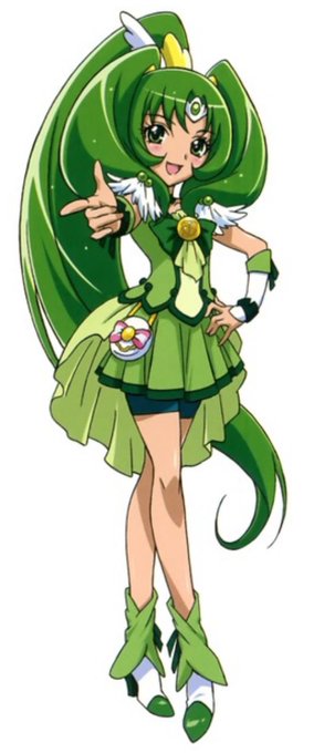
i was gonna do a whole cure march recolor for fun to fix contrast issues but i just darkened the hair and i feel like that goes a long way


I tried to draw with brighter colors and shadows, but now I miss the contrast. Mmmmmmmmh. Why is art so difficult?


i started playing ico the other day but i was so enamored with their contrasting character designs that i only got like an hour in before i had to stop and draw them


We are very excited to welcome a new artist to our group, @ericPetersenArt ! His illustrations consist of minimalistic figures contrasted with psychedelic colors and ominous compositions that result in an unsettling, yet very unique style. #rsar_group


Think more strategically when creating plans for your website, blog and social media content. Use high contrast materials & eye catching patterns to grab attention and showcase your work, talent and skill. Make people take notice of you! @SketchUp #sketchup #interiordesign #CAD


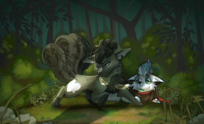
@Aevii_M @pixiipaws @panfullodoodles @Tauohaleion @vixenlynx I love the name! And her eyes contrast well with her fur color!


@blizzagadyne THE CONTRAST AND COLOURS DEEPENED MORE SHOWED HE HAS BLUSH IM CRYING HAR DER


Today's #mermay prompt is #witch 🦇
It's an experiment of painting + high b/w contrast w/ hardly any shading. Opinion? 🤷
#mermay2019 #mermaychallenge #mermayday22 #mermaid #mermaidart #gothic #blackandwhite #grayscale #monochromatic #digitalpainting #illustration #digitalartist


Another film study - this time from Tangled!
Went over the hour mark by accident this time. I shall set a timer for my next one!
It was ace focusing on lots of colour & natural shapes in this. A big contrast to the Kung Fu Panda study I did =]
#art #MaySketchaDay #digitalart


A wee tutorial I did a while ago for a friend.
you can do some pretty dynamic things with just a few colours! contrast and focus is everything 🌝🌚


Working with limited tones allows the artist to play with values and contrast.
“COLLAB: Devilman” by @OSHredART: https://t.co/S4CUnagpBA
#DevilMan #DMCB #Anime

full render commission for icy_vixen via FA! i learned a lot from this piece and still pushing myself on colors n'contrast | dA: https://t.co/3gmeoHiIE4


This was a fun one. Completed commission for @BurrPaws, featuring his Char Aslan on the left, my Siberia in the middle, and my new Char Asher, on the right. Decided to go for a more contrasty lighting effect! Quite like it.
High res (40 megapix) on my patreon :)